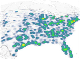
當您開啟 Power Map 時,Bing 地圖服務會自動在直條圖中繪製資料。 可以切換到熱力圖 (熱力圖是以色彩表示您的資料),讓使用者一眼就能看清大量資料。
-
按一下 [常用] >[圖層窗格]。
![Power Map [常用] 索引標籤上的 [圖層窗格] 按鈕](https://support.content.office.net/zh-tw/media/65317674-9161-4cb5-a3b6-6f78b84a8a7c.png)
-
在 [欄位清單] 索引標籤上,按一下 [熱力圖]。
![[欄位清單] 索引標籤上的 [熱地圖] 圖示](https://support.content.office.net/zh-tw/media/f900badf-1075-488a-beb4-afb9d35fcf36.png)
附註:
-
切換到熱力圖之後,[高度] 欄位就會變成 [值]。
-
您可能要放大或旋轉圖表,好讓您以更好的角度看清楚熱力圖。
-
您不能在熱力圖新增註釋。
-