
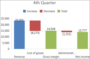
A waterfall chart shows a running total as values are added or subtracted. It's useful for understanding how an initial value (for example, net income) is affected by a series of positive and negative values.
The columns are color coded so you can quickly tell positive from negative numbers. The initial and the final value columns often start on the horizontal axis, while the intermediate values are floating columns. Because of this "look", waterfall charts are also called bridge charts.
Create a waterfall chart
-
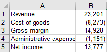
Select your data.
-
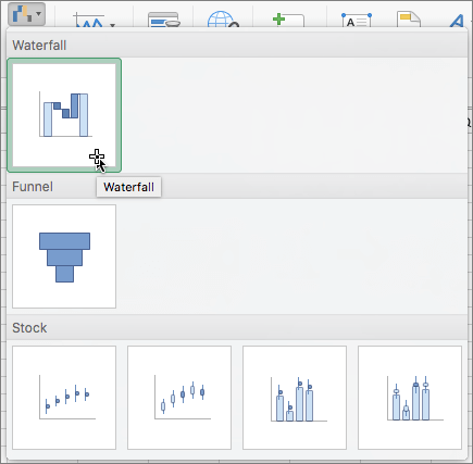
Click Insert >

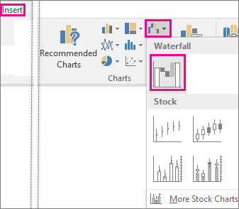
You can also use the All Charts tab in Recommended Charts to create a waterfall chart.
Tip: Use the Chart Design (or just Design) and Format tabs to customize the look of your chart. If you don't see these tabs, click anywhere in the waterfall chart to add these contextual tabs to the ribbon.
The ribbon tabs for charts in Microsoft 365 and Office 2021:

The ribbon tabs for charts in Office 2019 and earlier versions:

Start subtotals or totals from the horizontal axis
If your data includes values that are considered Subtotals or Totals, such as Net Income, you can set those values so they start on the horizontal axis at zero and don't "float".
-
Select a single data point on the chart, then right-click it and select Format Data Point to open the task pane. Then select the Set as total box, as illustrated below.
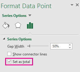
Note: If you right-click when all the data points are selected, you'll see the Format Data Series option, rather than the Format Data Point option.
To make the column "float" again, clear the Set as total box.
Tip: You can also set totals by right-clicking on a data point and picking Set as Total from the shortcut menu.
Show or hide connector lines
Connector lines connect the end of each column to the beginning of the next column, helping show the flow of the data in the chart.
-
To hide the connector lines, right-click a data series to open the Format Data Series task pane, and clear the Show connector lines box.
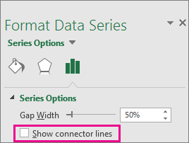
To show the lines again, check the Show connector lines box.
Tip: The chart legend groups the different types of data points in the chart: Increase, Decrease, and Total. Clicking a legend entry highlights all the columns that make up that group on the chart.
Here's how you create a waterfall chart in Excel for Mac:
-
Select your data.
-
On the Insert tab on the ribbon, click

Note: Use the Chart Design and Format tabs to customize the look of your chart. If you don't see these tabs, click anywhere in the Waterfall chart to display them on the ribbon.
See Also
Create a box and whisker chart


