
To create a chart, you need to select at least one cell in a range of data (a set of cells). Do one of the following:
-
If your chart data is in a continuous range of cells, select any cell in that range. Your chart will include all the data in the range.
-
If your data isn't in a continuous range, select nonadjacent cells or ranges. Just make sure your selection forms a rectangle.
Tip: If you don't want to include specific rows or columns of data in a chart, you can simply hide them on the worksheet, or you can apply chart filters to show the data points you want after you create the chart.
Arrange data for charts
Excel can recommend charts for you. The charts it suggests depend on how you’ve arranged the data in your worksheet. You also may have your own charts in mind. Either way, this table lists the best ways to arrange your data for a given chart.
|
For this chart |
Arrange the data |
|---|---|
|
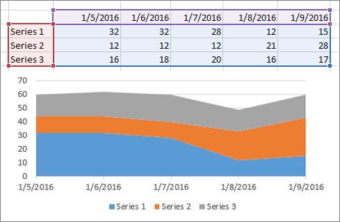
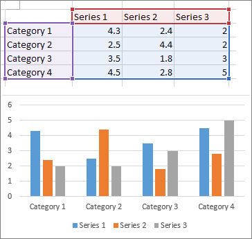
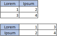
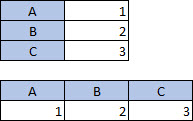
Column, bar, line, area, surface, or radar chart Learn more abut bar, line, area, and radar charts. |
In columns or rows.
 |
|
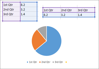
Pie chart This chart uses one set of values (called a data series). Learn more about |
In one column or row, and one column or row of labels.
|
|
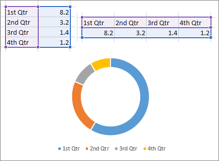
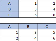
Doughnut chart This chart can use one or more data series. Learn more about |
In one or multiple columns or rows of data, and one column or row of labels.
|
|
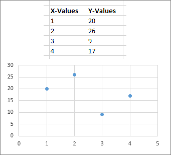
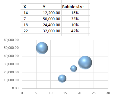
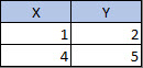
XY (scatter) or bubble chart Learn more about and bubble charts. |
In columns, placing your x values in the first column and your y values in the next column.
For bubble charts, add a third column to specify the size of the bubbles it shows, to represent the data points in the data series.
|
|
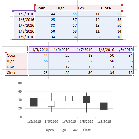
Stock chart Learn more about |
In columns or rows, using a combination of opening, high, low, and closing values, plus names or dates as labels in the right order.
|
See Also
Add a data series to your chart
To create a chart in Excel for the web, you need to select at least one cell in a range of data (a set of cells). Your chart will include all data in that range.
Arrange data for charts
This table lists the best ways to arrange your data for a given chart.
|
For this chart |
Arrange the data |
|---|---|
|
Column, bar, line, area, or radar chart |
In columns or rows, like this:
|
|
Pie chart This chart uses one set of values (called a data series). |
In one column or row, and one column or row of labels, like this:
|
|
Doughnut chart This chart can use one or more data series |
In multiple columns or rows of data, and one column or row of labels, like this:
|
|
Scatter chart |
In columns, placing your x values in the first column and your y values in the next column, like this:
|
For more information about any of these charts, see Available chart types.
Need more help?
You can always ask an expert in the Excel Tech Community or get support in Communities.


