
Note: This article has done its job, and will be retiring soon. To prevent "Page not found" woes, we're removing links we know about. If you've created links to this page, please remove them, and together we'll keep the web connected.
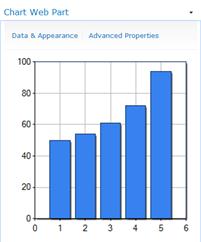
The Chart Web Part is a Web Part that can be created and added to a SharePoint site to enable users to view performance and other types of information at a glance. For example, you can use a Chart Web Part to see sales amounts across different teams or geographical regions in a retail organization.
Read this article to get an overview of the Chart Web Part and how you might use it in your organization. To learn how to create a Chart Web Part, see Create a chart by using the Chart Web Part.
In this article
What kinds of charts can be displayed by using the Chart Web Part?
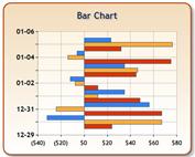
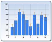
Charts can vary greatly in appearance and in the information that is displayed. For example, a bar chart that was created by using the Chart Web Part might resemble the following image:
Charts that are created by using the Chart Web Part are displayed as static images. This means that you can view up-to-date information in the chart, but you cannot click a value to see higher or lower levels of detail. Depending on how the chart is configured, you might be able to click hyperlinks that are connected to the chart series, legend, or data labels.
However, there are many other ways to visually represent data by using the Chart Web Part. The following table describes the various chart types that are available with the Chart Web Part:
|
Chart Type |
Description |
|
Bar chart
|
A bar chart illustrates comparisons among individual items. |
|
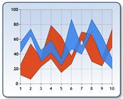
Area chart
|
An area chart is used to emphasize a degree of change over time, and also to show the relationship of its parts to a whole. |
|
Line chart
|
A line chart can be used to illustrate trends in data with the passing of time. |
|
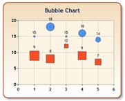
Point/Bubble chart
|
Bubble charts display data points as bubbles of different size. The larger a data value, the larger a bubble is in the chart. Although the chart is called "bubble" it also can display different shapes, like Square, Diamond, Triangle and Cross. |
|
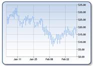
Financial chart
|
A financial chart is useful for displaying financial information, such as stock market values. |
|
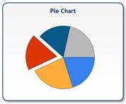
Pie chart
|
A pie chart shows how proportions of data, shown as pie-shaped pieces, contribute to the data as a whole. |
|
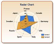
Radar chart
|
A Radar chart, sometimes referred to as a Spider chart or Star chart, is a circular graph used primarily as a data comparison tool. These charts normally have a circular shape, but can also be displayed as a polygon. |
|
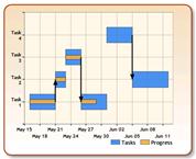
Gantt/Range Column chart
|
Gantt charts, or Time charts, display separate events that have beginning and end values. These charts are excellent for planning the use of resources, and data can be plotted using either a date-time or numerical scale. |
|
Range chart
|
The Range chart displays a range of data by plotting two Y values per data point, with each Y value being drawn as a line chart. The range between the Y values can then be filled with color, or an image. |
|
Error Bar chart
|
Error bar charts consist of lines with markers that are used to display statistical information about the data displayed in a graph. An Error Bar chart type is a series that has 3 Y values. Although these values can be assigned to each point in an Error Bar chart, the values are typically calculated from the data present in another series. |
|
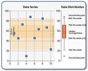
BoxPlot chart
|
The BoxPlot chart type consists of one or more box symbols that summarize the distribution of the data within one or more data sets. A Box Chart displays a rectangle with whisker lines extending from both ends. |
|
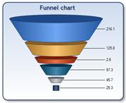
Funnel chart
|
The Funnel Chart type displays data that equals 100% when totaled. This type of chart is a single series chart that represents the data as portions of 100%. |
|
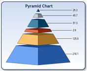
Pyramid chart
|
The Pyramid chart displays data that equals 100% when totaled. The Pyramid chart can be displayed as a pyramid or conical shape. |
Charts that are created by using the Chart Web Part are stored as site assets that are specific to the SharePoint pages where they were created. This means that you cannot reuse one particular chart across other pages.
Why use a Chart Web Part?
Like most other kinds of charts you might see in SharePoint sites, the Chart Web Part makes it easy to view performance information at a glance. The Chart Web Part is also useful when you want to quickly and easily create a chart and add it to a SharePoint site without leaving the SharePoint site.
Here are a few examples of when you might use a Chart Web Part:
-
To quickly and easily create a chart that personalizes your view of a SharePoint site.
For example, suppose that you are viewing a SharePoint site that contains performance or other types of information for a group or an organization. Suppose further that you want to add another report view to the page that displays particular information that you want to see. You can easily do this by using a Chart Web Part. -
To create a chart that uses data from another chart.
One of the benefits of the Chart Web Part is that it is capable of both sending and receiving data. This means you can use one Chart Web Part as a data source for another Chart Web Part. -
To create and use a chart that connects to external data.
For example, suppose that you want to create and use a chart that displays information from a customer relationship management (CRM) tool. If your organization uses Business Connectivity Services (BCS), you can connect the Chart Web Part to a BCS component to display that data.
What kinds of data sources can be used with the Chart Web Part?
A Chart Web Part can use one of the following data sources:
-
Another Web Part. You can connect the Chart Web Part to another Web Part that is capable of sending data. Examples of such Web Parts include a Document Library or a Contacts list.
-
A SharePoint List. You can connect the Chart Web Part to a SharePoint list that is located in the same site collection.
-
A Business Connectivity Services component. You can connect the Chart Web Part to a BCS component to display external or line of business data.
-
An Excel Services file. You can connect the Chart Web Part to an Excel workbook that has been published to Excel Services.
Next steps
To learn how to create a Chart Web Part, seeCreate a chart by using the Chart Web Part.
To learn more about SharePoint business intelligence, see What is SharePoint business intelligence?


