You can use the Page Viewer Web Part to display a Web page, file, or folder on a classic SharePoint page. You enter a hyperlink, file path, or folder path to link to the content.
Notes:
-
You can use the Page Viewer Web Part only in a browser that supports the HTML IFRAME element.
-
Displaying a file or a folder requires Microsoft Internet Explorer.
You can use the Page Viewer Web Part to display:
-
A favorite Internet news source in a dedicated news summary section of a SharePoint page.
-
A list of active work group files on a server that you want to view on a regular basis.
-
A frequently used document or spreadsheet.
To edit a page, you must have at least the permissions of a member of the Designer group for the site.
-
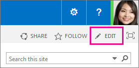
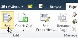
On the page that you want to add the Web Part to, select Edit in the upper right corner of the page.
Note: If the Edit command is disabled, you may not have the permissions to edit the page. Contact your administrator.
-
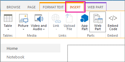
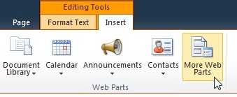
Select the Insert tab, and then select Web Part.
-
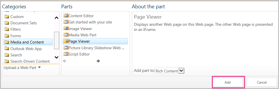
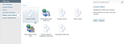
Under Categories, select a category, such as Media and Content, select a web part such as the Page Viewer Web Part, and then select Add.
-
When you have finished editing the page, select Save.
To edit the properties of the Page Viewer Web Part,
-
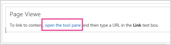
If you have not yet configured the Page Viewer Web Part, before you save your edits, select open the tool pane.
The Web Part properties appear in the tool pane. You can use the following descriptions to help configure the Web PartWeb Part custom properties:
|
Property |
Description |
|
Web Page, Folder, or File group |
Specifies the kind of content that you want to display in the Page Viewer Web Part. Select one of the following:
|
|
Link |
Specifies a hyperlink, folder, or file to link to the content that you want displayed in the Page Viewer Web Part:
|
Web parts share a common set of properties that control their appearance, layout, and advanced characteristics. You change Web Part properties in the tool pane.
Note: The common Web Part properties that you see in the tool pane may differ from what is documented in this section for several reasons:
-
A Web Part developer can choose not to display one or more of these common properties. In addition, a Web Part developer can create and display additional properties. These custom properties might not be listed in the Appearance, Layout, or Advanced sections of the tool pane.
-
Some permission and property settings may disable or hide Web Part properties.
|
Property |
Description |
|
Title |
Specifies the title of the Web Part that appears in the Web Part title bar. |
|
Height |
Specifies the height of the Web Part. |
|
Width |
Specifies the width of the Web Part. |
|
Chrome State |
Specifies whether the whole Web Part appears on the page when a user opens the page. By default, the chrome state setting is Normal and the whole Web Part appears. Only the title bar appears when the state is set to Minimized. |
|
Chrome Type |
Specifies whether the title bar and border of the Web Part frame are displayed. |
|
Property |
Description |
|
Hidden |
Specifies whether the Web Part is visible when a user opens the page. If the check box is selected, the Web Part is visible only when you are designing the page and has the suffix (Hidden) appended to the title. You can hide a Web Part. For example, you might want to use it to provide data to another Web Part through a Web Part connection, but you do not want to display the Web Part. |
|
Zone |
Specifies the zone on the page where the Web Part is located. Note: Zones on the page are not listed in the list when you do not have permission to modify the zone. |
|
Zone Index |
Specifies the position of the Web Part in a zone when the zone contains more than one Web Part. To specify the order, type a positive integer in the text box. If the Web Parts in the zone are ordered from top to bottom, a value of 1 means that the Web Part appears at the top of the zone. If the Web Parts in the zone are ordered from left to right, a value of 1 means that the Web Part appears on the left of the zone. For example, when you add a Web Part to an empty zone that is ordered from top to bottom, the Zone Index is 0. When you add a second Web Part to the bottom of the zone, its Zone Index is 1. To move the second Web Part to the top of the zone, type 0, and then type 1 for the first Web Part. Note: Each Web Part in the zone must have a unique Zone Index value. Therefore, changing the Zone Index value for the current Web Part can also change the Zone Index value for other Web Parts in the zone. |
Important: To see the Advanced section in the tool pane, you must have appropriate permission.
|
Property |
Description |
|
Allow Minimize |
Specifies whether the Web Part can be minimized. |
|
Allow Close |
Specifies whether the Web Part can be removed from the page. |
|
Allow Hide |
Specifies whether the Web Part can be hidden. |
|
Allow Zone Change |
Specifies whether the Web Part can be moved to a different zone. |
|
Allow Connections |
Specifies whether the Web Part can participate in connections with other Web Parts. |
|
Allow Editing in Personal View |
Specifies whether the Web Part properties can be modified in a personal view. |
|
Export Mode |
Specifies the level of data that is permitted to be exported for this Web Part. Depending on your configuration, this setting may not be available. |
|
Title URL |
Specifies the URL of a file that contains additional information about the Web Part. The file is displayed in a separate browser window when you select the Web Part title. |
|
Description |
Specifies the ScreenTip that appears when you rest the mouse pointer on the Web Part title or Web Part icon. The value of this property is used when you search for Web Parts by using the Search command on the Find Web Parts menu of the tool pane. |
|
Help URL |
Specifies the location of a file that contains Help information about the Web Part. The Help information is displayed in a separate browser window when you select the Help command on the Web Part menu. |
|
Help Mode |
Specifies how a browser will display Help content for a Web Part. Select one of the following: Modal Opens a separate browser window, if the browser has this capability. A user must close the window before they return to the Web page. Modeless Opens a separate browser window, if the browser has this capability. A user does not have to close the window before they return to the Web page. This is the default value. Navigate Opens the Web page in the current browser window. Note: Even though custom Microsoft ASP.NET Web Parts support this property, default SharePoint Help topics open only in a separate browser window. |
|
Catalog Icon Image URL |
Specifies the location of a file that contains an image to be used as the Web Part icon in the Web Part List. The image size must be 16 by 16 pixels. |
|
Title Icon Image URL |
Specifies the location of a file that contains an image to be used in the Web Part title bar. The image size must be 16 by 16 pixels. |
|
Import Error Message |
Specifies a message that appears if there is a problem importing the Web Part. |
|
Target Audiences |
An audience can be identified by using a SharePoint group, a distribution list, a security group, or a global audience. The Web Part appears only to the people who are members of the audiences that you specify here. |
The linked content of the Page Viewer Web Part is isolated from other content on the page by the HTML IFRAME element. The Page Viewer Web Part displays content asynchronously from the rest of the page. This means that you can view and use other Web Parts on the page if the link happens to take a long time to return the content.
This element ensures that any HTML elements that are displayed as content in the Page Viewer Web Part do not conflict with other HTML elements on the page. For example, the page may already contain an HTML FORM element, and the page would not be displayed correctly if the linked content also contained an HTML FORM element that was not inside the HTML IFRAME element.
You can use the Page Viewer Web Part to display:
-
A favorite Internet news source in a dedicated news summary section of a SharePoint page.
-
A list of active work group files on a server that you want to view on a regular basis.
-
A frequently used document or spreadsheet.
The linked content of the Page Viewer Web Part is isolated from other content on the page by using the HTML IFRAME element. This element ensures that any HTML elements that are displayed as content in the Page Viewer Web Part do not conflict with other HTML elements on the page. For example, the page may already contain an HTML FORM element, and the page would not be displayed correctly if the linked content also contained an HTML FORM element that was not inside the HTML IFRAME element.
The Page Viewer Web Part displays content asynchronously from the rest of the page. This means that you can view and use other Web Parts on the page if the link happens to take a long time to return the content.
To edit a page, you must have at least the permissions of a member of the Designer group for the site.
-
From a page, in the ribbon, click the Page tab, and then click the Edit command.
Note: If the Edit command is disabled, you may not have the permissions to edit the page. Contact your administrator.
-
Click on the page where you want to add a Web Part, click the Insert tab, and then click More Web Parts.
-
Under Categories, select a category, such as Media and Content, select the Web Part that you want to add to the page, such as Content Editor, and then click Add.
When you select a Web Part, information about the Web Part is displayed. -
When you have finished editing the page, click the Page tab, and then click Save.
Notes:
-
In SharePoint Foundation 2010, the page viewer Web Part is in the Media and Content category.
-
In Microsoft SharePoint Server 2010The page viewer Web Part is in the Authoring category.
-
To edit the properties of the page viewer Web part,
-
If you have not yet configured the page viewer Web Part, in the page viewer Web Part, click open tool pane.
-
Point to the Web Part, click the down arrow, and then click Edit Web Part.
The Web Part properties appear in the tool pane. You can use the following descriptions to help configure the Web Part custom properties.
|
Property |
Description |
|
Web Page, Folder, or File group |
Specifies the kind of content that you want to display in the Page Viewer Web Part. Select one of the following:
|
|
Link |
Specifies a hyperlink, folder, or file to link to the content that you want displayed in the Page Viewer Web Part:
|
Web Parts share a common set of properties that control their appearance, layout, and advanced characteristics. You change Web Part properties in the tool pane.
Note: The common Web Part properties that you see in the tool pane may differ from what is documented in this section for several reasons:
-
To see the Advanced section in the tool pane, you must have appropriate permission.
-
A Web Part developer can choose not to display one or more of these common properties. In addition, a Web Part developer can create and display additional properties. These custom properties might not be listed in the Appearance, Layout, or Advanced sections of the tool pane.
-
Some permission and property settings may disable or hide Web Part properties.
|
Property |
Description |
|
Title |
Specifies the title of the Web Part that appears in the Web Part title bar. |
|
Height |
Specifies the height of the Web Part. |
|
Width |
Specifies the width of the Web Part. |
|
Chrome State |
Specifies whether the whole Web Part appears on the page when a user opens the page. By default, the chrome state setting is Normal and the whole Web Part appears. Only the title bar appears when the state is set to Minimized. |
|
Chrome Type |
Specifies whether the title bar and border of the Web Part frame are displayed. |
|
Property |
Description |
|
Hidden |
Specifies whether the Web Part is visible when a user opens the page. If the check box is selected, the Web Part is visible only when you are designing the page and has the suffix (Hidden) appended to the title. You can hide a Web Part. For example, you might want to use it to provide data to another Web Part through a Web Part connection, but you do not want to display the Web Part. |
|
Direction |
Specifies the direction of the text in the Web Part content. For example, Arabic is a right-to-left language; English and most other European languages are left-to-right languages. This setting may not be available for all kinds of Web Parts. |
|
Zone |
Specifies the zone on the page where the Web Part is located. Note: Zones on the page will not appear on the list if you do not have permission to modify the zone. |
|
Zone Index |
Specifies the position of the Web Part in a zone when the zone contains more than one Web Part. To specify the order, type a positive integer in the text box. If the Web Parts in the zone are ordered from top to bottom, a value of 1 means that the Web Part appears at the top of the zone. If the Web Parts in the zone are ordered from left to right, a value of 1 means that the Web Part appears on the left of the zone. For example, when you add a Web Part to an empty zone that is ordered from top to bottom, the Zone Index is 0. When you add a second Web Part to the bottom of the zone, its Zone Index is 1. To move the second Web Part to the top of the zone, type 0, and then type 1 for the first Web Part. Note: Each Web Part in the zone must have a unique Zone Index value. Therefore, changing the Zone Index value for the current Web Part can also change the Zone Index value for other Web Parts in the zone. |
|
Property |
Description |
|
Allow Minimize |
Specifies whether the Web Part can be minimized. |
|
Allow Close |
Specifies whether the Web Part can be removed from the page. |
|
Allow Hide |
Specifies whether the Web Part can be hidden. |
|
Allow Zone Change |
Specifies whether the Web Part can be moved to a different zone. |
|
Allow Connections |
Specifies whether the Web Part can participate in connections with other Web Parts. |
|
Allow Editing in Personal View |
Specifies whether the Web Part properties can be modified in a personal view. |
|
Export Mode |
Specifies the level of data that is permitted to be exported for this Web Part. Depending on your configuration, this setting may not be available. |
|
Title URL |
Specifies the URL of a file that contains additional information about the Web Part. The file is displayed in a separate browser window when you click the Web Part title. |
|
Description |
Specifies the ScreenTip that appears when you rest the mouse pointer on the Web Part title or Web Part icon. The value of this property is used when you search for Web Parts by using the Search command on the Find Web Parts menu of the tool pane. |
|
Help URL |
Specifies the location of a file that contains Help information about the Web Part. The Help information is displayed in a separate browser window when you click the Help command on the Web Part menu. |
|
Help Mode |
Specifies how a browser will display Help content for a Web Part. Select one of the following:
Note: Even though custom Microsoft ASP.NET Web Parts support this property, default SharePoint Help topics open only in a separate browser window. |
|
Catalog Icon Image URL |
Specifies the location of a file that contains an image to be used as the Web Part icon in the Web Part List. The image size must be 16 by 16 pixels. |
|
Title Icon Image URL |
Specifies the location of a file that contains an image to be used in the Web Part title bar. The image size must be 16 by 16 pixels. |
|
Import Error Message |
Specifies a message that appears if there is a problem importing the Web Part. |