Content Control Properties
When you add content controls to a document or form, you can set various properties. Some properties are common across almost all controls. Other properties are specific to only certain controls, such as check boxes or date picker controls. The properties panel will change depending on which control you currently have selected.
-
General
-
Title Assign a title that shows up as a label above bounding box or in start/end tags.
-
Tag Set a tag for categorizing or grouping.
-
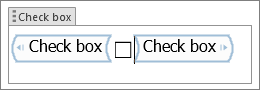
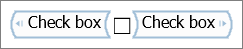
Show as Specify how a control is shown on a document or form.
-
Bounding box Puts an outline around control.
-
Start/End Tag Places tags at the beginning and end of a control.
-
None No bounding box or tags.
-
-
Color Set a color for the bounding box or start/end tags.
-
Use a style to format text typed into the empty control Set the style for text in a text or repeating control.
-
Style Choose the style to use form pre-set styles.
-
New style Create a new style dialog.
-
Remove content control when contents are edited Removes the control, bounding box, or start/end tags once text is typed.
-
-
Locking Choices for locking whether content can be edited or deleted.
-
Content control cannot be deleted Prevents the user from deleting the control
-
Contents cannot be edited Prevents the user from making changes to the control.
-
-
Ok Saves the settings and exits the properties panel.
-
Cancel Forgets any changes and exits the properties panel.
Control specific properties.
These properties are only on the listed controls.
-
Check Box properties Choices you have when a check box is selected.
-
Checked symbol Change the default X to something else from the symbol collections.
-
Unchecked symbol Change the default empty checkbox characters to something else from the symbol collections.
-
Change Displays the Word Symbol chart to choose a checked or unchecked symbol.
-
-
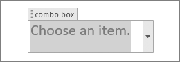
Drop-Down List properties Choices for the Combo or List box control.
-
Display Name The name or title of an item in the list.
-
Value A value (if different from Display Name) to use with the data store.
-
Add Shows a panel to add a Display Name and Value.
-
Modify Shows a panel to add a Display Name and Value.
-
Remove Removes a select Display Name and Value. This does not prompt for confirmation, it just deletes the selected item.
-
Move Up Moves the selected item up in the list.
-
Move Down Moves the selected item down in the list.
-
-
Date Picker Properties Choices for the Date Picker control.
-
Display the date like this Formatting choices for dates, such as 12/2/19, or 2-Dec-19.
-
Locale Choices for country or regional date formats. These choices depend on the languages you have installed in the operating system.
-
Calendar type Choices for calendar type, such as Gregorian.
-
Store XML contents in the following format when mapped Lets you define how dates are defined in XML when mapped. An XML mapping is a link between the text in a content control and an XML element in the custom XML data store for the document.
-
-
Repeating Section Properties Choices when using the Repeating Section control.
-
Allow users to add and remove sections Set whether to allow users to add or remove sections.
-
Section title Add a name or title to identify repeating sections.
-
-
Groups controls offer only the locking property.
-
Legacy controls have their own format property panel, depending the specific control you have selected.