
For most chart types, you can display or hide chart axes. To make chart data easier to understand, you can also change the way they look.
Important: This article does NOT cover changing the scale of chart axes. For information about how to change to the scale, see:
Learn more about axes
Charts typically have two axes that are used to measure and categorize data: a vertical axis (also known as value axis or y axis), and a horizontal axis (also known as category axis or x axis). 3-D column, 3-D cone, or 3-D pyramid charts have a third axis, the depth axis (also known as series axis or z axis), so that data can be plotted along the depth of a chart. Radar charts do not have horizontal (category) axes, and pie and doughnut charts do not have any axes.


The following describe how you can modify your charts to add impact and better convey information. For more info on what axes are and what you can do with them, see All about axes.
Display or hide axes
-
Click anywhere in the chart for which you want to display or hide axes.
This displays the Chart Tools, adding the Design, and Format tabs.
-
On the Design tab, click the down arrow next to Add chart elements, and then hover over Axes in the fly-out menu .

-
Click the type of axis that you want to display or hide.
Adjust axis tick marks and labels
-
On a chart, click the axis that has the tick marks and labels that you want to adjust, or do the following to select the axis from a list of chart elements:
-
Click anywhere in the chart.
This displays the Chart Tools, adding the Design and Format tabs.
-
On the Format tab, in the Current Selection group, click the arrow in the Chart Elements box, and then click the axis that you want to select.

-
-
On the Format tab, in the Current Selection group, click Format Selection.
-
In the Axis Options panel, under Tick Marks, do one or more of the following:
-
To change the display of major tick marks, in the Major tick mark type box, click the tick mark position that you want.

-
To change the display of minor tick marks, in the Minor tick mark type drop-down list box, click the tick mark position that you want.
-
To change the position of the labels, under Labels, click the option that you want.
Tip To hide tick marks or tick-mark labels, in the Axis labels box, click None.


-
Change the number of categories between labels or tick marks
-
On a chart, click the horizontal (category) axis that you want to change, or do the following to select the axis from a list of chart elements:
-
Click anywhere in the chart.
This displays the Chart Tools, adding the Design, Layout, and Format tabs.
-
On the Format tab, in the Current Selection group, click the arrow in the Chart Elements box, and then click the axis that you want to select.
-
-
On the Format tab, in the Current Selection group, click Format Selection.
-
Under Axis Options, do one or both of the following:
-
To change the interval between axis labels, under Interval between labels, click Specify interval unit, and then in the text box, type the number that you want.
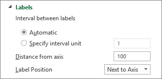
Tip Type 1 to display a label for every category, 2 to display a label for every other category, 3 to display a label for every third category, and so on.
-
To change the placement of axis labels, in the Label distance from axis box, type the number that you want.
Tip Type a smaller number to place the labels closer to the axis. Type a larger number if you want more distance between the label and the axis.
-
Change the alignment and orientation of labels
You can change the alignment of axis labels on both horizontal (category) and vertical (value) axes. When you have multiple-level category labels in your chart, you can change the alignment of all levels of labels. You can also change the amount of space between levels of labels on the horizontal (category) axis.
-
On a chart, click the axis that has the labels that you want to align differently, or do the following to select the axis from a list of chart elements:
-
Click anywhere in the chart.
This displays the Chart Tools, adding the Design and Format tabs.
-
On the Format tab, in the Current Selection group, click the arrow in the Chart Elements box, and then click the axis that you want to select.
-
-
On the Format tab, in the Current Selection group, click Format Selection.
-
In the Format Axis dialog box, click Text Options.
-
Under Text Box, do one or more of the following:
-
In the Vertical alignment box, click the vertical alignment position that you want.
-
In the Text direction box, click the text orientation that you want.
-
In the Custom angle box, select the degree of rotation that you want.
-
Tip You can also change the horizontal alignment of axis labels, by clicking the axis, and then click Align Left


Change text of category labels
You can change the text of category labels on the worksheet, or you can change them directly in the chart.
Change category label text on the worksheet
-
On the worksheet, click the cell that contains the name of the label that you want to change.
-
Type the new name, and then press ENTER.
Note Changes that you make on the worksheet are automatically updated in the chart.
Change the label text in the chart
-
In the chart, click the horizontal axis, or do the following to select the axis from a list of chart elements:
-
Click anywhere in the chart.
This displays the Chart Tools, adding the Design and Format tabs.
-
On the Format tab, in the Current Selection group, click the arrow in the Chart Elements box, and then click the horizontal (category) axis.
-
-
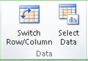
On the Design tab, in the Data group, click Select Data.
-
In the Select Data Source dialog box, under Horizontal (Categories) Axis Labels, click Edit.
-
In the Axis label range box, do one of the following:
-
Specify the worksheet range that you want to use as category axis labels.
-
Type the labels that you want to use, separated by commas — for example, Division A, Division B, Division C.
Note If you type the label text in the Axis label range box, the category axis label text is no longer linked to a worksheet cell.
-
-
Click OK.
Change how text and numbers look in labels
You can change the format of text in category axis labels or numbers on the value axis.
Format text
-
In a chart, right-click the axis that displays the labels that you want to format.
-
On the Home toolbar, click the formatting options that you want.
Tip You can also select the axis that displays the labels, and then use the formatting buttons on the Home tab in the Font group.
Format numbers
-
In a chart, click the axis that displays the numbers that you want to format, or do the following to select the axis from a list of chart elements:
-
Click anywhere in the chart.
This displays the Chart Tools, adding the Design and Format tabs.
-
On the Format tab, in the Current Selection group, click the arrow in the Chart Elements box, and then click the axis that you want to select.
-
-
On the Format tab, in the Current Selection group, click Format Selection.
-
Under Axis Options, Click Number, and then in the Category box, select the number format that you want.
Tip If the number format you select uses decimal places, you can specify them in the Decimal places box.
-
To keep numbers linked to the worksheet cells, select the Linked to source check box.

Note Before you format numbers as a percentage, make sure that the numbers on the chart have been calculated as percentages in the source data, and that they are displayed in decimal format. Percentages are calculated on the worksheet by using the equation amount / total = percentage. For example, if you calculate 10 / 100 = 0.1, and then format 0.1 as a percentage, the number will be correctly displayed as 10%.
Add tick marks on an axis
An axis can be formatted to display major and minor tick marks at intervals that you choose.
-
This step applies to Word for Mac only: On the View menu, click Print Layout.
-
Click the chart, and then click the Chart Design tab.
-
Click Add Chart Element > Axes > More Axis Options.
-
On the Format Axis pane, expand Tick Marks, and then click options for major and minor tick mark types.
After you add tick marks, you can change the intervals between the tick marks by changing the value in the Interval between marks box.
All about axes
Not all chart types display axes the same way. For example, xy (scatter) charts and bubble charts show numeric values on both the horizontal axis and the vertical axis. An example might be how inches of rainfall are plotted against barometric pressure. Both of these items have numeric values, and the data points will be plotted on the x and y axes relative to their numeric values. Value axes provide a variety of options, such as setting the scale to logarithmic.
Other chart types, such as column, line, and area charts, show numeric values on the vertical (value) axis only and show textual groupings (or categories) on the horizontal axis. An example might be how inches of rainfall are plotted against geographic regions. In this example, the geographic regions are textual categories of the data that are plotted on the horizontal (category) axis. The geographic regions will be uniformly spaced because they are text instead of values that can be measured. Consider this difference when you select a chart type, because the options are different for value and category axes. On a related note, the depth (series) axis is another form of category axis.
When you create a chart, tick marks and labels are displayed by default on axes. You can adjust the way that they are displayed by using major and minor tick marks and labels. To eliminate clutter in a chart, you can display fewer axis labels or tick marks on the horizontal (category) axis by specifying the intervals at which you want categories to be labeled, or by specifying the number of categories that you want to display between tick marks.
You can also change the alignment and orientation of the labels, and change or format the text and numbers that they display, for example, to display a number as a percentage.
See Also
Add or remove a secondary axis in a chart


