
In charts, axis labels are shown below the horizontal (also known as category) axis, next to the vertical (also known as value) axis, and, in a 3-D chart, next to the depth axis.

The chart uses text from your source data for axis labels. To change the label, you can change the text in the source data. If you don't want to change the text of the source data, you can create label text just for the chart you're working on.
In addition to changing the text of labels, you can also change their appearance by adjusting formats.
Note: An axis label is different from an axis title, which you can add to describe what's shown on the axis. Axis titles aren't automatically shown in a chart. To learn how to add them, see Add or remove titles in a chart. Also, horizontal axis labels (in the chart above, Qtr 1, Qtr 2, Qtr 3, and Qtr 4) are different from the legend labels below them (East Asia Sales 2009 and East Asia Sales 2010). To learn more about legends, see Add and format a chart legend.
-
Click each cell in the worksheet that contains the label text you want to change.
-
Type the text you want in each cell, and press Enter.
As you change the text in the cells, the labels in the chart are updated.

-
Right-click the category labels to change, and click Select Data.

-
In Horizontal (Category) Axis Labels, click Edit.
-
In Axis label range, enter the labels you want to use, separated by commas.

For example, type Quarter 1,Quarter 2,Quarter 3,Quarter 4.
-
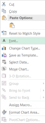
Right-click the category axis labels you want to format, and then select Font.
-
On the Font tab, pick the formatting options you want.
-
On the Character Spacing tab, pick the spacing options you want.
-
Right-click the value axis labels you want to format, and then select Format Axis.
-
In the Format Axis pane, select Number.
Tip: If you don't see the Number section in the pane, make sure you've selected a value axis (it's usually the vertical axis on the left).

-
Choose the number format options you want.

Tip: If the number format you choose uses decimal places, you can specify them in the Decimal places box.
-
To keep numbers linked to the worksheet cells, select the Linked to source check box.
Note: Before you format numbers as percentages, make sure that the numbers shown on the chart have been calculated as percentages in the worksheet, or are shown in decimal format like 0.1. To calculate percentages on the worksheet, divide the amount by the total. For example, if you enter =10/100 and format the result 0.1 as a percentage, the number is correctly shown as 10%.


