PerformancePoint Services in Microsoft SharePoint Server 2010 provides you with several new and improved features to help you monitor and analyze performance in your organization. You can use dashboards that include more sophisticated key performance indicators (KPIs) in scorecards. You can use new reports, such as a KPI Details report. And, you can open a Decomposition Tree from a value in an analytic report or a scorecard. You can also apply value filters, such as a “Top 10” filter, to view more specific information in some kinds of scorecards and reports.
Read this article to learn more about what’s new in PerformancePoint dashboards.
In this article
Enhancements in KPIs and scorecards
PerformancePoint scorecards new include more sophisticated KPIs and other advanced functionality to make it easier to monitor and analyze organizational performance. For example, you can use Drill Down and Drill Up to view lower or higher levels of detail in your scorecards. And, you can use scorecards that have KPIs on columns. You can also use more advanced scorecards that use Time Intelligence, calculated metrics, and multiple actuals to measure performance.
Scorecards that have Drill Down and Drill Up capabilities
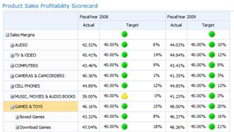
Depending on how your scorecard is configured, you can expand or collapse rows in your scorecard to see lower or higher levels of detail.
For example, if you have a scorecard that measures product sales profitability across different products in a retail organization, your scorecard might resemble the following image:
If you want to see the next level of detail for a particular category, such as GAMES & TOYS you can click the plus sign (+) next to that category and the scorecard will automatically expand to show the next level of detail. Then, your scorecard might resemble the following image:
You can continue expanding the scorecard until you get to the lowest level of detail. The following image shows the Download Games subcategory expanded to list individual products, which is the lowest level of detail for this particular scorecard.
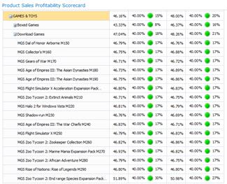
In the preceding example, the categories, subcategories, and individual products are dynamically populated. That is, as the data changes, the scorecard remains up to date to show the current data.
In addition to clicking the plus sign (+) or minus sign (-) next to an item in the scorecard, you can also use Drill Down and Drill Up commands, as shown in the following image:
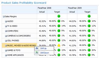
To use the Drill Up or Drill Down commands, right-click an item, and then click Drill Up or Drill Down.
Use Drill Up to view a higher level of detail.
Use Drill Down to view a lower level of detail.
Scorecards that have KPIs on columns
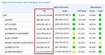
You can now have scorecards that include multiple KPIs on columns, enabling you to view more than one set of metrics for each row in your scorecard. A scorecard with KPIs on columns might resemble the following image:
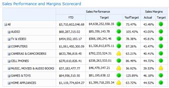
In the preceding example, the scorecard contains two KPIs on columns: Sales Performance and Sales Margins.
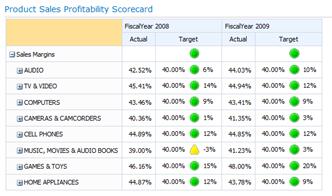
Scorecards that have more sophisticated KPIs
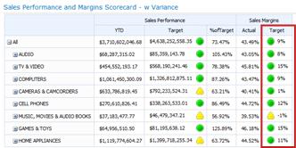
You can now use scorecards that contain more advanced KPIs. For example, you might have KPIs that use formulas and calculations to measure performance (such KPIs are said to use calculated metrics). Or, you might have KPIs that compare multiple values to an overall target (such KPIs are said to use multiple actuals). You can even have KPIs that use special formulas to show information for dynamic time periods, such as “Last Six Months” or “Year to Date” (such KPIs are said to use Time Intelligence). And, you can now have KPIs that show how far off performance is from a goal (such KPIs are said to display Variance).
Although you can have advanced KPIs in your scorecards, your scorecards can remain simple and easy to use. For example, a scorecard that includes such sophisticated KPIs might resemble the following image:
Calculated Metrics
In the following image, the Sales Margins KPI is highlighted. This KPI uses calculated metrics to determine whether performance is on or off target.
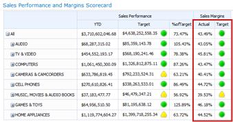
When calculated metrics are used in KPIs, SharePoint Server applies one or more formulas to the data as it is retrieved from the underlying database(s). This capability also enables the use of multiple data sources in a single KPI.
Multiple Actuals
In the following image, the Sales Performance KPI is highlighted. This KPI uses multiple actuals to determine whether overall performance is on or off target.
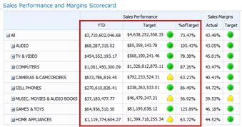
Time Intelligence
In the following image, one column of the Sales Performance KPI is highlighted. This KPI uses Time Intelligence to show Year to Date performance.
As time progresses, the scorecard remains up to date without requiring the dashboard administrator to make any changes to the scorecard or its underlying queries.
Variance
In the following image, one column in the Sales Margins KPI is highlighted. This KPI is configured to show whether performance is on or off target as well as how far above or below target.
New report types and views
You can now use three new PerformancePoint view types in your dashboards: the KPI Details report, analytic pie charts, and the Decomposition Tree.
KPI Details report
You can use a KPI Details report in your dashboard to view additional information about scorecard KPIs. For example, you can view the following information in a KPI Details report:
-
The kinds of metrics that are used for KPIs
-
How performance scores are calculated and what the thresholds are for individual scores
-
Comments that were posted by other scorecard users
A KPI Details report might resemble the following image:
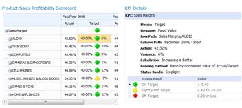
A KPI Details report is always accompanied by a scorecard in a dashboard page. This is because all the information that you view in the KPI Details report is determined by what you click in the scorecard. To view information in a KPI Details report, you click any value in a scorecard. To see how scores are calculated in a scorecard, click a cell in a Target value column.
Analytic pie charts
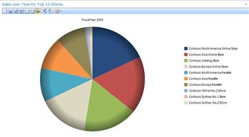
You can now use analytic pie charts in your dashboards. Similar to an analytic line or bar chart, you can use an analytic pie chart to view higher or lower levels of detail. You can also drill into the data to view a different dimension in the underlying SQL Server Analysis Services data cube.
An analytic pie chart might resemble the following image:
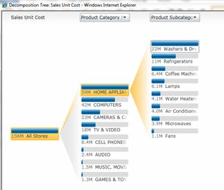
Decomposition Tree
You can open a Decomposition Tree to explore data in some kinds of scorecards and reports. The Decomposition Tree is available as an action that you can apply to PerformancePoint analytic reports and scorecards that use Analysis Services data.
You would typically use a Decomposition Tree to see how an individual value in a report or a scorecard can be broken down into its contributing members. The Decomposition Tree automatically sorts results and applies an inline Pareto chart to the data, so you can quickly see the highest contributors to a particular report value. You can also see trends across individual members that contribute to an overall value.
Note: In order to open and use the Decomposition Tree, you must have Microsoft Silverlight 2 or Silverlight 3 installed on your computer. In addition, depending on how a scorecard or an analytic view is configured, you might not be able to open the Decomposition Tree.
To open the Decomposition Tree, right-click an individual value, such as a point in a line chart, a bar in a bar chart, a wedge in a pie chart, or a cell in a grid or a scorecard. Then, you can select Decomposition Tree. The Decomposition Tree opens in a new window, where you can either drill down to the next level of detail, or drill into the data to view a different dimension in the data cube.
A Decomposition Tree might resemble the following image:
Using the Decomposition Tree, you can also view member properties for a particular dimension member, as shown in the following image:

Value filters
In addition to value filters that you might see across the top of a dashboard page, you can now apply value filters to most scorecards and reports. There are two main groups of value filters available for PerformancePoint dashboard items: Top 10 value filters and user-specified value filters.
-
Top 10 value filters. Use the Top 10 value filter to display the number of top (or bottom) members in a group. You can keep the default setting of 10, or you can specify a different number of items to display.
-
User-specified value filters. Use Value Filter to specify the criteria for the items that you want to display. For example, you can configure the filter to display items that have values less than (or greater than) a numeric value that you specify. Or, you can configure the filter to display items that have values within a particular range that you specify.
You can apply Top 10 and user-specified value filters to most of your dashboard items.
Tip: When you apply value filters to scorecards and reports, your changes are not saved to SharePoint Server. You might want to export your results to Microsoft PowerPoint or Microsoft Excel to save your work.
Top 10 value filters
As its name implies, the Top 10 value filter enables you to easily display results for the 10 best members in a particular group. However, you are not necessarily restricted to displaying only the Top 10 members in a group. You can specify criteria for the Top 10. For example, you can configure the Top 10 filter to show the Bottom 10 items in a group. Or, you can type a different number to display, such as the Top (or Bottom) 3 items.
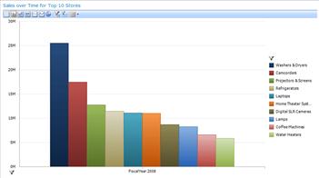
The Top 10 value filter enables you to quickly focus on just the items that you want to see in a dashboard. For example, suppose that you are using an analytic chart that shows sales amounts for different product categories. Depending on the number of product categories your organization sells, your analytic chart might resemble the following image:
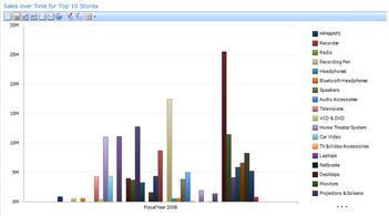
You can easily apply value filters to simplify the information in this report. For example, you can use a Top 10 filter to display just the 10 best-selling product groups. To do this, you right-click on the chart, click Filter, and then click Top 10. Your chart refreshes to display the results, as shown in the following image:
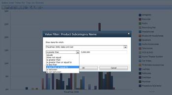
User-specified value filters
Similar to Top 10 value filters, user-specified value filters enable you to easily see information for particular items in a report or scorecard. These filters are called “user-specified value filters” because you specify the criteria. For example, suppose that you are using an analytic chart that shows sales amounts for different product categories, and that your chart resembles the following image:
If you are interested in product sales that are within a particular range and not necessarily the top or bottom-selling items, you can apply a user-specified value filter. To do this, right-click on the analytic view, click Filter, and then click Value Filters. A Value Filter dialog box opens, where you can specify the results that you want to see, as shown in the following image: