Note: This article has done its job, and will be retiring soon. To prevent "Page not found" woes, we're removing links we know about. If you've created links to this page, please remove them, and together we'll keep the web connected.
You can use the HTML Form Web Part to connect to and pass data to another Web Part, such as the List view Web Part.
In this article:
Using the Form Web Part
You can use the HTML Form Web Part to connect and pass data to another Web Part. For example, you can use the default HTML Form Web Part to type a region name, pass the value to a List View Web Part of customer data, and filter the data by that region. You can also customize the HTML Form Web Part to enable a user to, for example, select the region name from a drop-down list. You can use text boxes, drop-down lists, multi-line text boxes, check boxes, or option buttons in the HTML Form Web Part.
The way you connect fields to the other Web Part depends on how the other Web Part has been defined to use Web Part connections.
Although you can have more than one element (text box, radio buttons, and so on) on your form, only one field can be connected to a List View Web Part. However, different fields can be connected to different Web Parts at the same time. For example, you can have an HTML Form Web Part with a text box and a set of option buttons. The text box can be connected to one List View Web Part and the option buttons to another. When the user clicks the Go button, both List View Web Parts are filtered according to the information entered on the HTML Form Web Part.
You can connect two or more fields in the HTML Form Web Part to another Web Part, if that Web Part can accept multiple parameters. In this case, you may need a SharePoint-compatible Web design program, such as SharePoint Designer 2010 to complete the connections.
Add a Web Part to a page
To edit a page you must have at least the permissions obtained by being added to the default <Site Name> Members SharePoint group for the site.
-
From a page, in the ribbon, click the Page tab, and then click the Edit command.
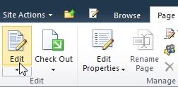
If the Edit command is disabled, you may not have the permissions to edit the page. Contact your administrator.
-
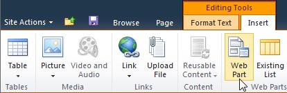
Click on the page where you want to add a Web Part, click the Insert tab, and then click Web Part.
-
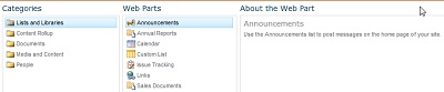
Under Categories, select a category, such as Lists and Libraries, select the Web Part that you want to add to the page, such as Announcements, and then click Add.
-
When you select a Web Part, information about the Web Part is displayed in About the Web Part.
-
When you have finished editing the page, click the Page tab, and then click Save & Close.
Connect the HTML Form Web Part to another Web Part
To use the HTML Form Web Part, you connect it with another Web Part that is capable of receiving values through a Web Part connection, such as the List View Web Part. The list you want to filter, and the column on which you want to filter it, must be visible in a Web Part on the same page as the HTML Form Web Part. For information about adding an HTML Form Web Part to a page, see Add a Web Part to a Page.
-
Browse to the page containing the Web Part you want to filter.
-
In the ribbon, click the Page tab, and then click the Edit command.
If the Edit command is disabled, you may not have the permissions to edit the page. Contact your administrator.
-
Point to the HTML Form Web Part, click the down arrow, click Connections, point to Provide Form Value To, and then click the name of the Web Part to which you want to link.
-
In the Choose Connection dialog box, click the Configure Connection tab.
-
From the Connection Type menu, select the field that matches the information from the HTML Form Web Part.
Note: The fields do not have to have the same names, nor do they have to be the same data types. The values sent from the HTML Form Web Part are text values.
-
Click Finish, and then click Exit Edit Mode at the top of the page.
By default, you can enter text in the text box and then click Go or press ENTER. The other Web Part will display only the data that matches the text you entered. To clear the text box so that you can enter new text, select the current text, and then delete it.
Customize the HTML Form Web Part
You can customize the HTML Form Web Part by using either the Source Editor, which is available from the HTML Form Web Part tool pane, or a SharePoint-compatible Web design program, such as SharePoint Designer 2010. Instead of the standard text box, you can use option buttons, check boxes, multi-line text boxes, and list boxes. You can also add labels and assign a default value.
If you customize the HTML Form Web Part, keep in mind the following:
-
Only one Go button (which uses the INPUT element) can be used to pass data to another Web Part.
-
The HTML Form Web Part uses the FORM element. Certain HTML elements cannot be used inside the FORM element, including the HTML, BODY, and FORM elements.
-
All form field names must be unique. Each name value is used to connect to a corresponding column name in the Web Part that you are connecting to.
To customize the Form Web Part, use the Source Editor button to display the Text Editor dialog box and then revise or add the HTML source code.
Note: The HTML Form Web Part only provides data to another connectable Web Part — it cannot get data from another connectable Web Part. For example, you cannot use the HTML Form Web Part as a detail form to display a row of data.
Customize the default HTML Form Web Part
To customize the default HTML Form Web Part, do the following:
-
From the page displaying the HTML Form Web Part, in the Ribbon, click the Edit tab, and then click the Edit command.
-
Point to the HTML Form Web Part, click the down arrow, and then click Edit Web Part.
-
On the tool pane, click the Source Editor button.
-
The Text Entry dialog box opens with the default HTML code.
To make the code easier to read and modify, insert carriage returns in the text to break the lines as shown here:
<div onkeydown="javascript:if (event.keyCode == 13) _SFSUBMIT_">
<input type="text" name="T1"/>
<input type="button" value="Go" onclick="javascript:_SFSUBMIT_"/>
</div>
You can change the first INPUT element in several ways by changing the name of a field, adding a label to a field, or adding a default value.
|
Property |
Description |
|
Field name |
The name of the default text box in the Form Web Part is T1. This is the name that appears in the Configuration Connection dialog box. To give the field a more meaningful name, type a new name in place of T1. Do not remove the quotation marks. |
|
Field label |
You can add label text before or after the form field. Type the text without quotations marks. |
|
default value |
You can add a default value to the text area field. The user can accept the value by clicking the Go button, or override it by typing their own entry. To add a default value, use the value attribute. |
For example if you want to provide a more meaningful name, add a default value, and add a label, you can do the following:
Region: <input type="text" name="Region" value="India"/>
You can change the second INPUT element by changing the name of the button, as the following example shows:
<input type="button" value="SUBMIT" onclick="javascript:_SFSUBMIT_"/>
You can also add other HTML elements before and after the DIV element. For example, a very useful and simple way to enable the user to quickly refresh the page and reset the FORM elements is to add an anchor tag of the current page after the closing DIV element. For example:
<br/>
<a href="http://contoso/SitePages/CustByRegion.aspx">Refresh</a>
Important: Do not change the other HTML code in the Text Editor dialog box. The HTML Form Web Part dynamically creates a scripting routine at run time to create the connection to the other Web Part. Do not modify the onkeydown or onclick event code, or you may unintentionally break the HTML Form Web Part.
Use a multi-line text box
The TEXTAREA element defines a multi-line text input control. The ROWS attribute specifies the number of lines that are visible in the text field. The COLS attribute specifies the width of the text area in characters. In the following example, the user sees a text box of 5 lines and 30 characters in width. When the user enters text in the box, the text will wrap at 30 characters.
<textarea name="Region" rows=5 cols=30></textarea>
Tip: Make sure there is no space in the source code immediately after the right angle bracket (>).
Use option buttons
Option buttons, also called radio buttons, provide mutually exclusive choices to a user. The following example displays three radio buttons. Use the same name for each radio button. It’s customary to add the labels after each button. If you want to format each radio button on a separate line, use the BR element.
<input type="radio" name="Region" value="India"/> India<BR/>
<input type="radio" name="Region" value="USA"/> USA<BR/>
<input type="radio" name="Region" value="Spain"/> Spain<BR/>
Use a drop-down list of choices
If there are many mutually exclusive choices, consider using a drop down list box by using the SELECT element. Each option appears as a separate choice in the list, but the user can only select one choice. The text after the closing angle bracket of the OPTION element is what appears in the drop-down list.
<select name="Region">
<option value="India">India</option>
<option value="USA">USA</option>
<option value="Spain"> Spain </option>
</select>
To provide a default value, such as Spain, do the following:
<option value="Spain" selected="selected"> Spain </option>
Use checkboxes
If there are several non-mutually exclusive choices, consider using checkboxes. Each option appears as a separate check box, and the user can select any or all choices. Using this option requires a Web Part that accepts multiple parameters as part of the Web Part connection.
<input type="checkbox" name="region1" value="India"/> India<BR/>
<input type="checkbox" name="region2" value="USA"/> USA<BR/>
<input type="checkbox" name="region3" value="Spain"/> Spain<BR/>
To provide a default value, such as Spain, do the following:
<input type="checkbox" name="region3" value="Spain" checked="checked"/> Spain<BR/>
Configure the common properties of a Web Part
Web parts share a common set of properties that control their appearance, layout, and advanced characteristics. You change Web Part properties in the tool pane.
Note: The common Web Part properties that you see in the tool pane may be different from what is documented in this section for several reasons:
-
To see the Advanced section in the tool pane, you must have appropriate permission.
-
For a specific Web Part, a Web Part developer may have chosen not to display one or more of these common properties or may have chosen to create and display additional properties that are not listed below in the Appearance, Layout, and Advanced sections of the tool pane.
-
Some permission and property settings may disable or hide Web Part properties.
Appearance
|
Property |
Description |
|
Title |
Specifies the title of the Web Part that appears in the Web Part title bar. |
|
Height |
Specifies the height of the Web Part. |
|
Width |
Specifies the width of the Web Part. |
|
Chrome State |
Specifies whether the entire Web Part appears on the page when a user opens the page. By default, the chrome state is set to Normal and the entire Web Part appears. Only the title bar appears when the state is set to Minimized. |
|
Chrome Type |
Specifies whether the title bar and border of the Web Part frame are displayed. |
Layout
|
Property |
Description |
|
Hidden |
Specifies whether the Web Part is visible when a user opens the page. If the check box is selected, the Web Part is visible only when you are designing the page and has the suffix (Hidden) appended to the title. You can hide a Web Part if you want to use it to provide data to another Web Part through a Web Part connection, but you do not want to display the Web Part. |
|
Direction |
Specifies the direction of the text in the Web Part content. For example, Arabic is a right-to-left language; English and most other European languages are left-to-right languages. This setting may not be available for all types of Web Parts. |
|
Zone |
Specifies the zone on the page where the Web Part is located. Note: Zones on the page are not listed in the list box when you do not have permission to modify the zone. |
|
Zone Index |
Specifies the position of the Web Part in a zone when the zone contains more than one Web Part. To specify the order, type a positive integer in the text box. If the Web Parts in the zone are ordered from top to bottom, a value of 1 means that the Web Part appears at the top of the zone. If the Web Parts in the zone are ordered from left to right, a value of 1 means that the Web Part appears on the left of the zone. For example, when you add a Web Part to an empty zone that is ordered from top to bottom, the Zone Index is 0. When you add a second Web Part to the bottom of the zone, its Zone Index is 1. To move the second Web Part to the top of the zone, type 0, and then type 1 for the first Web Part. Note: Each Web Part in the zone must have a unique Zone Index value. Therefore, changing the Zone Index value for the current Web Part can also change the Zone Index value for other Web Parts in the zone. |
Advanced
|
Property |
Description |
|
Allow Minimize |
Specifies whether the Web Part can be minimized. |
|
Allow Close |
Specifies whether the Web Part can be removed from the page. |
|
Allow Hide |
Specifies whether the Web Part can be hidden. |
|
Allow Zone Change |
Specifies whether the Web Part can be moved to a different zone. |
|
Allow Connections |
Specifies whether the Web Part can participate in connections with other Web Parts. |
|
Allow Editing in Personal View |
Specifies whether the Web Part properties can be modified in a personal view. |
|
Export Mode |
Specifies the level of data that is permitted to be exported for this Web Part. Depending on your configuration, this setting may not be available. |
|
Title URL |
Specifies the URL of a file containing additional information about the Web Part. The file is displayed in a separate browser window when you click the Web Part title. |
|
Description |
Specifies the ScreenTip that appears when you rest the mouse pointer on the Web Part title or Web Part icon. The value of this property is used when you search for Web Parts by using the Search command on the Find Web Parts menu of the tool pane. |
|
Help URL |
Specifies the location of a file containing Help information about the Web Part. The Help information is displayed in a separate browser window when you click the Help command on the Web Part menu. |
|
Help Mode |
Specifies how a browser will display Help content for a Web Part. Select one of the following: • Modal Opens a separate browser window, if the browser has this capability. A user must close the window before returning to the Web page. • Modeless Opens a separate browser window, if the browser has this capability. A user does not have to close the window before returning to the Web page. This is the default value. • Navigate Opens the Web page in the current browser window. Note: Even though custom Microsoft ASP.NET Web Parts support this property, default SharePoint Help topics open only in a separate browser window. |
|
Catalog Icon Image URL |
Specifies the location of a file containing an image to be used as the Web Part icon in the Web Part List. The image size must be 16 by 16 pixels. |
|
Title Icon Image URL |
Specifies the location of a file containing an image to be used in the Web Part title bar. The image size must be 16 by 16 pixels. |
|
Import Error Message |
Specifies a message that appears if there is a problem importing the Web Part. |