
Funnel charts show values across multiple stages in a process. For example, you could use a funnel chart to show the number of sales prospects at each stage in a sales pipeline. Typically, the values decrease gradually, allowing the bars to resemble a funnel.

Note: This feature is only available in Excel for Windows if you have Office 2019, Office 2021, or if you have a Microsoft 365 subscription. If you are a Microsoft 365 subscriber, make sure you have the latest version of Office.
-
Set up your data like the above example. Use one column for the stages in the process, and one for the values.
-
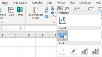
Select the data.
-
Click Insert > Insert Waterfall, Funnel, Stock, Surface or Radar chart > Funnel.
Tip: In Excel, use the Design and Format tabs to customize the look of your chart. If you don't see these tabs, click anywhere in the funnel chart, and then the Chart Tools will appear at the top of the program:

Note: This feature is only available in Excel for Mac if you have Office 2019, or if you have a Microsoft 365 subscription. If you are a Microsoft 365 subscriber, make sure you have the latest version of Office.
-
Set up your data like the above example. Use one column for the stages in the process, and one for the values.
-
Select the data.
-
On the ribbon, click the Insert tab, then click

Tip: In Excel for Mac, use the Chart Design and Format tabs to customize the look of your chart. If you don't see these tabs, click anywhere in the funnel chart and the tabs will appear on the ribbon.
-
Set up your data like the above example. Use one column for the stages in the process, and one for the values.
-
Select the data.
-
Click Insert > Chart > Funnel.
Note: This feature is only available in these applications if you have Office 2019, Office 2019, or if you have a Microsoft 365 subscription. If you are a Microsoft 365 subscriber, make sure you have the latest version of Office.
-
Click an empty space in an email message, presentation, or document.
-
Click Insert > Chart > Funnel.
-
The funnel chart will appear. And, a small window with example data will appear. Change the numbers to your own.
Tip: At the top of the data window is the Edit Data in Microsoft Excel button

-
To add the names of the stages, right-click anywhere in column A, and then click Insert.
-
Click Entire column, and then click OK.
-
Type the names of the stages in cells A2, A3, and so on.
-
At the top of the program window, click the Design tab.
-
Click Select Data.
Note: In PowerPoint, you may have to move the small data window down to see the Select Data button.
The Select Data Source window will appear. And, dashed lines will appear around the second column of data.
-
In the data, click and drag to select both columns: the stages and the values. When you're done, the dashed lines should surround the two columns.
-
In the Select Data Source window, click OK to close it.
-
Now close the data window. Or, if you opened Excel to edit your data, close the Excel window.


