
Important: In Excel for Microsoft 365 and Excel 2021, Power View is removed on October 12, 2021. As an alternative, you can use the interactive visual experience provided by Power BI Desktop, which you can download for free. You can also easily Import Excel workbooks into Power BI Desktop.
Abstract: At the end of the previous tutorial, Create Map-based Power View Reports, your Excel workbook included data from various sources, a Data Model based on relationships established using Power Pivot, and a map-based Power View report with some basic Olympics information. In this tutorial, we extend and optimize the workbook with more data, interesting graphics, and prepare the workbook to easily create amazing Power View reports.
Note: This article describes data models in Excel 2013. However, the same data modeling and Power Pivot features introduced in Excel 2013 also apply to Excel 2016.
The sections in this tutorial are the following:
At the end of this tutorial is a quiz you can take to test your learning.
This series uses data describing Olympic Medals, hosting countries, and various Olympic sporting events. The tutorials in this series are the following:
-
Extend Data Model relationships using Excel 2013, Power Pivot, and DAX
-
Incorporate Internet Data, and Set Power View Report Defaults
We suggest you go through them in order.
These tutorials use Excel 2013 with Power Pivot enabled. For more information on Excel 2013, click here. For guidance on enabling Power Pivot, click here.
Import Internet-based image links into the Data Model
The amount of data is constantly growing, and so is the expectation to be able to visualize it. With additional data comes different perspectives, and opportunities to review and consider how data interacts in many different ways. Power Pivot and Power View bring your data together – as well as external data – and visualize it in fun, interesting ways.
In this section, you extend the Data Model to include images of flags for the regions or countries that participate in the Olympics, and then add images to represent the contested disciplines in the Olympic Games.
Add flag images to the Data Model
Images enrich the visual impact of the Power View reports. In the following steps you add two image categories – an image for each discipline, and an image of the flag that represents each region or country.
You have two tables which are good candidates for incorporating this information: the Discipline table for the discipline images, and the Hosts table for flags. To make this interesting, you use images found on the Internet, and use a link to each image so it can render for anyone viewing a report, regardless of where they are.
-
After searching around the Internet, you find a good source for flag images for each country or region: the CIA.gov World Factbook site. For example, when you click on the following link, you get an image of the flag for France.
https://www.cia.gov/library/publications/the-world-factbook/graphics/flags/large/fr-lgflag.gif
When you investigate further and find other flag image URLs on the site, you realize the URLs have a consistent format, and that the only variable is the two-letter country or region code. So if you knew each two-letter country or region code, you could just insert that two-letter code into each URL, and get a link to each flag. That’s a plus, and when you look closely at your data, you realize that the Hosts table contains two-letter country or region codes. Great. -
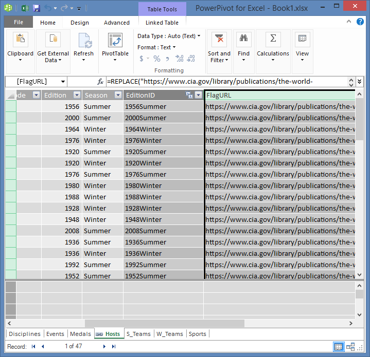
You need to create a new field in the Hosts table to store the flag URLs. In an earlier tutorial you used DAX to concatenate two fields, and we’ll do the same for the flag URLs. In Power Pivot, select the empty column that has the title Add Column in the Hosts table. In the formula bar, type the following DAX formula (or you can copy and paste it into the formula column). It looks long, but most of it is the URL we want to use from the CIA Factbook.
=REPLACE("https://www.cia.gov/library/publications/the-world-factbook/graphics/flags/large/fr-lgflag.gif",82,2,LOWER([Alpha-2 code]))
In that DAX function you did a few things, all in one line. First, the DAX function REPLACE replaces text in a given text string, so by using that function you replaced the part of the URL that referenced France’s flag (fr) with the appropriate two-letter code for each country or region. The number 82 tells the REPLACE function to begin the replacement 82 characters into the string. The 2 that follows tells REPLACE how many characters to replace. Next, you may have noticed that the URL is case-sensitive (you tested that first, of course) and our two-letter codes are uppercase, so we had to convert them to lowercase as we inserted them into the URL using the DAX function LOWER. -
Rename the column with the flag URLs to FlagURL. Your Power Pivot screen now looks like the following screen.
-
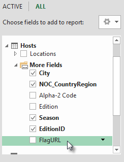
Return to Excel and select the PivotTable in Sheet1. In PivotTable Fields, select ALL. You see the FlagURL field you added is available, as shown in the following screen.
Notes: In some instances, the Alpha-2 code used by the CIA.gov World Factbook site doesn’t match the official ISO 3166-1 Alpha-2 code provided in the Hosts table, which means some flags don’t display properly. You can fix that, and get the right Flag URLs, by making the following substitutions directly in your Hosts table in Excel, for each affected entry. The good news is that Power Pivot automatically detects the changes you make in Excel, and recalculates the DAX formula:
-
change AT to AU
-
Add sport pictograms to the Data Model
Power View reports are more interesting when images are associated with Olympic events. In this section, you add images to the Disciplines table.
-
After searching the Internet, you find that Wikimedia Commons has great pictograms for each Olympic discipline, submitted by Parutakupiu. The following link shows you the many images from Parutakupiu.
http://commons.wikimedia.org/wiki/user:parutakupiu -
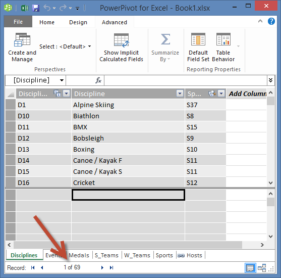
But when you look at each of the individual images, you find the common URL structure doesn’t lend itself to using DAX to automatically create links to the images. You want to know how many disciplines exist in your Data Model, to gauge whether you should input the links manually. In Power Pivot select the Disciplines table, and look at the bottom of the Power Pivot window. There, you see the number of records is 69, as shown in the following screen.
You decide that 69 records is not too many to copy and paste manually, especially since they’ll be so compelling when you create reports. -
To add the pictogram URLs, you need a new column in the Disciplines table. That presents an interesting challenge: the Disciplines table was added to the Data Model by importing an Access database, so the Disciplines table appears only in Power Pivot, not in Excel. But in Power Pivot, you can’t directly input data into individual records, also called rows. To address this, we can create a new table based on information in the Disciplines table, add it to the Data Model, and create a relationship.
-
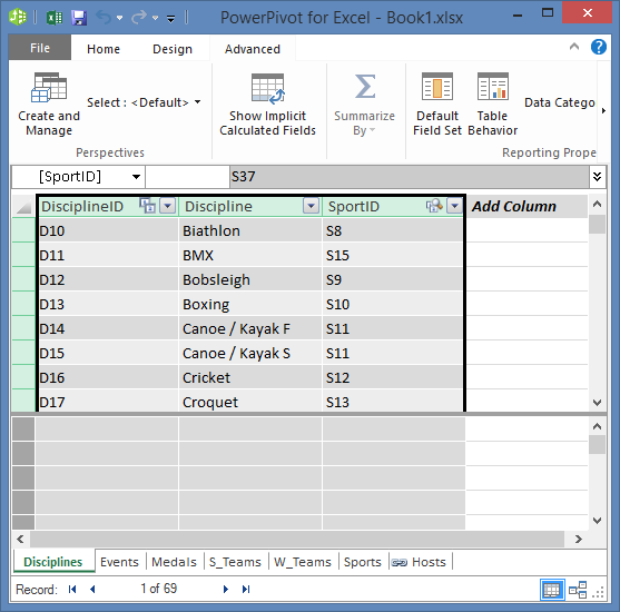
In Power Pivot, copy the three columns in the Disciplines table. You can select them by hovering over the Discipline column then dragging across to the SportID column, as shown in the following screen, then click Home > Clipboard > Copy.
-
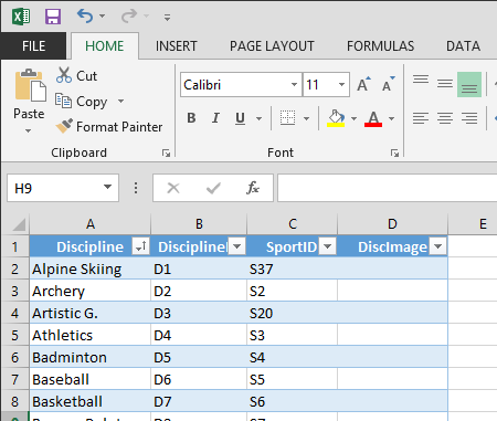
In Excel, create a new worksheet and paste the copied data. Format the pasted data as a table like you did in previous tutorials in this series, specifying the top row as labels, then name the table DiscImage. Name the worksheet DiscImage as well.
Note: A workbook with all the manual input completed, called DiscImage_table.xlsx, is one of the files you downloaded in the first tutorial in this series. To make it easy, you can download it by clicking here. Read the next steps, which you can apply to similar situations with your own data.
-
In the column beside SportID, type DiscImage in the first row. Excel automatically extends the table to include the row. Your DiscImage worksheet looks like the following screen.
-
Enter the URLs for each discipline, based on the pictograms from Wikimedia Commons. If you’ve downloaded the workbook where they’re already entered, you can copy and paste them into that column.
-
Still in Excel, choose Power Pivot > Tables > Add to Data Model to add the table you created to the Data Model.
-
In Power Pivot, in Diagram View, create a relationship by dragging the DisciplineID field from the Disciplines table to the DisciplineID field in the DiscImage table.
Set the Data Category to correctly display images
In order for reports in Power View to correctly display the images, you must correctly set the Data Category to Image URL. Power Pivot attempts to determine the type of data you have in your Data Model, in which case it adds the term (Suggested) after the auto-selected Category, but it’s good to be sure. Let’s confirm.
-
In Power Pivot, select the DiscImage table, and then choose the DiscImage column.
-
On the ribbon, select Advanced > Reporting Properties > Data Category and select Image URL, as shown in the following screen. Excel attempts to detect the Data Category, and when it does, marks the selected Data category as (suggested).
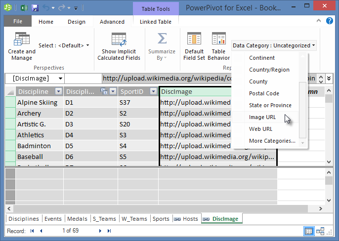
Your Data Model now includes URLs for pictograms that can be associated with each discipline, and the Data Category is correctly set to Image URL.
Use Internet data to complete the Data Model
Many sites on the Internet offer data that can be used in reports, if you find the data reliable and useful. In this section, you add population data to your Data Model.
Add population information to the Data Model
In order to create reports that include population information, you need to find and then include population data in the Data Model. A great source of such information is the Worldbank.org data bank. After visiting the site, you find the following page that enables you to select and download all sorts of country or region data.
There are many options for downloading data from Worldbank.org, and all sorts of interesting reports you could create as a result. For now, you’re interested in population for countries or regions in your data model. In the following steps you download a table of population data, and add it to your Data Model.
Note: Websites sometimes change, so the layout at Worldbank.org might be a little different than described below. Alternatively, you can download an Excel workbook named Population.xlsx that already contains the Worldbank.org data, created using the following steps, by clicking here.
-
Navigate to the worldbank.org website from the link provided above.
-
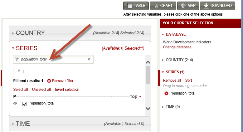
In the center section of the page, under COUNTRY, click select all.
-
Under SERIES, search for and select population, total. The following screen shows an image of that search, with an arrow pointing to the search box.
-
Under TIME, select 2008 (that’s a few years old, but it matches the Olympics data used in these tutorials)
-
Once those selections are made, click the DOWNLOAD button, and then choose Excel as the file type. The workbook name, as downloaded, isn’t very readable. Rename the workbook to Population.xls, then save it in a location where you can access it in the next series of steps.
Now you’re ready to import that data into your Data Model.
-
In the Excel workbook that contains your Olympics data, insert a new worksheet and name it Population.
-
Browse to the downloaded Population.xls workbook, open it, and copy the data. Remember, with any cell in the dataset selected, you can press Ctrl + A to select all adjacent data. Paste the data into cell A1 in the Population worksheet in your Olympics workbook.
-
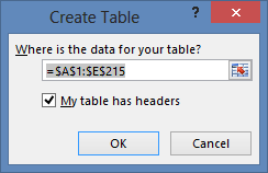
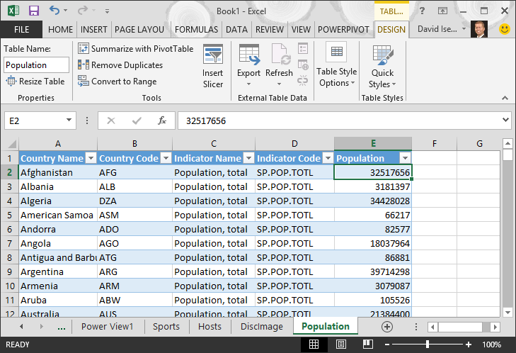
In your Olympics workbook, you want to format the data you just pasted as a table, and name the table Population. With any cell in the dataset selected, such as cell A1, press Ctrl + A to select all adjacent data, and then Ctrl + T to format the data as a table. Since the data has headers, select My table has headers in the Create Table window that appears, as shown here.
Formatting the data as a table has many advantages. You can assign a name to a table, which makes it easy to identify. You can also establish relationships between tables, enabling exploration and analysis in PivotTables, Power Pivot, and Power View. -
In the TABLE TOOLS > DESIGN tab, locate the Table Name field, and type Population to name the table. The population data is in a column titled 2008. To keep things straight, rename the 2008 column in the Population table to Population. Your workbook now looks like the following screen.
Notes: In some instances, the Country Code used by the Worldbank.org site doesn’t match the official ISO 3166-1 Alpha-3 code provided in the Medals table, which means some countryregions won’t display population data. You can fix that by making the following substitutions directly in your Population table in Excel, for each affected entry. The good news is that Power Pivot automatically detects the changes you make in Excel:
-
change NLD to NED
-
change CHE to SUI
-
-
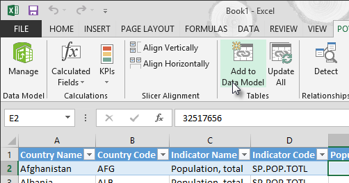
In Excel, add the table to the Data Model by selecting Power Pivot > Tables > Add to Data Model, as shown in the following screen.
-
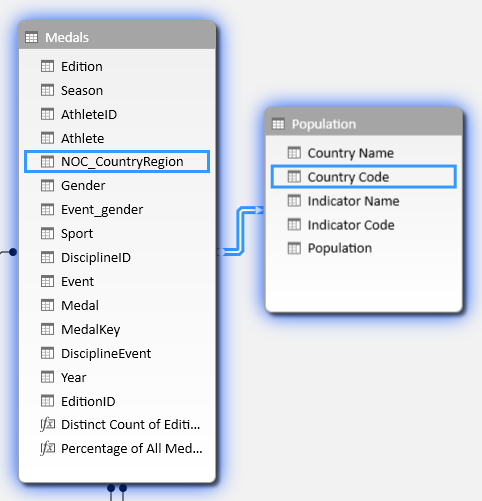
Next, let’s create a relationship. We noticed that the Country or Region Code in Population is the same three-digit code found in the NOC_CountryRegion field of Medals. Great, we can easily create a relationship between those tables. In Power Pivot, in Diagram View, drag the Population table so it’s situated beside the Medals table. Drag the NOC_CountryRegion field of the Medals table onto the Country or Region Code field in the Population table. A relationship is established, as shown in the following screen.
That wasn’t too hard. Your Data Model now includes links to flags, links to discipline images (we called them pictograms earlier), and new tables that provide population information. We have all sorts of data available, and we’re almost ready to create some compelling visualizations to include in reports.
But first, let’s make report creation a little easier, by hiding some tables and fields our reports won’t use.
Hide tables and fields for easier report creation
You may have noticed how many fields are in the Medals table. A whole lot of them, including many you won’t use to create a report. In this section, you learn how to hide some of those fields, so you can streamline the report creation process in Power View.
To see this yourself, select the Power View sheet in Excel. The following screen shows the list of tables in Power View Fields. That is a long list of tables to choose from, and in many tables, there are fields your reports will never use.
The underlying data is still important, but the list of tables and fields is too long, and maybe a little bit daunting. You can hide tables and fields from client tools, such as Pivot Tables and Power View, without removing the underlying data from the Data Model.
In the following steps, you hide a few of the tables and fields using Power Pivot. If you need tables or fields you’ve hidden to generate reports, you can always go back to Power Pivot and unhide them.
Note: When you hide a column or field, you won’t be able to create reports or filters based on those hidden tables or fields.
Hide Tables using Power Pivot
-
In Power Pivot, select Home > View > Data View to make sure Data View is selected, rather than being in Diagram View.
-
Let’s hide the following tables, which you don’t believe you need to create reports: S_Teams and W_Teams. You notice a few tables where only one field is useful; later in this tutorial, you find a solution to them as well.
-
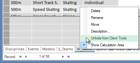
Right-click on the W_Teams tab, found along the bottom of the window, and select Hide from Client Tools. The following screen shows the menu that appears when you right-click a hidden table tab in Power Pivot.
-
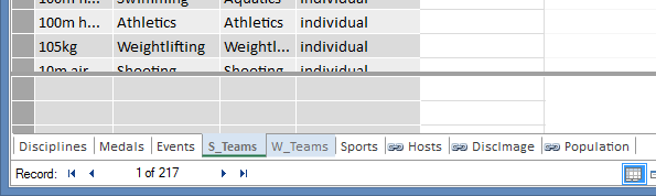
Hide the other table, S_Teams, as well. Notice that tabs for hidden tables are grayed out, as shown in the following screen.
Hide Fields using Power Pivot
There are also some fields that aren’t useful for creating reports. The underlying data may be important, but by hiding fields from client tools, such as PivotTables and Power View, the navigation and selection of fields to include in reports becomes clearer.
The following steps hide a collection of fields, from various tables, that you won’t need in your reports.
-
In Power Pivot, click on the Medals tab. Right-click the Edition column, then click Hide from Client Tools, as shown in the following screen.
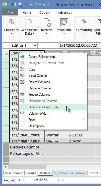
Notice the column turns gray, similar to how the tabs of hidden tables are gray. -
On the Medals tab, hide the following fields from client tools: Event_gender, MedalKey.
-
On the Events tab, hide the following fields from client tools: EventID, SportID.
-
On the Sports tab, hide SportID.
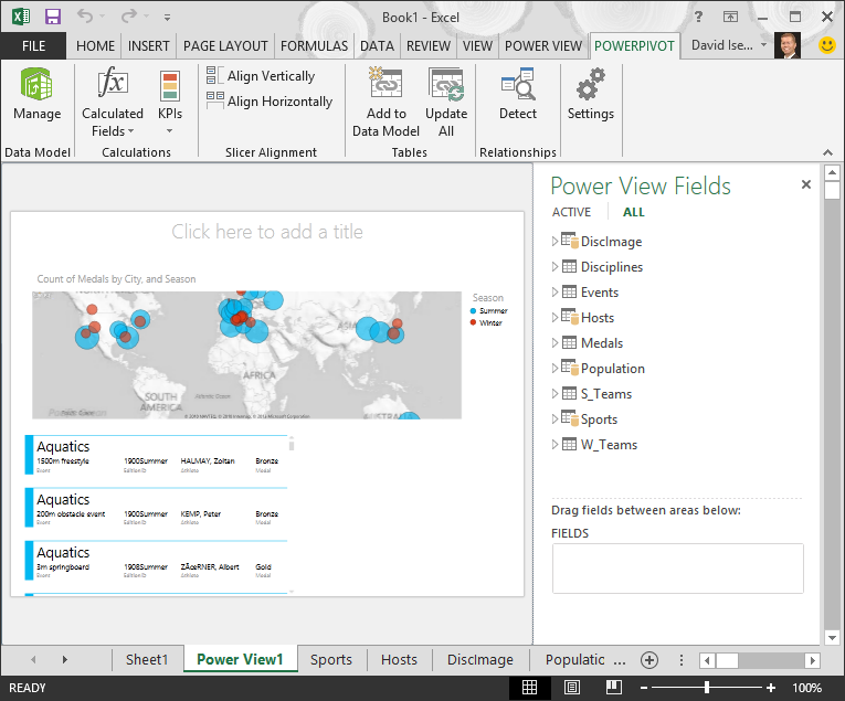
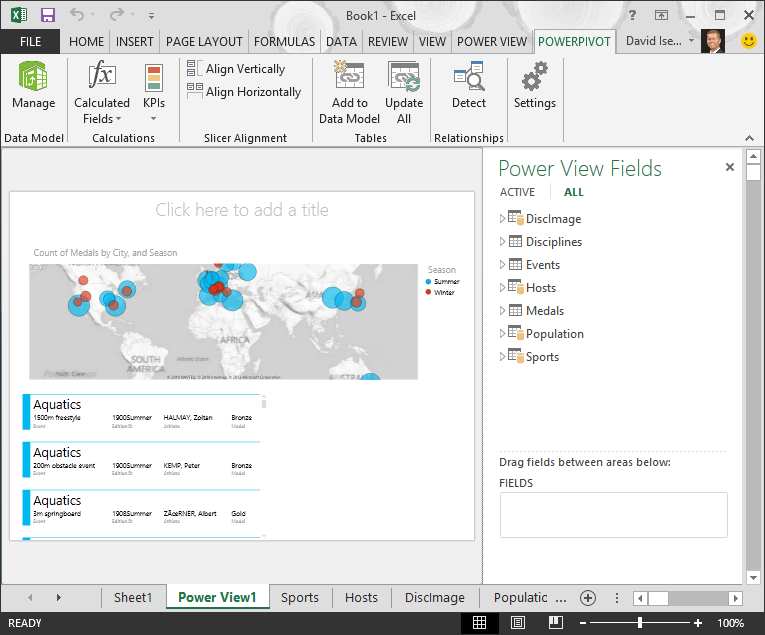
Now when we look at the Power View sheet and Power View Fields, we see the following screen. This is more manageable.
Hiding tables and columns from client tools helps the report creation process go more smoothly. You can hide as few or as many tables or columns as necessary, and you can always unhide them later, if necessary.
With the Data Model complete, you can experiment with the data. In the next tutorial, you create all sorts of interesting and compelling visualizations using the Olympics data and the Data Model you’ve created.
Checkpoint and Quiz
Review what you learned
In this tutorial you learned how to import Internet-based data to your Data Model. There’s a lot of data available on the Internet, and knowing how to find it and include it in your reports is a great tool to have in your reporting knowledge set.
You also learned how to include images in your Data Model, and how to create DAX formulas to smooth the process of getting URLs into your data mash-up, so you can use them in reports. You learned how to hide tables and fields, which comes in handy when you need to create reports and have less clutter from tables and fields that aren’t likely to be used. Hiding tables and fields is especially handy when other people are creating reports from the data you provide.
QUIZ
Want to see how well you remember what you learned? Here’s your chance. The following quiz highlights features, capabilities, or requirements you learned about in this tutorial. At the bottom of the page, you’ll find the answers. Good luck!
Question 1: Which of the following methods is a valid way of including Internet data in your Data Model?
A: Copy and paste the information as raw text into Excel, and it is automatically included.
B: Copy and paste the information into Excel, format it as a table, then select Power Pivot > Tables > Add to Data Model.
C: Create a DAX formula in Power Pivot that populates a new column with URLs that point to Internet data resources.
D: Both B and C.
Question 2: Which of the following is true of formatting data as a table in Excel?
A: You can assign a name to a table, which makes it easy to identify.
B: You can add a table to the Data Model.
C: You can establish relationships between tables, and thereby explore and analyze the data in in PivotTables, Power Pivot, and Power View.
D: All of the above.
Question 3: Which of the following is true of hidden tables in Power Pivot?
A: Hiding a table in Power Pivot erases the data from the Data Model.
B: Hiding a table in Power Pivot prevents the table from being seen in client tools, and thus prevents you from creating reports that use that table’s fields for filtering.
C: Hiding a table in Power Pivot has no effect on client tools.
D: You cannot hide tables in Power Pivot, you can only hide fields.
Question 4: True or False: Once you hide a field in Power Pivot, you cannot see it or access it any longer, even from Power Pivot itself.
A: TRUE
B: FALSE
Quiz answers
-
Correct answer: D
-
Correct answer: D
-
Correct answer: B
-
Correct answer: B
Notes: Data and images in this tutorial series are based on the following:
-
Olympics Dataset from Guardian News & Media Ltd.
-
Flag images from CIA Factbook (cia.gov)
-
Population data from The World Bank (worldbank.org)
-
Olympic Sport Pictograms by Thadius856 and Parutakupiu


