
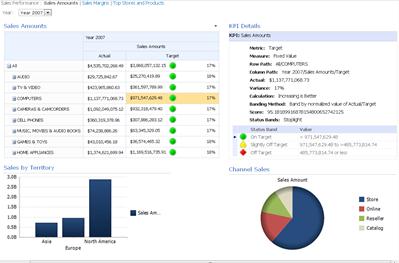
When you look at a PerformancePoint dashboard on a SharePoint site, you might see one or several items on it. Typically, but not always, the dashboard contains a scorecard, and some filters, charts and grids. Each scorecard and report is placed on the dashboard as a Web Part. You can navigate within a report or perform actions on the Web part itself. Dashboard can include more than one page.
The dashboard in the example below shows a filter, links to more pages, a scorecard, an analytic bar chart, a KPI details report, and a pie chart. Each scorecard and report is in a separate Web Part, each with its own menu. The controls for each Web Part are indicated on the dashboard page by a drop-down symbol (
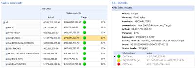
In some cases, the actions that you take in one Web Part affect the results that you see in another Web Part. In the example below, the results that you see in the KPI Details report apply to the item (COMPUTERS – target amount) that is highlighted in the Sales Amounts scorecard.
You can easily view and explore data by using the scorecards and reports that are on a dashboard. You can drill down (or up) in scorecards and analytic charts and grids to see lower (or higher) levels of detail and to change your view of the data in the reports. This is useful when you want to see more information than is currently displayed in the dashboard. You can also view each report in a separate window, export them to PowerPoint, or export them to Excel.
What do you want to do?
Navigate in a dashboard
The real power of a PerformancePoint dashboard lies in its interactivity. By moving around the dashboard and investigating each scorecard and report, you can get a very detailed picture of your organization's performance.
Moving around the dashboard
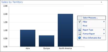
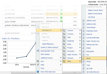
Use your cursor to select the scorecard or report you want to focus on. If the dashboard page is larger than your browser window, use the vertical or horizontal scroll bars to move the dashboard up and down or left and right. Right-click a report to see its shortcut menu. The example below shows the shortcut menu for an analytic chart.
Interacting with scorecards and reports
Most reports have some level of interactivity. For example, if you click a section of a pie chart, a new pie chart might open, displaying more detailed data about just the section that you clicked. If you click a cell on a scorecard that has a related KPI Details report, theKPI Detailsreport updates and displays details that pertain only to the selected cell. The KPI Detailsreport in the following example shows results for COMPUTERS, the item selected in the related scorecard.
Move between dashboard pages
If your dashboard contains more than one page, you can move from one page to another by clicking the page links at the top of the dashboard page. The dashboard in the example shown at the beginning of this article has three pages: Sales Amounts, Sales Margins, and Top Stores and Products. The links for those pages are at very top of the dashboard, next to the dashboard name. The current page is always shown in solid text, whereas other pages are shown in hyperlinked text.
Control my view of a scorecard or report
Each drop-down symbol
Use filters to view just the data that you need
When you first open a dashboard that contains filters, you see a view that is based on the initial filter selections, but you can change the view by using filter controls. The example below shows two filters, one for time, and the other for products. You can change the Timefilter by clicking the drop-down symbol
To narrow your view even further, you can filter the view to just the product you are interested in, or you can compare performance of a specific product to all available products. In this example, All is selected and Computers andCameras & Camcorders are also selected. By making these selections, the user can compare the performance of computer sales and sales of cameras and camcorders for the past year against the performance of all product sales.
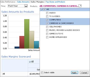
Tip: If you want to view data for all products, select All. If you want to view only certain products, clear the All check box and select just the product or products that interests you.
Use the Web Parts menu
Each Web Part has its own menu. Click the drop-down symbol
The following example shows the Web Part menu for a scorecard.

Explore data on the dashboard
A dashboard can contain one or more scorecards and other reports. What you can do in each report depends on the type of report it is. For more information on report types, see About PerformancePoint report types.
Use report shortcut menus
Each report on a dashboard has its own set of controls, most of which you access by right-clicking. You can, for example, right-click in any analytic chart or grid, select Report Type, and then change it to a different report type. Or, you can make some formatting changes or filter the data that you see. You can click specific data points, such as those on the following line chart, or click individual bars on an analytic chart to drill further into the data. You can also select a section of a pie chart to see greater detail or different detail. You can discover which elements are interactive by moving your mouse pointer around the report. When the pointer changes, it means you can click that item.
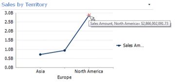
Right-click a value in the chart and select Drill Down To. This loads a list of available dimensions you can explore.
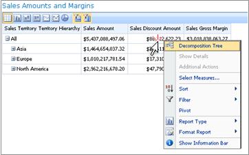
Scorecards are highly interactive, too. For example, you can right-click in various places on a scorecard, and depending on how the scorecard was set up, you can perform the following tasks:
-
Drill up and down to see higher or lower levels of detail
-
Filter data
-
Find the top ten in a category (like sales by channel, for example)
-
Analyze a data value in a Decomposition Tree
The following example shows a shortcut menu that you can reach on a scorecard by right-clicking.
Note: Occasionally, when you expand and then collapse multiple rows or columns in a scorecard, the expand/collapse functionality might not work as expected. If this occurs, use the Web Parts Menu to refresh the scorecard to restore it to its original display.
Undo changes for a chart that is opened in a new browser window
Click the Back button in your browser window. This undoes the last change you made to the view. Repeat till you reach the view that you want. This is useful if you made several changes to the report but do not want to reset the chart to the default view.
Tip: If the Back button is not active, the report is displayed in the default report view.
Reset the report view
You can reset a report to its original view by using either of the following methods:
-
If you are viewing the report in its original location on the dashboard , open the Web Part menu, and then select Reset View.
-
If you are viewing the report in a new browser window , click the Refresh button in the new browser window (or press F5). This not only resets the analytic chart to the default view that is shown in the dashboard but also resizes the chart to fit inside the new browser window.
Video: Explore data in PerformancePoint reports and scorecards
By watching this video, you will see how to investigate data in PerformancePoint reports and scorecards, how to drill into data, and how to filter it. It reinforces the information that is contained in this article.


