
As a form designer, it is important to focus on how your form template looks, not just how it works. Whether you are adding a splash of color or a company logo, Microsoft Office InfoPath provides several ways to create interest and visually organize information so that your form template is attractive and easy for people to use.
You don't need to be a professional graphic designer to create a nice-looking form template. Just remember not to overload a form template with too many different design elements, which can make it look cluttered. Instead, pick a few elements that meet your design goals, and then use them consistently to give the form template a polished, professional look.
This article provides check lists that can help you keep your design on the right track.
In this article
Check list for using color, borders, and shading
Using color is one of the easiest ways to add visual interest to your form template. InfoPath provides many predesigned color schemes that help you to apply different color combinations to certain items on your form template. You can also apply color to the background of a form template.
In addition, you can create interest and organize elements on a form template through the use of borders and shading. A border outlines the boundaries of a control, table, or table cell. Borders are particularly useful when you want to differentiate the sections in your form template. Differentiating the sections helps users understand the organization of the form. In the following example, the form designer has used borders to emphasize the cells in a repeating table.

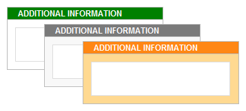
Applying shading to a control or table cell changes its background color. The following illustration shows how various shading choices can change the look of an Additional Information box on a form template.
When using color in your design, keep the following guidelines in mind.
|
Guideline |
Details |
|
|
|
Don't rely on color alone to convey important information. |
For example, if your form template contains a color-coded legend, use additional cues, such as textual annotations, to supplement the use of color. Some users might use a limited color scheme or a handheld computer with a monochrome display, or they might rely on screen review utilities, which seldom convey information that is only represented by colors. In addition, up to 10% of the population has difficulty distinguishing between some colors or seeing some colors. |
|
|
Consider color contrast and background. |
Make sure that the color contrast is high between the background and the foreground of your form template. For example, use a white or gray background with control colors, or a white or gray table cell color with a font color. |
|
|
If you are using color in the background of your form template, verify that the Print background colors and pictures option is turned off. |
Backgrounds can create contrast and interest when users are viewing your form on their computer screen. However, background colors may not be optimal for printing, because users may not have color printers, and printing background colors in grayscale, or in black and white may make the form hard to read. Moreover, printing backgrounds may make a form print more slowly, and may waste printer ink or toner. For these reasons, InfoPath does not print background colors or pictures by default. |
|
|
Use shading and borders judiciously. |
Although you can use borders to group similar items together, too many boxes can make your form template look messy and detract from its overall appearance. Focus on what you want to accomplish by using borders and shading, and then pick and consistently use an effect that meets that goal. For example, you can limit the use of borders to highlighting key information or reinforcing the overall organization of your form. |
|
|
Verify that the colors look okay when you view the form template on different monitors. |
You should test how colors in your form template display on different monitors. For example, you might ask a few colleagues to review your form template, check the colors in different lighting conditions, or experiment with different computer screen and printer settings. |
|
|
Be sensitive to the fact that colors mean different things in different countries and regions. |
For example, in some countries and regions, red is associated with death. |


Check list for using fonts and font formatting
Modifying the appearance of text can emphasize key information or drastically change the overall look of your form template. For example, you can adjust the color and size of certain words to create headers that help organize the form template and break it into logical sections.
In the following example, the form designer is using two different fonts, one for headings and one for the text that appears inside the controls on the form template. Note that in general, you should avoid using ALL CAPS for emphasis. However, this technique can work if you use it sparingly, such as with headings and other short phrases, as shown in the following example.
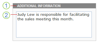
1. For heading text, the font is 9-point Arial.
2. For control text, the font is 10-point Verdana.
When using different fonts and font formatting in your design, keep the following guidelines in mind.
|
Guideline |
Details |
|
|
|
Verify that the text is visible against any background colors or shaded areas. |
Text is easiest to read when there is adequate contrast between the text and the background. Black text on a white background gives the highest contrast. Light text on a dark background also offers good contrast. |
|
|
Verify that the text on the form isn't too small. |
Small text may occasionally be necessary, such as when you include fine print in your form template, or when you are labeling controls. However, in most cases, larger text is far more comfortable for the majority of people to read. |
|
|
Use fonts and font effects judiciously. |
Avoid using numerous fonts in the same form template. It can create a jarring, disjointed effect. A good guideline is to keep it simple by using a maximum of three fonts. Also, avoid cartoonish fonts, because these tend to look unprofessional in a business form. |
|
|
Verify that text is readable when viewed in high-contrast color schemes. |
Some people with low vision opt to use a high-contrast color scheme to heighten the color contrast of some text and images on the computer screen. This makes those items more distinct and easier to identify. Check your form template by using the various high-contrast color schemes to make sure that the form template is usable in this mode. To learn how to turn a high-contrast color scheme on or off, refer to the Help system for your operating system. |
|
|
Consider whether text is scannable. |
If your form template contains a large amount of text, you can help your users by ensuring that the text is scannable. For example, if you include lengthy Help instructions on a form template, use numbered or bulleted lists instead of big blocks of text, because lists are often easier to scan and digest. |
|
|
Verify that you are using font effects appropriately. |
Use bold, italic, and other font effects sparingly, if you use them at all. For example, italic text is often quite difficult to read on the screen, especially when it is used with certain fonts. Similarly, too much bold text detracts from the overall message of the text. |
Check list for using logos and other images
Images are another way for you to customize and add style to your form template. For example, including a company logo can help brand your form template.
When using images in your design, keep the following guidelines in mind.
|
Guideline |
Details |
|
|
|
Verify that images adequately identify the company or the form template's purpose. |
Whether the image is simply a visual cue (such as a company logo) or is used to convey important information (like a data chart), make sure your audience can understand its purpose. |
|
|
Verify that images are appropriately sized and positioned. |
Make sure that the size of the image and its location on the form template do not hinder users as they fill out the form template. |
|
|
Verify that images are culturally sensitive. |
For example, photos that include hand gestures can be offensive. Maps and flags can also be sensitive images. If the image includes people, consider showing a range of ethnicities and both genders. |
|
|
Use images judiciously. |
Including excessive or unnecessary images can make your form template look cluttered and unorganized, which ultimately detracts from your form template's overall appearance and effectiveness. |
|
|
Verify that images include alternative text, and the alternative text makes sense when read out loud. |
Alternative text helps those who can't see the image on the screen. For example, alternative text is beneficial to people who rely on screen review utilities to read out information on the screen or to those who use text-only browsers to view a browser-enabled form template. |
|
|
Verify that images are saved in an appropriate file format. |
Large image files can increase the time that it takes the form to open. Certain file formats produce files that are much larger than others. For example, a file saved as a bitmap (.bmp) or Tagged Image File Format (TIFF) file is significantly larger than the same file saved as a JPEG, GIF, or PNG file. The JPEG format is generally best for photographs or other complex images. The GIF or PNG formats are often ideal for line drawings, logos, illustrations, charts, and diagrams. |
|
|
Verify that images are not copyright-protected. |
Because so many images are easily accessible on the Internet, you might be tempted to use any image that you see. Unfortunately, many of these images are protected by copyrights, and you need permission before you can use them in your form templates. However, there are several sites, such as Bing Image Search, that, when you use the copyright license filter, you can use their clips and pictures as long as you agree to their terms of use. |
|
|
Don't rely on images alone to convey important information. |
Just as you should not rely on color alone to convey critical information to users, you should not rely solely on images. Users might not be able to see the images in your form template. For example, they might turn off images in the browser to speed up performance when viewing your form in a browser, or they might have low vision, which prevents them from actually seeing the image on the screen. |


