
PerformancePoint dashboards and their Web Parts can offer you a world of information about your organization. Because PerformancePoint dashboards are continually connected to their data sources, the information in them is up-to-date and it is usually interactive, too.
You can do any or all of the following in a PerformancePoint dashboard:
-
Drill up or down in data
-
Filter data to see just the information you need
-
Explore data through actions on various menus
-
Open reports in new windows
-
Export reports to Microsoft Excel or PowerPoint
-
Print dashboards and reports
This article covers what you can expect to see on a PerformancePoint dashboard page and what is included in a PerformancePoint Web Part. To learn what you can do on a PerformancePoint dashboard or Web Part, see How to navigate PerformancePoint dashboards and explore data and Overview of PerformancePoint strategy maps.
What do you want to know?
What’s on a PerformancePoint dashboard page?
PerformancePoint dashboards or dashboard pages vary considerably, depending on their purpose and their design. However, certain parts are always present.
-
The Quick Launch pane
-
Web Parts
-
A link to Help
In many cases, page navigation links and filters are also present. The following dashboard page shows all these items. The numbers, which are explained below the screen shot, identify the various parts of the dashboard.
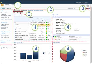
1. Quick Launch pane
2. Page navigation area
3. Link to Help
4. Web Part
5. Filter
Quick Launch
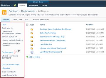
The Quick Launch pane appears at the side of your PerformancePoint dashboard and contains links to various SharePoint lists and document libraries. Some examples of links in the Quick Launch pane include Lists, Dashboards, Data Connections, Libraries, and PerformancePoint Content. You can click these links to go directly to a particular SharePoint list or library. For example, to see other dashboards that have been published to Microsoft SharePoint Server, click Dashboards.
In some cases, such as the one in the following example, you might see some dashboard names listed in the Dashboards section of the Quick Launch pane, but there might be more dashboards than are represented there. If you click the Dashboards link, you can see all dashboards that are available to you.
In this example, the Litware operational dashboard is represented on the Quick launch pane, and also in the center pane, but the rest of the available dashboards only come into view after the Dashboards link is clicked. It is a good idea to click the Dashboards link if the dashboard you are looking for is not visible on the Quick Launch pane.
Web Parts
The Web Parts in a PerformancePoint dashboard are modular units that contain PerformancePoint reports and scorecards, most of which are interactive.
Some dashboards have only one Web Part. Others have two or more. The dashboard in the above example has four Web Parts, each containing a separate report: Sales Amounts, Sales by Territory, KPI Details, and Channel Sales.
The person who designs the dashboards allots a defined amount of space for each Web Part. If the report contains more information than the space allows, scroll bars appear at the bottom or side of the report, whichever needs expansion. Some reports have scroll bars on both the bottom and the side.
Help
You can find Help by clicking the 
Page navigation
Page navigation links normally appear at the top of a dashboard. The currently selected page is formatted in solid typeface. Other pages are in hyperlinked text. To move from one page to another, click the appropriate page link. The dashboard in the example above includes three dashboard pages: Sales Amounts, Sales Margins, and Top Stores and Products. The current page is the Sales Amounts page. It is the one in solid dark typeface.

Filters
A filter is a control on a dashboard that you can use to modify your view of the data. Filters often appear at the top of a dashboard page, but they can also appear above a specific report or scorecard. In the dashboard in this article, the Year filter appears at the top of the page. Filters are always connected to at least one report or scorecard, but they might be connected to several of them, and they can be connected across multiple pages, too.
What’s in the Web Parts?
PerformancePoint dashboards contain reports of various types. Scorecards, which are a special report type, appear on many dashboards. They are popular because they provide an at-a-glance view of performance against specific goals.
PerformancePoint reports are always connected to a data source, which means that the information presented in them is always up-to-date. Most PerformancePoint reports are also interactive, so you can drill into the data, sort it, filter it, and view it in various formats. You can even export the reports to Microsoft PowerPoint or Excel if you want to use it in a presentation or explore it further in a spreadsheet.
Reports
You might see a variety of reports on a PerformancePoint dashboard, each of which serves a different purpose and each of which might be connected to a different data source. Some might draw their data from sales information, for example, and others might draw information from product information. And, of course, they might all draw their information from the same data source, depending on how the designer set up the reports and the dashboard that contains them.
Report types
A dashboard can have one or more of the following report types, but most dashboards have some combination of these report types.
-
A nalytic charts and grids – these are usually displayed as line charts, pie charts, or bar charts, although you can change the graphical formats to a grid format. They are highly interactive.
-
Excel Services reports – these display Excel worksheets, or, perhaps, a section of a worksheet. They, too, are highly interactive.
-
SQL Server Reporting Services reports – these are reports that have been published to Reporting Services and then imported into a PerformancePoint dashboard. Typically, they are interactive.
-
ProClarity Server reports – these are reports that have been published to ProClarity Analytics Server and then imported into a PerformancePoint dashboard. They are highly interactive.
-
Web Page reports – these are interactive Web pages from internal or external Web sites and displayed in a SharePoint Web Part. They generally relate to something else on the dashboard—a stock report, for example, or a weather report. A Web Page report will look like any other page on the Internet except that it is contained within a PerformancePoint dashboard.
-
Scorecards – these reports show performance by comparing actual results against target values. They use graphical images, called indicators, to demonstrate in a visual way, how well a specific item is performing. The indicators frequently appear in traffic light colors—red, yellow, and green, but you might also see arrows that show upward or downward trends, smiling or frowning faces, or other images that communicate results visually. Scorecards can also serve as data sources for KPI Details reports and strategy maps.
-
Strategy Maps – these reports are Microsoft Visio diagrams that are linked to PerformancePoint scorecards so they can display various performance measures at a glance. The shapes are connected to key performance indicators in the connected scorecards and their colors update automatically to reflect current performance.
-
KPI Details reports – these reports contain information about each key performance indicator (KPI) in a scorecard. A KPI Details report is always connected to a scorecard and its connected scorecard is always on the same dashboard page as the KPI Details report. The KPI Details report is not interactive. Its purpose is to help you understand how performance is being measured for each item that you see on a scorecard. However, the KPI Details report might seem interactive because it does update each time you click on a Target or Actual value in a scorecard.
For pictures of each of these report types, and more detailed descriptions of them, see Learn about PerformancePoint report types and Learn about PerformancePoint scorecards.
To learn how to explore the data in PerformancePoint reports, see How to navigate PerformancePoint dashboards and explore data.
Menus
Web Part menus and right-click menus play a powerful role in PerformancePoint dashboards and Web Parts. Each Web Part has its own menu and each report is likely to have one or more right-click menus. By using these menus, you can fully explore the data in each report.
Web Part menus
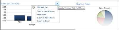
The Web Part menu appears as a tiny triangle above a report. Clicking it opens a drop-down box that contains menu options for the Web Part that you are viewing. To locate it, you might have to mouse over the report until the drop-down image becomes visible.
In the following example, the Sales by Territory Web Part menu is in view and you can see that there are four options available to you for that Web Part. The ability to open the report in a new window is especially handy when you have a very large report in the Web Part.
Right-click menus
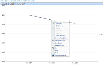
Right-click menus offer many options and those options change, depending on the report type and the part of the report that you click. In the following example, right-clicking the report, some place other than directly on a bar, produces a menu that lets you apply various commands to the report. You can even change the type of report that you see.
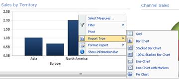
If you click directly on the bar of this same report, however, you get a different right-click menu. As the following example shows, you can drill into data that is specific to a particular bar, filter its data, sort it, show greater detail, and more. You can do that for each bar on the chart.

If you have a line chart, you can right-click a data point and find a similar menu.
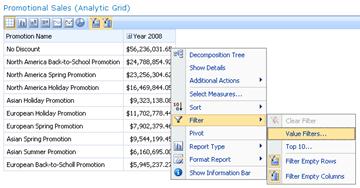
Right-clicking an analytic grid produces a slightly different menu:
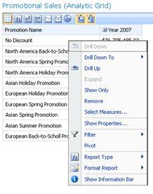
Essentially, it is a good idea to try right-clicking in any PerformancePoint report, and in various parts of the report, to find out what menu options you have available. If you change an analytic grid or chart to a different report type, your options might also change. Try working with PerformancePoint reports to see which options provide you with the view that you want and the data that you need.
Filters
Two types of filters can exist on a dashboard. The ones referred to here as “dashboard filters” usually appear at the top of a dashboard page or above an individual Web Part. Other filters, referred to in this article as “filters on right-click menus,” appear in some individual Web Parts when you right-click a report or an item in a report.
Dashboard filters
Dashboard filters are controls on a dashboard page that help you find the data that you need. Filters might apply to one or more reports on the dashboard page. If you select an item from a filter, watch the dashboard to see which reports update. For example, if the year is changed on the dashboard in the example at the beginning of the report, three of the four charts update. Only the pie chart remains unchanged.
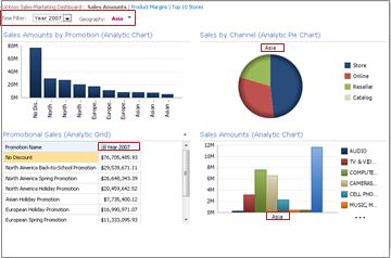
Some dashboards have multiple filters. Each of those filters can be connected to the same reports or to different reports. The following report has two filters—one for Time and one for Geography. The Time filter is connected to all reports except the pie chart. The Geography filter is connected to the pie chart and the Sales Amounts analytic chart. The Time filter shows Year 2007 and the Geography filter shows Asia.
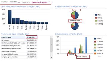
After changing the Time filter to Year 2008 and the Geography filter to Europe and North America, you can see that the Geography filter is applied to the Sales by Channel and Sales Amounts charts, while the Time filter is applied to the Sales Amounts by Promotion, Promotional Sales, and Sales Amounts charts.
Filters on right-click menus
Filters on the right-click menus filter data on specific reports, or section of reports, that you are exploring. They do not apply to the entire dashboard. The two types of filters available on the right-click menus are Top 10 and Value filters.
For more information about filters and filtering, see Business intelligence in Excel and Excel Services (SharePoint Server 2013) and Use multiple filters to focus on specific information.


