
Note: This article has done its job, and will be retiring soon. To prevent "Page not found" woes, we're removing links we know about. If you've created links to this page, please remove them, and together we'll keep the web connected.
You don’t have to start in Excel to add an Excel chart to a Word document. Instead, you can create the Excel chart from scratch in Word, and edit the data and customize the chart right there.
-
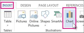
In your Word document, click Insert > Chart.
-
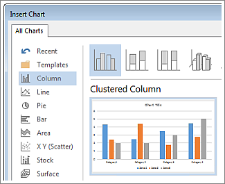
Select the type of chart you want, such as column or pie chart, and click OK. (If you’re not sure which to choose, move down the All Charts list to preview each type.)
-
Enter your data into the spreadsheet that automatically opens with the chart. The chart will update to match the data after you finish typing into one cell and move to the next.
Edit and customize your chart
Once your chart is in place, you can change colors, styles, details, components, and data as much and as often as you want. These three steps can help organize your approach
-
To change something about the whole chart, click the chart to display four buttons along the right edge. Click these to change the Layout Options (shown below), Chart Elements, Chart Styles, and Chart Filters.

Or, click the chart to open Chart Tools > Design, and choose from many chart styles, types, and elements.
-
To edit the data, right-click the chart and click Edit Data to reopen the spreadsheet. Changes in the spreadsheet show up automatically in the chart. Or, under Design, click Data > Edit Data.
-
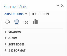
To edit, change, add, or remove, a specific element of the chart, such as the legend, axis labels, title, data bars, or background, click that element. Then click through the options in the Format pane that’ll open to the right of your workspace. (If you don’t see a Format pane, double-click the chart element you want to change.)
For example, if you double-click a chart axis, a Format Axis pane opens, and you’ll see these types of effects under Axis Options. Click Shadow, Glow, and the others to see what’s possible.
If you’ve already created a chart in Excel that you’d rather copy into Word—if, for example, you want to be able to update your chart automatically when data in your original Excel workbook changes—see Insert a chart from an Excel spreadsheet into Word.


