If you’re doing statistical analysis, you may want to create a standard box plot to show distribution of a set of data. In a box plot, numerical data is divided into quartiles, and a box is drawn between the first and third quartiles, with an additional line drawn along the second quartile to mark the median. In some box plots, the minimums and maximums outside the first and third quartiles are depicted with lines, which are often called whiskers.

While Excel 2013 doesn't have a chart template for box plot, you can create box plots by doing the following steps:
-
Calculate quartile values from the source data set.
-
Calculate quartile differences.
-
Create a stacked column chart type from the quartile ranges.
-
Convert the stacked column chart to the box plot style.
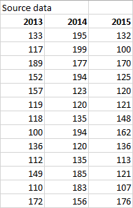
In our example, the source data set contains three columns. Each column has 30 entries from the following ranges:
-
Column 1 (2013): 100–200
-
Column 2 (2014): 120–200
-
Column 3 (2015): 100–180
In this article
Step 1: Calculate the quartile values
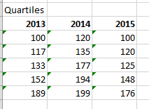
First you need to calculate the minimum, maximum and median values, as well as the first and third quartiles, from the data set.
-
To do this, create a second table, and populate it with the following formulas:
Value
Formula
Minimum value
MIN(cell range)
First quartile
QUARTILE.INC(cell range, 1)
Median value
QUARTILE.INC(cell range, 2)
Third quartile
QUARTILE.INC(cell range, 3)
Maximum value
MAX(cell range)
-
As a result, you should get a table containing the correct values. The following quartiles are calculated from the example data set:
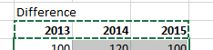
Step 2: Calculate quartile differences
Next, calculate the differences between each phase. In effect, you have to calculate the differentials between the following:
-
First quartile and minimum value
-
Median and first quartile
-
Third quartile and median
-
Maximum value and third quartile
-
To begin, create a third table, and copy the minimum values from the last table there directly.
-
Calculate the quartile differences with the Excel subtraction formula (cell1 – cell2), and populate the third table with the differentials.
For the example data set, the third table looks like the following:
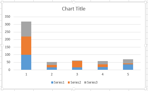
Step 3: Create a stacked column chart
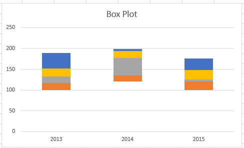
The data in the third table is well suited for a box plot, and we'll start by creating a stacked column chart which we'll then modify.
-
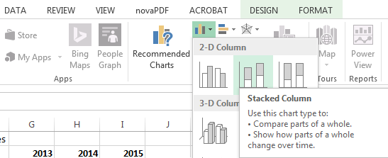
Select all the data from the third table, and click Insert > Insert Column Chart > Stacked Column.
At first, the chart doesn't yet resemble a box plot, as Excel draws stacked columns by default from horizontal and not vertical data sets.
-
To reverse the chart axes, right-click on the chart, and click Select Data.
-
Click Switch Row/Column.
Tips:
-
To rename your columns, on the Horizontal (Category) axis labels side, click Edit, select the cell range in your third table with the category names you want, and click OK.
-
To rename your legend entries, on the Legend Entries (Series) side, click Edit, and type in the entry you want.
-
-
Click OK.
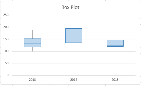
The graph should now look like the one below. In this example, the chart title has also been edited, and the legend is hidden at this point.
Step 4: Convert the stacked column chart to the box plot style
Hide the bottom data series
To convert the stacked column graph to a box plot, start by hiding the bottom data series:
-
Select the bottom part of the columns.
Note: When you click on a single column, all instances of the same series are selected.
-
Click Format > Current Selection > Format Selection. The Format panel opens on the right.
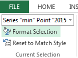
-
On the Fill tab, in the Formal panel, select No Fill.
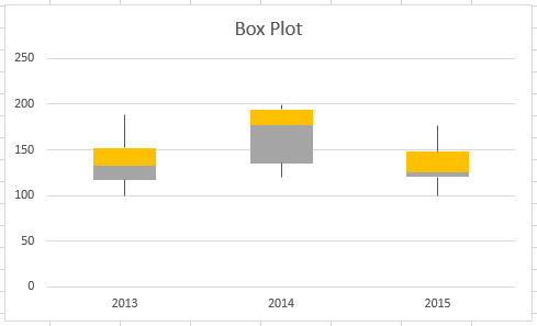
The bottom data series are hidden from sight in the chart.
Create whiskers for the box plot
The next step is to replace the topmost and second-from-bottom (the deep blue and orange areas in the image) data series with lines, or whiskers.
-
Select the topmost data series.
-
On the Fill tab, in the Formal panel, select No Fill.
-
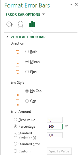
From the ribbon, click Design > Add Chart Element > Error Bars > Standard Deviation.

-
Click one of the drawn error bars.
-
Open the Error Bar Options tab, in the Format panel, and set the following:
-
Set Direction to Minus.
-
Set End Style to No Cap.
-
For Error Amount, set Percentage to 100.
-
-
Repeat the previous steps for the second-from-bottom data series.
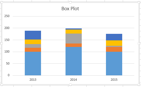
The stacked column chart should now start to resemble a box plot.
Color the middle areas
Box plots are usually drawn in one fill color, with a slight outline border. The following steps describe how to finish the layout.
-
Select the top area of your box plot.
-
On the Fill & Line tab in Format panel click Solid fill.
-
Select a fill color.
-
Click Solid line on the same tab.
-
Select an outline color and a stroke Width.
-
Set the same values for other areas of your box plot.
The end result should look like a box plot.