
Important: In Excel for Microsoft 365 and Excel 2021, Power View is removed on October 12, 2021. As an alternative, you can use the interactive visual experience provided by Power BI Desktop, which you can download for free. You can also easily Import Excel workbooks into Power BI Desktop.
Abstract: In this tutorial, you will learn how to create interactive Power View reports: multiples charts, interactive reports, and scatter charts and bubble charts with time-based play visualizations.
Note, too, that when you publish these reports and make them available on SharePoint, these visualizations are just as interactive as they are in this tutorial, for anyone viewing them.
The sections in this tutorial are the following:
At the end of this tutorial is a quiz you can take to test your learning. You can also see a list of videos that show many of the concepts and capabilities of Power View in action.
This series uses data describing Olympic Medals, hosting countries, and various Olympic sporting events. The tutorials in this series are the following:
-
Extend Data Model relationships using Excel 2013, Power Pivot, and DAX
-
Incorporate Internet Data, and Set Power View Report Defaults
-
Create Amazing Power View Reports
We suggest you go through them in order.
These tutorials use Excel 2013 with Power Pivot enabled. For more information on Excel 2013, see Excel 2013 Quick Start Guide. For guidance on enabling Power Pivot, see Power Pivot Add-in.
Create Multiples Charts
In this section, you continue creating interactive visualizations with Power View. This section describes creating a few different types of Multiples charts. Multiples are sometimes also called Trellis Charts.
Create Interactive Vertical Multiples Charts
To create multiples charts, you begin with another chart, such as a pie chart or a line chart.
-
In Excel, select the Bar and Column worksheet. Create a new Power View report by selecting POWER VIEW > Insert > Power View from the ribbon. A blank Power View report sheet is created. Rename the report Multiples, by right-clicking the tab along the bottom and selecting Rename from the menu that appears. You can also double-click the tab to rename it.
-
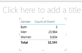
Expand the Medals table in Power View Fields and select the Gender and then the Event fields. From the FIELDS area, select the arrow button beside Event, and select Count (Not Blank). The table Power View creates looks like the following screen.
-
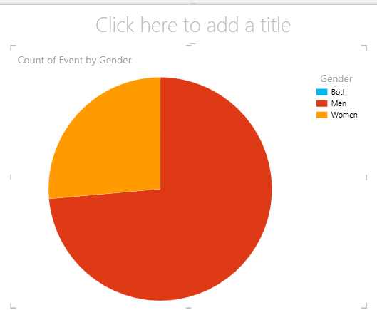
From the ribbon, select DESIGN > Switch Visualization > Other Chart > Pie Chart. Now your report looks like the following screen.
-
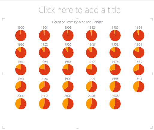
You decide it would be interesting to view the number of events by gender over time. One way to view that information is to use multiples. From the Medal table, drag Year to the VERTICAL MULTIPLES field. In order to view more multiples, remove the legend from the report by selecting LAYOUT > Legend > None from the ribbon.
-
Change the layout so the multiples grid shows six charts wide by six charts tall. With the chart selected, select LAYOUT > Grid Height > 6 and then LAYOUT > Grid Width > 6. Your screen now looks like the following screen.
-
The multiples chart type is interactive too. Hover over any pie chart, and information about that slice is displayed. Click any pie slice in the grid, and that selection is highlighted for each chart in the multiple. In the screen below the yellow slice (women) for 1952 was selected, and all other yellow slices are highlighted. When more charts are available than Power View can display in one screen, a vertical scroll bar is displayed along the right edge of the visualization.
Create Interactive Horizontal Multiples Charts
Horizontal charts behave similar to Vertical Multiple Charts.
-
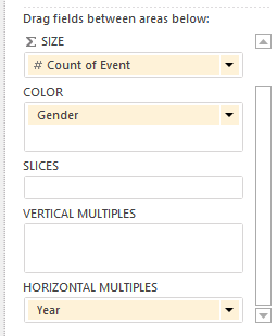
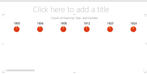
You want to change your Vertical Multiples Charts to Horizontal Verticals. To do so, drag the Year field from the VERTICAL MULTIPLES area into the HORIZONTAL MULTIPLES area, as shown in the following screen.
-
The Power View report visualization changes to a Horizontal Multiples Chart. Notice the scroll bar along the bottom of the visualization, shown in the following screen.
Create Multiples Line Charts
Creating line charts as multiples is easy, too. The following steps show you how to create multiple line charts based on the count of medals for each year.
-
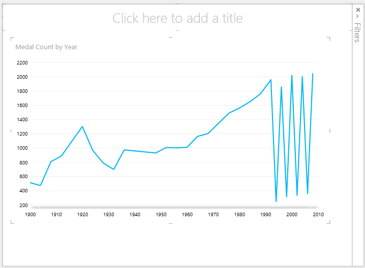
Create a new Power View sheet, and rename it Line Multiples. From Power View Fields, select Medal Count and Year from the Medals table. Change the visualization to a line chart by selecting DESIGN > Other Chart > Line. Now drag Year to the AXIS area. Your chart looks like the following screen.
-
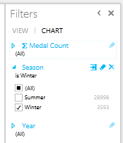
Let’s focus on Winter medals. In the Filters pane, select CHART, then drag Season from the Medals table into the Filters pane. Select Winter, as shown in the following screen.
-
To create the multiples line charts, drag NOC_CountryRegion from the Medals table into the VERTICAL MULTIPLES area. Your report now looks like the following screen.
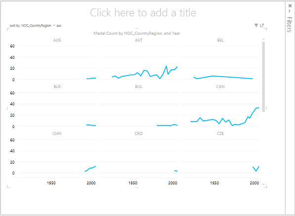
-
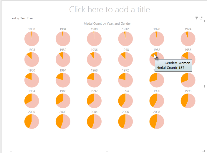
You can choose to arrange the multiple charts based on different fields, and in ascending or descending order, by clicking on the selections in the upper left corner of the visualization.
Build Interactive Reports using Cards and Tiles
Tiles and cards convert tables to a series of snapshots that visualize the data, laid out in card format, much like index cards. In the following steps, you use cards to visualize the number of medals awarded in various sports, and then, refine that visualization by tiling the results based on Edition.
Create Card Visualizations
-
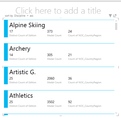
Create a new Power View Report, and rename it Cards. From Power View Fields, from the Disciplines table, select Discipline. From the Medals table, select Distinct Count of Edition, Medal Count, and NOC_CountryRegion. In the FIELDS area of Power View Fields, click the arrow next to NOC_CountryRegion, and select Count (Distinct).
-
In the ribbon, select DESIGN > Switch Visualization > Table > Card. Your table looks like the following screen.
-
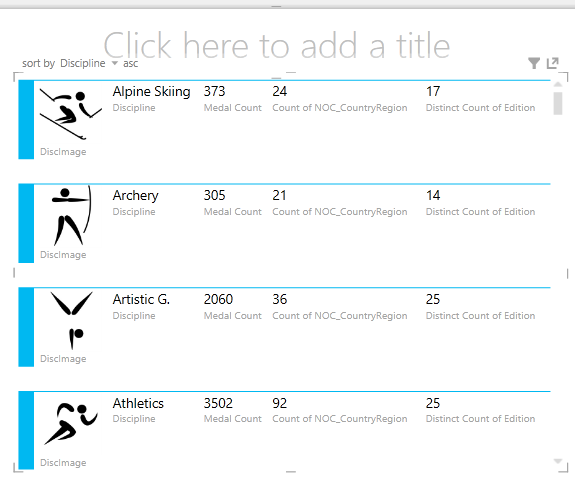
With the card visualization selected, select DiscImage from the DiscImage table. You may get a security warning that prompts you to click a button to Enable Content in order to get the images to display, as shown in the following screen.

-
In the FIELDS area, arrange the fields in the following order: DiscImage, Discipline, Medal Count, Count of NOC_CountryRegion, and last, Distinct Count of Edition. Your Cards now look similar to the following screen.
Use Tiles with Card Visualizations
-
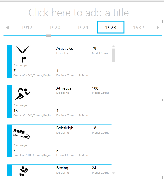
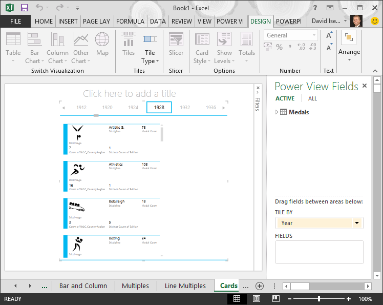
Reviewing these cards based on the year in which the medals were awarded is easy. In Power View Fields, from the Medals table, drag the Year field into the TILE BY area. Your visualization now looks like the following screen.
-
Now the cards are tiled by Year, but something else happened as well. The TILE BY field became a container, which at this point only contains the cards you created in the previous steps. We can add to that container, however, and see how using TILE BY can create interactive reports that coordinate the view of your data.
-
Click in the area beside the cards visualization, but still inside the TILE BY container. The Power View Fields pane changes to reflect that you are still in the TILE BY container, but you are not in the cards visualization. The following screen shows how this appears in the Power View Fields pane.
-
In Power View Fields, select ALL to show all available tables. From the Hosts table, select City, Season, NOC_CountryRegion, and FlagURL. Then from the ribbon, select DESIGN > Switch Visualization > Table > Card. You want the table you just created to fill up more of the available report space, so you decide to change the type of Card visualization. Select DESIGN > Options > Card Style > Callout. That’s better. Your report now looks like the following screen.
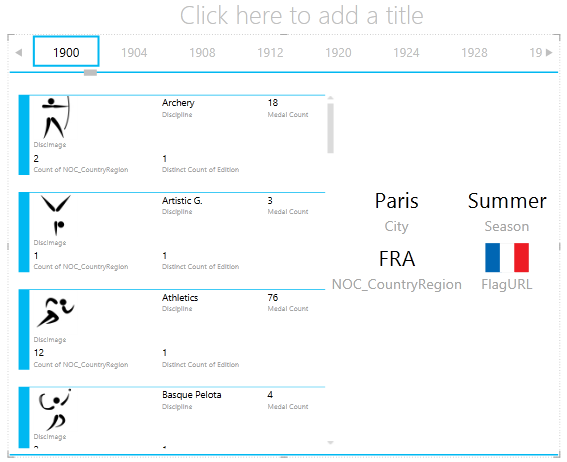
-
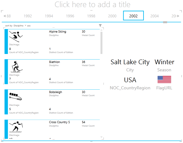
Notice how, when you select a different Year from the Tiles along the top of the TILE BY container, the callout card you just created is also synchronized with your selection. That’s because both card visualizations reside within the TILE BY container you created. When you scroll the TILE BY selection and select 2002, for example, your report looks like the following screen.
-
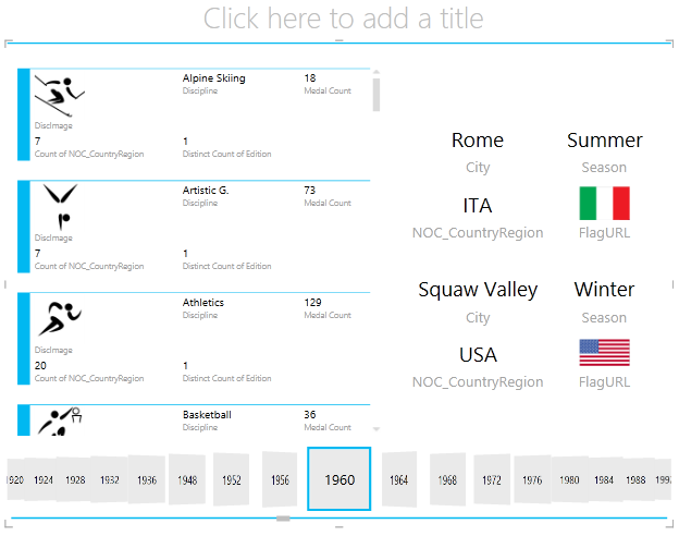
You can also change the way Power View tiles information. From the ribbon, select DESIGN > Tiles > Tile Type > Tile Flow. The tile visualizations changes, and Power View moves the tiles to the bottom of the tile container, as shown in the following screen.
As mentioned previously, when you publish these reports and make them available on SharePoint, these visualizations are just as interactive for anyone viewing them.
Create Scatter Charts and Bubble Charts with Time-based Play Visualizations
You can also create interactive charts that show changes over time. In this section you create Scatter Charts and Bubble Charts, and visualize the Olympics data in ways that will allow anyone viewing your Power View reports to interact with them in interesting and amazing ways.
Create a Scatter Chart and Bubble Chart
-
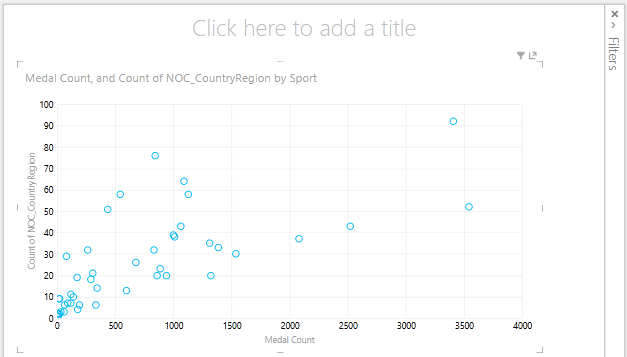
Create a new Power View report by selecting POWER VIEW > Insert > Power View from the ribbon. Rename the report Bubbles. From the Medals table, select Medal Count and NOC CountryRegion. In the FIELDS area, click the arrow beside NOC_CountryRegion and select Count (Distinct) to have it provide a count of country or region codes, rather than the codes themselves. Then from the Events table, select Sport.
-
Select DESIGN > Switch Visualization > Other Chart > Scatter to change the visualization to a scatter chart. Your report looks like the following screen.
-
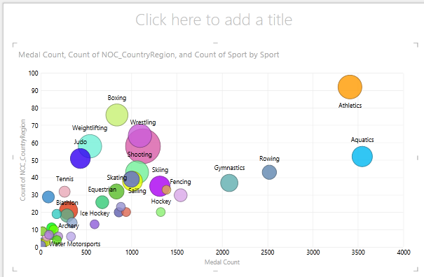
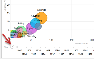
Next drag Event from the Events table into the SIZE area of Power View Fields. Your report becomes much more interesting, and now looks like the following screen.
-
Your scatter chart is now a bubble chart, and the size of the bubble is based on the number of medals awarded in each sport.
-
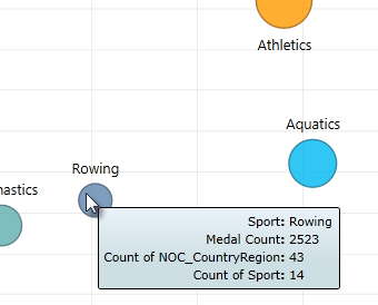
Your bubble chart is interactive too. When you hover over the Rowing bubble, Power View presents you with additional data about that sport, as shown in the following image.
Create Time-Based Play Visualizations
Many of the visualizations you create are based on events that happen over time. In the Olympics data set, it’s interesting to see how medals have been awarded throughout the years. The following steps show you how to create visualizations that play, or animate, based on time-based data.
-
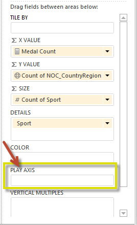
In the Scatter Chart you created in the previous steps, notice the PLAY AXIS area in Power View Fields, as shown in the following screen.
-
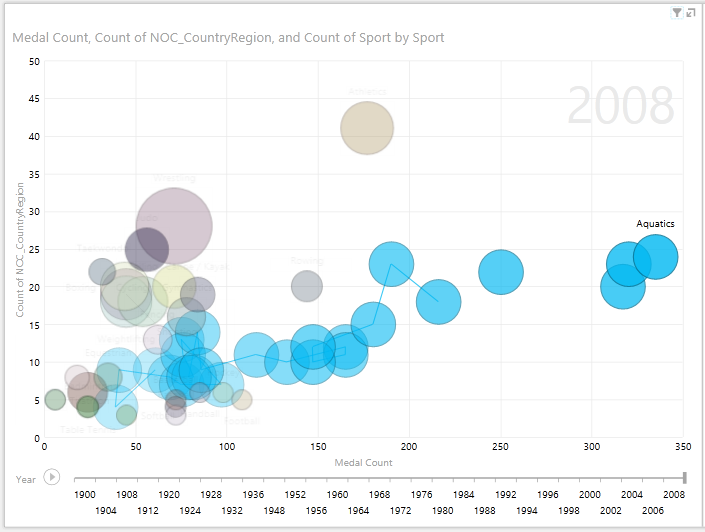
From the Medals table, drag Year to the PLAY AXIS area. Here comes the fun part. An axis is created along the bottom of the scatter chart visualization, and a PLAY icon appears beside it, as shown in the following screen. Press play.
-
Watch as the bubbles move, grow, and contract as the years move along the Play axis. You can also highlight a particular bubble, which in this case is a particular Sport, and clearly see how it changes as the Play axis progresses. A line follows its course, visually highlighting and tracking its data points as the axis moves forward.
-
Select Aquatics, then click Play. Aquatics is highlighted, and a watermark in the upper right corner of the report displays the Year (the PLAY axis) as the PLAY axis moves ahead. At the end, the path Aquatics has taken is highlighted in the visualization, while other sports are dimmed. The following screen shows the report when the Play axis completes.
-
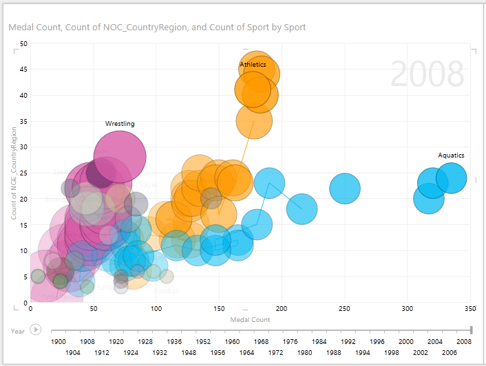
You can select more than one sport by holding the CTRL key and making multiple selections. Try it for yourself. In the following screen, three sports are selected: Wrestling, Athletics, and Aquatics.
-
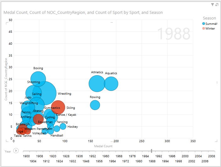
Lastly, you can filter Scatter charts just like any other visualization. There are a lot of colors, because there are a lot of sports in the data set. From the Medals table, drag Season into the COLOR area of Power View Fields. Now only two colors are used, one for each Season (Summer or Winter). The following screen shows this, but to see how cool this looks, watch the video at the end of this tutorial.
There are all sorts of amazing, compelling reports you can create with Power View. Each visualization brings a certain and distinct view onto your data. To provide even more compelling reports, you can combine different visualizations on a single report page, and make your data come alive.
Checkpoint and Quiz
Review What You’ve Learned
In this tutorial you learned how to create multiples charts, line charts, bubble charts, and scatter charts. You also learned how to tile your report, and how to create a container into which many reports can be included.
This tutorial rounds out the series on creating Power View reports.
Videos from the Olympics Data Set
Sometimes it’s nice to see these tasks in action. In this section you’ll find links to videos that were created using the Olympics data set. These videos are similar to the tutorials, but some of the workbooks, Power Pivot images, or Power View sheets might be slightly different.
Thank you! I hope you’ve enjoyed this tutorial series, and found it helpful in understanding how to make your own Power View reports. You can create amazing, immersive, and interactive reports with Power View, and share them using the Business Intelligence Portal on SharePoint.
Tutorials in this Series
The following list provides links to all tutorials in this series:
-
Extend Data Model relationships using Excel 2013, Power Pivot, and DAX
-
Incorporate Internet Data, and Set Power View Report Defaults
-
Create Amazing Power View Reports
QUIZ
Want to see how well you remember what you learned? Here’s your chance. The following quiz highlights features, capabilities, or requirements you learned about in this tutorial. At the bottom of the page, you’ll find the answers. Good luck!
Question 1: What is another name for the Multiples chart type?
A: Scrolling Charts.
B: Tuples Charts.
C: Trellis Charts.
D: Page Charts
Question 2: Which Area in Power View Fields lets you create a container, into which you could put multiple visualizations?
A: The COLUMNS area.
B: The SUMMARIZE area.
C: The TILE BY area.
D: The CONTAINER area.
Question 3: To create an animated visualization based on a field, such as a date field, which Power View Fields Area should you use?
A: The PLAY AXIS area.
B: The HORIZONTAL MULTIPLES area.
C: The ANIMATION area.
D: You can’t create visualizations that are that cool, can you?
Question 4: What happens on Multiples charts if there are more pie charts than what can fit on one screen?
A: Power View automatically begins scrolling through the pie charts.
B: Power View provides a scroll bar, allowing you to scroll through the other pie charts.
C: Power View creates a report for only as many pie charts that can be seen on the screen at once.
D: Power View automatically puts all pie charts on one screen, regardless of how many pie charts are required.
Quiz answers
-
Correct answer: C
-
Correct answer: C
-
Correct answer: A
-
Correct answer: B
Notes: Data and images in this tutorial series are based on the following:
-
Olympics Dataset from Guardian News & Media Ltd.
-
Flag images from CIA Factbook (cia.gov)
-
Population data from The World Bank (worldbank.org)
-
Olympic Sport Pictograms by Thadius856 and Parutakupiu


