When you want to add a trendline to a chart in Microsoft Graph, you can choose any of the six different trend/regression types. The type of data you have determines the type of trendline you should use.
Trendline reliability A trendline is most reliable when its R-squared value is at or near 1. When you fit a trendline to your data, Graph automatically calculates its R-squared value. If you want, you can display this value on your chart.
Linear
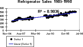
A linear trendline is a best-fit straight line that is used with simple linear data sets. Your data is linear if the pattern in its data points resembles a line. A linear trendline usually shows that something is increasing or decreasing at a steady rate.
In the following example, a linear trendline clearly shows that refrigerator sales have consistently risen over a 13-year period. Notice that the R-squared value is 0.9036, which is a good fit of the line to the data.
Logarithmic
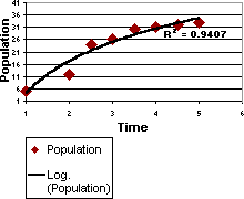
A logarithmic trendline is a best-fit curved line that is most useful when the rate of change in the data increases or decreases quickly and then levels out. A logarithmic trendline can use negative and/or positive values.
The following example uses a logarithmic trendline to illustrate predicted population growth of animals in a fixed-space area, where population leveled out as space for the animals decreased. Note that the R-squared value is 0.9407, which is a relatively good fit of the line to the data.
Polynomial
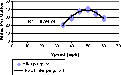
A polynomial trendline is a curved line that is used when data fluctuates. It is useful, for example, for analyzing gains and losses over a large data set. The order of the polynomial can be determined by the number of fluctuations in the data or by how many bends (hills and valleys) appear in the curve. An Order 2 polynomial trendline generally has only one hill or valley. Order 3 generally has one or two hills or valleys. Order 4 generally has up to three.
The following example shows an Order 2 polynomial trendline (one hill) to illustrate the relationship between speed and gasoline consumption. Notice that the R-squared value is 0.9474, which is a good fit of the line to the data.
Power
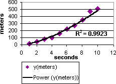
A power trendline is a curved line that is best used with data sets that compare measurements that increase at a specific rate — for example, the acceleration of a race car at one-second intervals. You cannot create a power trendline if your data contains zero or negative values.
In the following example, acceleration data is shown by plotting distance in meters by seconds. The power trendline clearly demonstrates the increasing acceleration. Note that the R-squared value is 0.9923, which is a nearly perfect fit of the line to the data.
Exponential
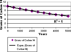
An exponential trendline is a curved line that is most useful when data values rise or fall at increasingly higher rates. You cannot create an exponential trendline if your data contains zero or negative values.
In the following example, an exponential trendline is used to illustrate the decreasing amount of carbon 14 in an object as it ages. Note that the R-squared value is 1, which means the line fits the data perfectly.
Moving average
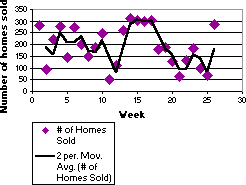
A moving average trendline smoothes out fluctuations in data to show a pattern or trend more clearly. A moving average trendline uses a specific number of data points (set by the Period option), averages them, and uses the average value as a point in the trendline. If Period is set to 2, for example, then the average of the first two data points is used as the first point in the moving average trendline. The average of the second and third data points is used as the second point in the trendline, and so on.
In the following example, a moving average trendline shows a pattern in number of homes sold over a 26-week period.
