Important: In Excel for Microsoft 365 and Excel 2021, Power View is removed on October 12, 2021. As an alternative, you can use the interactive visual experience provided by Power BI Desktop, which you can download for free. You can also easily Import Excel workbooks into Power BI Desktop.
In Power View in SharePoint 2013 and in Excel 2013, you can quickly create a variety of data visualizations, from tables and matrices to bar, column, and bubble charts, and sets of multiple charts. For every visualization you want to create, you start on a Power View sheet by creating a table, which you then easily convert to other visualizations, to find one best illustrates your data.
Create a visualization
-
Create a table on the Power View sheet by checking a table or field in the field list or dragging a field from the field list to the sheet. Power View draws the table on the sheet, displaying your actual data and automatically adding column headings.
-
Convert the table to a visualization by choosing a visualization type on the Design tab. Depending on the data in your table, different visualization types are available, to give you the best visualization for that data.
Tip: To create another visualization, start another table by clicking the blank sheet before selecting fields from the fields section of the field list.
In this article
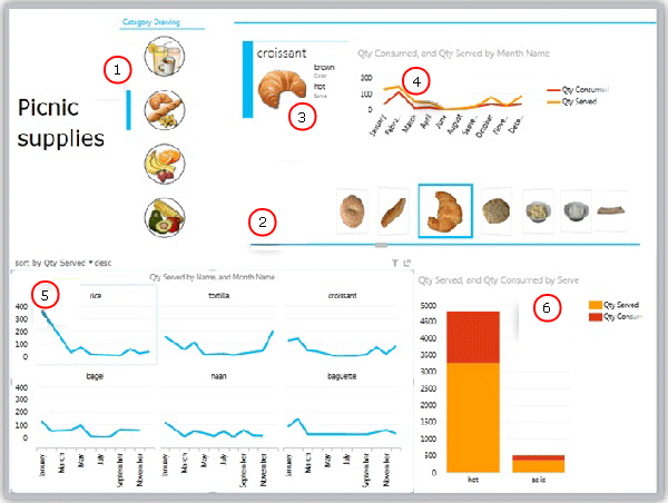
Examples of visualizations available in Power View
-
Slicer filtering the report to breads
-
Tile flow navigation for tiles, currently on croissant
-
Card in a tile container, filtered to the current tile (croissant)
-
Line chart in tile container showing quantities consumed and server, filtered to croissants January to December
-
Multiples, filtered to breads and sorted in descending order by quantity served
-
Column chart filtered to breads, showing quantities served and consumed
Charts
Power View offers a number of chart options: pie, column, bar, line, scatter, and bubble. Charts can have multiple numeric fields and multiple series. You have several design options in a chart—showing and hiding labels, legends, and titles.
Charts are interactive: As you click values in one chart, you:
-
Highlight that value in that chart.
-
Filter to that value in all the tables, matrices, and tiles in the report.
-
Highlight that value in all the other charts in the report.
Charts are interactive in a presentation setting, too—for example, in reading and full-screen modes in Power View in SharePoint or in a Power View sheet in an Excel workbook saved to Excel Services or viewed in Microsoft 365.
Pie charts
Pie charts are simple or sophisticated in Power View. You can make a pie chart that drills down when you double-click a slice, or a pie chart that shows sub-slices within the larger color slices. You can cross-filter a pie chart with another chart. Say you click a bar in a bar chart. The part of the pie chart that applies to that bar is highlighted, and the rest of the pie is grayed. Read about pie charts in Power View.

Scatter and bubble charts
Scatter and bubble charts are a great way to display a lot of related data in one chart. In scatter charts, the x-axis displays one numeric field and the y-axis displays another, making it easy to see the relationship between the two values for all the items in the chart.
In a bubble chart, a third numeric field controls the size of the data points. You can add a “play” axis to a scatter or bubble chart, too, to view data as it changes over time.
More about Bubble and scatter charts in Power View.
Line, bar, and column charts
Line, bar and column charts are useful for comparing data points in one or more data series. In line, bar, and column charts, the x-axis displays one field and the y-axis displays another, making it easy to see the relationship between the two values for all the items in the chart.
Bar charts
In a bar chart, categories are organized along the vertical axis and values along the horizontal axis. Consider using a bar chart in any of these cases:
-
You have one or more data series that you want to plot.
-
Your data contains positive, negative, and zero (0) values.
-
You want to compare the data for numerous categories.
-
The axis labels are long.
In Power View, you have three bar chart subtypes to choose from: stacked, 100% stacked, and clustered.
Column charts
Data that is arranged in columns or rows on a worksheet can be plotted in a column chart. Column charts are useful for showing data changes over a period of time or for illustrating comparisons among items. In column charts, categories are along the horizontal axis and values along the vertical axis.
In Power View, you have three column chart subtypes to choose from: stacked, 100% stacked, and clustered.
Line charts
Line charts distribute category data evenly along a horizontal (category) axis, and all numerical value data along a vertical (value) axis.
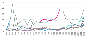
Consider using a line chart with time scale along the horizontal axis. Line charts display dates in chronological order at specific intervals or base units, such as the number of days, months, or years, even if the dates on the worksheet are not in order or in the same base units.
Create a line chart in Power View.
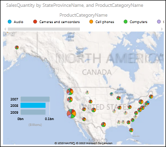
Maps
Maps in Power View use Bing map tiles, so you can zoom and pan as you would with any other Bing map. Adding locations and fields places dots on the map. The bigger the value, the bigger the dot. When you add a multi-value series, you get pie charts on the map, with the size of the pie chart showing the size of the total. Read more about maps in Power View.
Multiples: A set of charts with the same axes
With multiples, you can create a series of charts with identical X and Y axes and arrange them side by side – which makes it easy to compare many different values at the same time. Multiples are sometimes called “trellis charts.”
Matrices
A matrix is similar to a table in that it is made up of rows and columns. But a matrix has the following capabilities that a table does not:
-
Display data without repeating values.
-
Display totals and subtotals by row and column
-
With a hierarchy, you can drill up/drill down
-
Collapse and expand the display
Read more about Working with a matrix in Power View
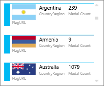
Cards
You can convert a table to a series of cards that display the data from each row in the table laid out in a card format, like an index card.
Tiles
You can convert a table or matrix to tiles to present tabular data interactively. Tiles are containers with a dynamic navigation strip. Tiles act as filters – they filter the content inside the tile to the value selected in the tab strip. You can add more than one visualization to the tile, and all are filtered by the same value. You can use text or images as the tabs. Read more about Tiles in Power View.
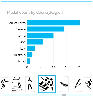
This image shows number of medals won by countries competing in speed skating.