
Update the data in an existing chart
If you need to change data in a chart, you can do it from its source.

Try it!
Changes you make will instantly show up in the chart. Right-click the item you want to change and input the data--or type a new heading--and press Enter to display it in the chart.
To hide a category in the chart, right-click the chart and choose Select Data. Deselect the item in the list and select OK.
To display a hidden item on the chart, right-click and Select Data and reselect it in the list, then choose OK.
Try it!
You can update the data in a chart in Word, PowerPoint for macOS, and Excel by making updates in the original Excel sheet.
Access the original data sheet from Word or PowerPoint for macOS
Charts that display in Word or PowerPoint for macOS originate in Excel. When you edit the data in the Excel sheet, the changes display in the chart in Word or PowerPoint for macOS.
Word
-
Select View > Print Layout.
-
Select the chart.
-
Select Chart Design > Edit Data in Excel.
Excel opens and displays the data table for the chart.
PowerPoint for macOS
-
Select the chart.
-
Select Chart Design > Edit Data in Excel.
Excel opens and displays the data table for the chart.
Edit data in a chart
-
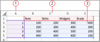
Select the original data table on the Excel sheet.
Notes: Excel highlights the data table that is used for the chart.
-
The gray fill indicates a row or column used for the category axis.
-
The red fill indicates a row or column that contains data series labels.
-
The blue fill indicates data points plotted in the chart.
-
-
Make changes.
Change the number of rows and columns in the chart-rest the pointer on the lower-right corner of the selected data and drag to select to increase or decrease the desired data.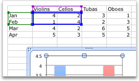
Add or edit in a cell- select the cell and make the change.
Change which chart axis is emphasized
You can change the way that table rows and columns are plotted in a chart. A chart plots the rows of data from the table on the chart's vertical (value) axis and the columns of data on the horizontal (category) axis. You can reverse the way the chart is plotted.
Example:

Emphasizing sales by instrument
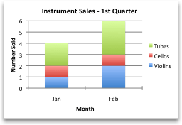
Emphasizing sales by the month
-
Select the chart.
-
Select Chart Design > Switch Row/Column.
Change the order of the data series
You can change the order of a data series in a chart with more than one data series.
-
In the chart, select a data series. For example, in a column chart, click a column, and all the columns of that data series become selected.
-
Select Chart Design > Select Data.
-
In the Select Data Source dialog box, next to Legend entries (Series), use the up and down arrows to move the series up or down in the list.
Depending on the chart type, some options may not be available.
Note: For most chart types, changing the order of the data series affects both the legend and the chart itself.
-
Select OK.
Change the fill color of the data series
-
In the chart, select a data series. For example, in a column chart, click a column, and all the columns of that data series become selected.
-
Select Format.
-
Under Chart Element Styles, select Shape Fill

Add data labels
You can add labels to show the data point values from the Excel sheet in the chart.
-
Select the chart, and then select Chart Design.
-
Select Add Chart Element > Data Labels.
-
Select the location for the data label (for example, select Outside End).
Depending on the chart type, some options may not be available.
Add a data table
-
Select the chart., and then click the tab.
-
Select Chart Design > Add Chart Element > Data Table.
-
Select the options.
Depending on the chart type, some options may not be available.
See Also


Need more help?
Want more options?
Explore subscription benefits, browse training courses, learn how to secure your device, and more.


Communities help you ask and answer questions, give feedback, and hear from experts with rich knowledge.


