
You can use the new OpenType features in Microsoft Word 2010 with a font that supports these features to make your document look professionally printed.
The OpenType features include ligatures, number spacing options, number form options, and stylistic sets.
In this article
Apply OpenType features
-
On the Home tab, click the Font Dialog Box Launcher.
-
Click the Advanced tab.
-
Under OpenType Features, select the options that you want.
OpenType features
When font designers create fonts, they often add designs for special features. Selected OpenType fonts include some or all of the features below, and you can check with the font provider for details. With those fonts, these features are available for you to apply to your text for to make it more polished and easier to read.
For example, the fonts in the Microsoft ClearType Collection – Calibri, Cambria, Candara, Consolas, Constantia, and Corbel – contain various OpenType including small caps, ligatures, number forms, and number spacing. Gabriola, a newer font originally released with Windows 7, includes even richer OpenType feature support, including extensive use of stylistic sets.
Ligature options
A ligature is a combination of characters that is written as a glyph, which is written as though it is a single character. Most often, ligatures are made up of pairs of letters. The OpenType standard specifies four categories of ligatures, but the font designer decides which to support and in which group to put any given combination of characters. The descriptions below are guidelines about each type of ligature that might be used.
Standard Only The standard set of ligatures varies by language, but it contains the ligatures that most typographers and font designers agree are appropriate for that language. For example, in English, the common ligatures are related to the letter “f” and are seen in the phrase “five spiffy flowers.”
Standard and Contextual Contextual ligatures are ones that the font designer believes are appropriate for use with that font, but they are not standard. The combination of standard and contextual ligatures gives you the set of ligatures that the font designer thought appropriate for common usage.
Historical and Discretionary Historical forms are ligatures that were once standard but are no longer commonly used in the language. They can be used for a “period” effect. Discretionary ligatures are those that the font designer included for specific purposes. In general, you are more likely to want to apply historical or discretionary ligatures to just a portion of your text. In English, the phrase “check your fast facts on Fiji Islands” can show you some of the historical ligatures.
All All ligature combinations that are available for a font are applied to the text.
Number spacing options
Default The default number spacing is specified by the font designer of each font.
Proportional Numbers are spaced more like letters, with varying widths. For example, an 8 is wider than a 1. This spacing is easier to read in text. Candara, Constantia, and Corbel are three of the Microsoft fonts that use proportional spacing by default.
Tabular Each number has the same width. This means that in a table column, for example, all three-digit numbers will align. Tabular spacing is also useful for math. Cambria, Calibri, and Consolas are three of the Microsoft OpenType fonts with tabular spacing by default.
Number form options
Default The default number form is specified by the font designer of each font.
Lining Lining numbers all have the same height, and they don’t extend below the baseline of the text. Lining numbers are easier to read in tables, boxes, or forms. Cambria, Calibria, and Consolas are three of the Microsoft OpenType fonts that are set to Lining numbers by default.
Old-style In Old-style numbering, the lines of the characters flow above or below the line of the text (which makes the numbers easier to read). For example, some numbers, such as 3 and 5, extend below the baseline or are centered higher on the line. Candara, Constantia, and Corbel are three of the Microsoft OpenType fonts that are set to Old-style numbering by default.
Stylistic set options
You can change the look of your text by applying a different stylistic set to your text. A font designer may include up to 20 stylistic sets in a given font, and each stylistic set may include any subset of the characters of the font.
For example, if your text is formatted as Gabriola, you can choose between 7 stylistic sets, each of which changes the formatting of each of the characters in your text.
When a stylistic set contains other features, such as contextual alternates, those features are activated as part of selecting that stylistic set.
When you click the number of a set in the Stylistic sets list, the Preview box shows you how the text will look.
Default The default stylistic set is specified by the font designer of each font.
1-20 The stylistic sets are provided by the font designer. Not all fonts offer a variety of stylistic sets.
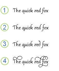
Text in the Gabriola font, with the default stylistic set applied
The same text, with stylistic set 4 applied
The same text, with stylistic set 5 applied
The same text, with stylistic set 6 applied
Use contextual alternates
Select this check box to provide fine-tuning of letters or combinations of letters based on the surrounding characters. You can use this feature to provide script that looks more natural and flowing. You can also use contextual alternates to provide specific letter forms at the start or end of words, next to punctuation, or even at the end of paragraphs.
Some fonts include contextual alternates for whole words, such as of and the.
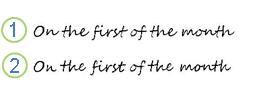
Text in the Segoe Script font
The same text, with contextual alternates applied. The difference is subtle. You can see it in the shape of the letter h.
Note: Word 2010 does not support contextual alternates for the end of a line that is followed by an automatic page break.


