
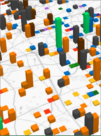
When you open 3D Maps for a new set of data, it detects the geography in your data and plots a clustered column chart by default.

Switch between clustered and stacked columns
-
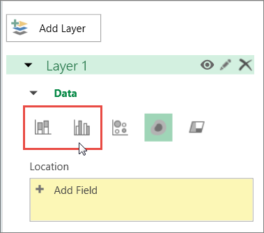
Click Home > Layer Pane.

-
In the Layer Pane tab, for the layer that you want to change, click Stacked Column or Clustered Column.
Notes:
-
You can drag additional fields into the Height or Category boxes, or check the fields, and 3D Maps puts your field in the appropriate box.
-
If you drag a field only to the Category box and leave the Height box blank, 3D Maps automatically adds that same field to Height and draws a chart that represents the count of each category.
-
More about stacked and clustered columns
Use stacked columns when you have multiple data series and you want to emphasize the total. For example, if you want to plot all of the different kinds of show tickets (Day, Evening, Full Price, Discounted, Member, Nonmember) by ZIP code.
Use clustered columns to compare data across both categories and data series. For example, if you have entries like Strongly Agree, Agree, Neutral, Disagree, and Strongly Disagree, by customer segment.


