
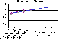
Trendlines are used to graphically display trends in data and to analyze problems of prediction. Such analysis is also called regression analysis. By using regression analysis, you can extend a trendline in a chart beyond the actual data to predict future values. For example, the following chart uses a simple linear trendline that is forecast ahead four quarters to clearly show a trend toward rising revenue:
Moving Average You can also create a moving average, which smoothes out fluctuations in data and shows the pattern or trend more clearly.
Chart types that support trendlines You can add trendlines to data series in unstacked 2-D area, bar, column, line, stock, xy (scatter), and bubble charts. You cannot add trendlines to data series in 3-D, stacked, radar, pie, surface, or doughnut charts. If you change a chart or data series so that it can no longer support the associated trendline — for example, by changing the chart type to a 3-D chart — you lose the trendlines.
More information
Choosing the best trendline for your data


