All Microsoft Office InfoPath forms that users fill out are based on an underlying form template. The form template determines how the resulting form looks and behaves.
When filling out forms, users enter information by typing in text boxes, clicking items in a list, selecting check boxes, and performing other actions. The graphical user interface objects that users interact with are called controls. You use controls to display data or choices, perform an action, or help make the form's user interface easier to read.
In addition to standard controls, such as text boxes and list boxes, InfoPath includes a number of new controls, such as repeating tables, choice groups, and optional sections. These types of controls let you design a flexible form template that accommodates your users. For example, in an expense report form template, you can use a repeating table to allow users to enter only as many expense items as they need.
Information that users enter into a control is stored in the form's data source. When you design a form template, you typically use the Controls task pane to insert controls, although you can also insert controls by dragging fields and groups from the Data Source task pane onto the form template.
You can customize a control's appearance, including the font, color, and alignment of text inside the control, the control's default value and data type, and other properties, such as the ScreenTip that appears when a user rests the mouse pointer on the control. You can also customize a control's behavior, such as its ability to filter information or respond to rules.
Tip: To view the properties for a control, double-click the control on the form template.
In this article
Controls and the data source
Almost all of the controls on an InfoPath form are associated with, or bound to, the form template's data source. Most controls, including text boxes, check boxes, and list boxes, are bound to fields in the data source. If a control is not bound to the data source, or if it is bound incorrectly, the information that is entered into that control cannot be saved properly in the underlying form (.xml) file.
When you design an InfoPath form template, you can choose to have the fields in the data source created automatically each time you insert a control, or you can manually bind each control to an existing field yourself.
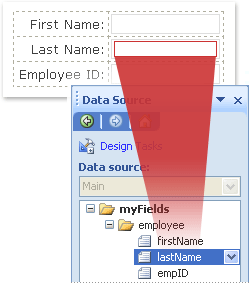
In the following example, the form designer inserted a Last Name text box on the form template. The text box is bound to the lastName field in the form template's data source.
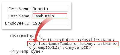
When filling out a form based on this form template, the user enters his or her name in the Last Name text box. InfoPath saves that data as Extensible Markup Language (XML), as shown in the following image.
Together, the type of control and its associated field determine the type of information that users can enter into the control, as well as how users can enter that information. For example, if you have a date picker control on your form template that is bound to a field with a date data type, then users can enter only dates into that control. If they try to enter other data, such as their name or address, into that control, InfoPath will show a data validation error.
Note: In addition to the main data source for your form template, you can create data connections to XML documents, databases, Web services, and Microsoft Windows SharePoint Services libraries and lists. These data connections result in secondary data sources that can be used to populate list boxes and provide the values for text boxes and other controls.
Ways to insert controls on a form template
When designing a form template, you can use the Controls task pane to insert controls. You can choose to create the form template's data source automatically when you insert a control, in which case a field or group will be automatically created in the data source for each control that you add. Alternatively, you can choose to bind each control to an existing field or group in the form template's data source. If you choose this option, you are prompted to select a field or group from the data source when you insert a control.
Tip: To switch between automatically creating the data source and binding the controls to an existing field or group, use the Automatically create data source check box in the Controls task pane.
You can also insert controls by dragging fields and groups from the Data Source task pane onto your form template. Each time that you drag a field or group onto your form template, InfoPath suggests the control that best matches the field or group. For example, if the field has a date data type, InfoPath suggests a date picker.
Types of controls
The Controls task pane includes more than 30 different controls that you can add to your form template. These controls can be grouped in the following categories:
-
Standard controls
-
Repeating and optional controls
-
File and picture controls
-
Advanced controls
-
Custom controls
The following tables describe the purpose of each control.
Standard controls
Standard controls include the controls that you typically associate with collecting and displaying information. These controls include text boxes, list boxes, check boxes, and buttons.
|
Control |
Icon |
Description |
|
Text box |
|
The most commonly used control on a form. Users can enter any type of unformatted text into a text box, such as sentences, names, numbers, dates, and times. Text boxes cannot contain formatted text. |
|
Rich text box |
|
A control that can contain formatted text, including bold and italic text, and a variety of fonts, font sizes, and font colors. In addition, users can insert images, lists, and tables into a rich text box. |
|
Drop-down list box |
|
A control that presents users with a list of choices in a box. To select an item from the list, users click an arrow to open the list of choices. The choices can come from a list that you create manually, from values in the form's data source, or from values that come from a data connection to an XML document, database, Web service, or SharePoint library or list. |
|
Combo box |
|
A control that presents users with a list of choices in a box from which users select the appropriate item or type their own. The choices can come from a list that you create manually, from values in the form's data source, or from values that come from a data connection to an XML document, database, Web service, or SharePoint library or list. |
|
List box |
|
A control that presents users with a list of choices in a box from which users select the appropriate item. The choices can come from a list that you create manually, from values in the form's data source, or from values that come from a data connection to an XML document, database, Web service, or SharePoint library or list. |
|
Date picker |
|
A control that contains a box where users can type dates and a calendar button that allows users to select a date. |
|
Check box |
|
A control that allows users to set yes/no or true/false values by adding or removing a check mark from a small square box. |
|
Option button |
|
A control that lets users select from a set of mutually exclusive choices. When one option button in a group is selected, the other option buttons are cleared. A group of option buttons is bound to one field in the data source, and each option button saves a different value in that field. |
|
Button |
|
A control that can be used to submit a form or query a database, among other things. You can also associate a button with rules or custom code that runs when users click the button. |
|
Section |
|
A control that is a container for other controls. Sections can include any of the controls listed in the Controls task pane, including other sections. |


Repeating and optional controls
Repeating and optional controls include list controls, repeating tables, repeating sections, and optional sections. These controls allow users to insert list items, rows, record sets, and optional information when filling out a form.
|
Control |
Icon |
Description |
|
Optional section |
|
A control that is a container for other controls and is useful for including extra information that is not necessary for all users to fill out. When filling out a form that includes an optional section, users can choose whether to include the optional section on the form. |
|
Repeating section |
|
A control that is a container for other controls and is useful for presenting record-based data, such as employee database records. When filling out the form that includes a repeating section, users can add additional occurrences of the repeating section. |
|
Repeating table |
|
A control that displays repeating information in a tabular structure. Each item appears in a new row in the repeating table. When filling out a form, users can add or delete rows in a repeating table as necessary. Repeating tables can contain other controls. |
|
Horizontal repeating table |
|
A control that displays repeating information in a tabular structure. Each item appears in a new column in the repeating table. When filling out a form, users can add or delete columns in a repeating table as necessary. Horizontal repeating tables can contain other controls. |
|
Master/detail |
|
A control that is actually a set of repeating controls that are directly related to one another. The master control is always a repeating table, and the detail control can be either a repeating table or a repeating section. Master/detail controls help users work more efficiently with large amounts of data. For example, if your form template displays employee database records, you can specify that only a subset of information about each employee should appear in the master control. Then, when a user selects a record (row) in the master control, the detail control can display more detailed information about the employee. |
|
Bulleted list |
|
A control that allows users to add or delete bulleted list items in the form as necessary. Bulleted list controls are a good way to include simple text that repeats, such as a list of action items in a meeting agenda form template. |
|
Numbered list |
|
A control that allows users to add or delete numbered list items in a form as necessary. Numbered list controls are a good way to include simple text that repeats and indicates some sort of order, such as a list of agenda items in a meeting agenda form template. |
|
Plain list |
|
A control that allows users to add or delete list items in a form as necessary. Plain list controls are a good way to include simple text that repeats, such as a list of attendee names in a meeting request form template. |
|
Multiple-selection list box |
|
A control that presents the user with a list of choices that appear as a scrollable list of check boxes. Users can select as many check boxes as necessary, and may even be able to add custom entries, depending on how the form template is designed. |


File and picture controls
You can design your form template so that users can insert file attachments or pictures when they fill out forms that are based on your form template. In addition, users who fill out InfoPath forms on a Tablet PC benefit from a special ink picture control that lets them create and save ink drawings.
|
Control |
Icon |
Description |
|
File attachment |
|
A control that allows users to attach files to their forms. Each file attachment control permits one file to be attached, and you can restrict the file type, if necessary. If your users want to attach multiple files, you can insert the file attachment control inside a repeating control. |
|
Picture |
|
A control that can be included on a form template as a static element, such as a title or a background, or can allow users to insert a picture as part of the form. Picture controls can store the image on the form itself or store an address (URL) that points to the saved location of the picture. |
|
Ink picture |
|
A control that allows users with a Tablet PC to add ink drawings to their forms, either within the control itself or on top of a background picture. |


Advanced controls
Advanced controls are controls that may be used less frequently than standard controls or only in special circumstances.
|
Control |
Icon |
Description |
|
Hyperlink |
|
A control that can be used to link to a URL. For example, a form template that shows information about a list of products can include hyperlinks to product information Web pages. Hyperlink controls can point to any Web server on either an intranet or the Internet. |
|
Expression box |
|
A read-only text control. You can use expression boxes to display read-only text, display the value of another control on the form, or create formulas based on XPath expressions. |
|
Vertical label |
|
A read-only text label that appears at a 90-degree angle on your form template. Vertical labels are often used as column headings in repeating tables. |
|
Scrolling region |
|
A control that contains other controls, retains a fixed size, and includes scroll bars so that users can scroll to see information that is out of view. Scrolling regions are particularly useful when a section of a form contains a lot of data, and users do not need to see it all at once. |
|
Horizontal region |
|
A control that contains other controls and that can be used to place other controls side-by-side on a form template. |
|
Choice group |
|
A control that contains two or more choice sections that in turn contain other controls. Each choice section in a choice group serves as a single option in a set of mutually exclusive choices. When filling out a form, users can replace the default choice section with a different choice section. For example, on a job application form template, you can use a choice group to allow users to enter either a home phone number or a work phone number for their references. |
|
Repeating choice group |
|
A control that displays two or more choice sections in a repeating structure. When filling out a form, users can add, delete, or replace additional repeating choice groups, as necessary. For example, on an employee information form template, you can use a repeating choice group to let users enter multiple emergency contacts. For each contact, the user can replace home address information with work address information. |
|
Choice section |
|
A control that contains other controls and that should always appear inside choice groups or repeating choice groups. Choice sections are useful when you need to add more choices to an existing choice group. If you insert a choice section anywhere other than in a choice group, InfoPath automatically inserts the choice section inside a new choice group. |
|
Repeating recursive section |
|
A control that contains other controls and can be inserted within itself. You can use repeating recursive sections to create hierarchical content, such as an outline. |


Custom controls
You can use the Add Custom Control Wizard to make custom controls, including Microsoft ActiveX controls and template parts, available in InfoPath. A custom control is one that is not included in InfoPath by default.
|
Control |
Description |
|
Template part |
A customized set of controls that includes layout, property settings, and some aspects of control behavior, which can be saved for reuse in multiple form templates. After creating a template part, you use the Add Custom Control Wizard to import the template part into design mode so that you can use it in your form template. |
|
ActiveX control |
A control that isn't included in InfoPath but that can be added to the Controls task pane. You can choose from existing ActiveX controls that are registered on your computer, or you can use custom controls that you develop to meet your specific business needs. For example, if you are developing form templates for use in a financial setting, you can develop an ActiveX control that allows stock ticker information to be displayed on a form template. After creating or locating an ActiveX control, you use the Add Custom Control Wizard to import the control into design mode so that you can use it in your form template. |
Compatibility Considerations
When you design a form template in InfoPath, you can choose a specific compatibility mode to design a browser-compatible form template. When a browser-compatible form template is published to a server running InfoPath Forms Services, and then browser-enabled, forms based on the form template can be viewed in a Web browser. When you design a browser-compatible form template, some controls are unavailable in the Controls task pane because they cannot be displayed in a Web browser. The following controls are not supported in browser-compatible form templates:
-
Combo box
-
Multiple-selection list boxes
-
Master/detail controls
-
Bulleted, numbered, and plain list controls
-
Picture and ink picture controls
-
Ink picture controls
-
Vertical labels
-
Scrolling regions
-
Horizontal regions
-
Horizontal repeating tables
-
Choice group, repeating choice group, and choice section controls
-
Repeating recursive sections
-
ActiveX controls
You can also choose to design Microsoft Office InfoPath 2007 form templates that are compatible with Microsoft Office InfoPath 2003. In backward-compatible form templates, combo boxes and multiple-selection list boxes are not supported. When users open the form template in InfoPath 2003, combo boxes appear as drop-down list boxes, and multiple-selection list boxes appear as bulleted lists.
If you have a particular part of a form template that you want to reuse in other form templates, you can design a template part. A typical template part consists of controls and a data source and may also include features such as data connections, data validation, and rules. In template parts, ActiveX controls are not supported and are consequently hidden in the Controls task pane. In addition, if you design a browser-compatible template part, you have access to fewer controls and features than you would if you were designing the template part solely for use in InfoPath.
Remove a control from a form template
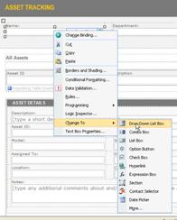
To remove a control from a form template, you select the control and then press the DELETE key. When you remove a control, the field that is bound to that control remains in the data source. However, a form that is based on this form template will not show the data stored in this field. To display the data, you bind a control to the field.
If you want to bind a different control to the field, instead of deleting the control, you can change the control to a different type. You do this by right-clicking the control, clicking Change To, and then clicking one of the choices on the menu. The menu displays only the types of controls that can be bound to this type of field.