
PerformancePoint Services in Microsoft SharePoint Server 2010 enables dashboard authors and users to easily view and use a variety of report types, including analytic charts and grids, Excel Services reports, strategy maps, and many others.
Read this article to get an overview of the different kinds of reports that you might use in your PerformancePoint dashboard.
In this article
Analytic charts and grids
Analytic charts and grids are used to display information in highly interactive charts and tables (known as grids). These reports enable dashboard users to quickly and easily explore complex data without having to write queries.
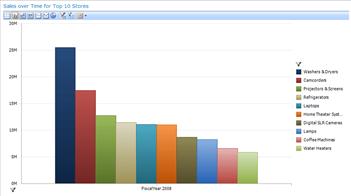
An analytic chart might resemble a bar chart, as shown in the following image:
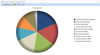
Or, an analytic chart might resemble a pie chart, as shown in the following image:
Analytic charts and grids use data that is stored in SQL Server Analysis Services. These reports display information that is continuously up to date, and they are highly interactive. Using your mouse, you can typically do all of the following in analytic charts and grids:
-
Drill down or up to see lower or higher levels of detail.
-
Sort items in ascending or descending order.
-
Filter out empty rows or columns, isolate an item, or remove an item from the report view.
-
Apply top or bottom members in a group.
-
Apply value filters, such as items greater than or less than an amount that you specify.
-
Pivot a grid, or change a grid to an analytic chart.
-
Use Additional Actions, which are defined in the Analysis Services cube.
-
Show or hide information that is included in the chart or grid.
-
Work with pages of grid data (useful when a query returns a large set of results).
-
Launch a Decomposition Tree to view more information about a particular report value.
For more detailed information about analytic charts and grids, see Learn about analytic charts and grids and Create an analytic chart or grid by using PerformancePoint Dashboard Designer on TechNet.
Excel Services reports
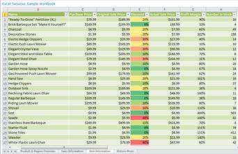
Excel Services reports are used to display Excel spreadsheets or items that are in an Excel workbook, such as PivotTable reports, PivotChart reports, or a section in a worksheet. An Excel Services report might resemble the following image:
Excel Services reports can use data that is stored in Analysis Services, a SharePoint List, a table in SQL Server, an Excel workbook, or in Excel Services.
Similar to scorecards and analytic charts and grids, Excel Services reports are typically highly interactive. Using your mouse, you can click to see lower levels of detail. You can export these reports to PowerPoint or Excel, and you can apply filters to them.
For more detailed information about Excel Services reports, see Create an Excel Services report by using Dashboard Designer on TechNet.
SQL Server Reporting Services reports
SQL Server Reporting Services reports are reports that have been published to Reporting Services. Reporting Services reports can resemble tables or charts, and they can include their own filters, which are sometimes called parameters.
Reporting Services reports are typically highly interactive. Depending on how the reports are configured, dashboard users can explore data by clicking, sorting, and scrolling through pages. In addition, users can do the following:
-
Preview, adjust, and print one or more pages in the report.
-
Apply one or more parameters without having to rerun a query to the database. Parameters are built-in filters that are specific to the report.
-
Export data as image files, Adobe PDF files, Web files, or other formats that Microsoft applications recognize.
For more detailed information about Reporting Services reports, see Overview of Reporting Services reports displayed in PerformancePoint Web Parts and Create a Reporting Services report by using Dashboard Designer on TechNet.
ProClarity Server reports
ProClarity Analytics Server Page reports, also called ProClarity Server reports, are reports that were created by using ProClarity Professional and then published to ProClarity Analytics Server.
ProClarity reports can include a variety of ProClarity views, pie charts, bar charts, line charts, grids, or a combination of a chart and grid in one report. ProClarity reports can also include specialized views, such as the Decomposition Tree, Perspective View, and Performance Map.
ProClarity reports use data that is stored in Analysis Services. ProClarity reports are highly interactive. Similar to analytic charts and grids, you can drill up or down to see higher or lower levels of detail, view the individual transactions that make up a particular value, and export a report to PowerPoint or Excel.
For more detailed information about ProClarity Server reports, see Overview of ProClarity Server reports displayed in PerformancePoint Web Parts and Create a ProClarity Server report by using Dashboard Designer on TechNet.
Web Page reports
Web Page reports are fully functional internal or external Web sites that are displayed in SharePoint Web Parts next to your other dashboard items. Web Page reports are useful for viewing publicly available information alongside other internal reports in a single dashboard.
For example, suppose that a sales team in a financial services organization is using a dashboard that contains a variety of reports that display sales and forecast data for the organization. Suppose further that the sales team must stay abreast of current events, such as breaking news or changes in the stock market. This type of information is typically available in external Web sites, not in internal reports. The external Web sites can be displayed in a dashboard along with the other dashboard items the sales team uses. That way, the sales team can view all the information they need in a single location.
For more detailed information about Web Page reports, see Create a Web Page report by using Dashboard Designer on TechNet.
Scorecards
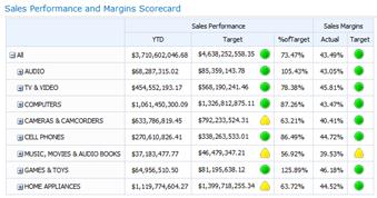
Scorecards are a kind of report that shows performance by comparing actual results to target values with graphical icons that are called indicators. A scorecard might resemble the following image:
PerformancePoint scorecards can use data that is stored in SQL Server Analysis Services, a SharePoint List, an Excel Services file, a table in SQL Server, or a list of values that is created by the scorecard author. In addition, scorecards serve as data sources for two other kinds of reports: Strategy Maps and KPI Details reports.
For more detailed information about scorecards, see the following resources:
-
Overview of PerformancePoint scorecards on TechNet
-
Create and configure a KPI by using Dashboard Designer on TechNet
-
Edit a scorecard by using Dashboard Designer on TechNet
Strategy Map
Strategy Maps are Microsoft Visio diagrams that are linked to scorecards to display various performance measures in an organization at a glance. A strategy map uses shapes in a Visio diagram to show the relationships between objectives. The shapes are connected to key performance indicators (KPIs) that are in a PerformancePoint scorecard, and colors to show how each objective is performing according to the scorecard KPIs.
Strategy maps have their roots in the Balanced Scorecard framework, which defines organizational performance by using four perspectives:
-
Financial perspective, which typically includes metrics such as revenue, cost, and profit.
-
Customer perspective, which typically includes metrics such as customer counts, market share, and number of complaints.
-
Internal process perspective, which typically includes metrics such as time to market for new products, service error rates, and quality control measures.
-
Learning and growth perspective, which typically includes metrics such as employee turnover rates, the number of new employees, and hiring data.
When you have a scorecard and a strategy map that use the same four perspectives described above in a single dashboard page, you have a Balanced Scorecard. However, you might see other types of strategy maps in your dashboards.
For more detailed information about strategy maps, see Learn about strategy maps and Create a strategy map by using PerformancePoint Dashboard Designer on TechNet.
KPI Details reports
KPI Details reports are used in conjunction with scorecards in a dashboard. KPI Details reports are used to show additional information about the KPIs and other items that are in a scorecard. A KPI Details report might resemble the following image:
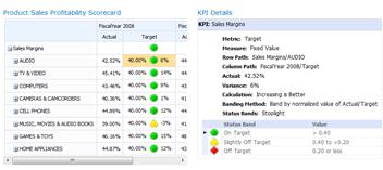
When you click in a cell in a scorecard, the KPI Details refreshes to display information, such as the calculation and banding methods that are used for each KPI.
A KPI Details must be connected to a scorecard in the dashboard. This means that a KPI Details report is not used in a dashboard without its accompanying scorecard on the same dashboard page.
Unlike most other report types in a dashboard, a KPI Details report is not interactive. The KPI Details report refreshes automatically to display information for a particular scorecard cell, but you cannot click items in it to see higher or lower levels of information and you cannot apply filters to it.
KPI Details reports are useful for understanding how performance is measured and what kinds of indicators are used in a scorecard.
For more detailed information about KPI Details reports, see Create a KPI Details report by using Dashboard Designer on TechNet.
Decomposition Tree
The Decomposition Tree is a view that you can open from a value in certain scorecards and analytic charts and grids. For more information, see Learn about the Decomposition Tree.


