
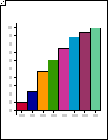
Use a 2-D bar graph to quickly compare data in a simple yet visually interesting way.
Create a 2-D bar graph
-
Start Visio.
-
In the Business category or template, click Charts and Graphs or Marketing Charts and Diagrams.
-
From Charting Shapes, drag a Bar graph 1 or Bar graph 2 shape onto the drawing page.
-
Select the number of bars you want (from 1 to 12), and then click OK.
-
To add a title to the graph, from Charting Shapes, drag a Text block shape onto the page. With the shape selected, type a title.
Notes:
-
In the Bar graph 1 shape, bars represent numerical quantities. In the Bar graph 2 shape, bars represent percentages.
-
If you need more than 12 bars in your graph, place two or more bar graph shapes side by side.
-
Change the number of bars
-
Right-click the bar graph shape and click Set Number of Bars.
-
Click the Number of Bars arrow and select from 1 to 12 bars.
Note: If you need more than 12 bars in your graph, position two or more bar graph shapes side by side.
Set the width and height of the bars
-
Click the bar graph to select it.
-
Drag the control handle at the bottom right corner of the first bar, until the bars are the width you want.
-
Drag the control handle at the top left corner on the left side of the bar graph, until the tallest bar is the height you want.
Tip: To see a tip about a control handle for a selected shape, pause the pointer over the control handle.
Set the color for each bar
-
Select the bar graph, and then click an individual bar to subselect it.
-
On the Home tab, in the Shape Styles group, click Fill, and then select the color you want.
Add value and name labels
-
From Charting Shapes, drag the Y-axis label shape onto the drawing page. Line it up at the x- and y-axis origin, so that its horizontal line is flush with the x-axis.
Tip: To zoom in, hold down CTRL+SHIFT and click the graph.
-
With the Y-axis label shape selected, press CTRL+D to create a copy. Position the second label toward the top of the y-axis, so that its horizontal line is flush with the highest value.
Tip: To nudge a shape into position, select the shape and then press the arrow key that represents the direction you want.
-
Repeat to create labels for additional values along the y-axis.
-
Select each label shape, and then type the value or name that corresponds to the shape's position on the axis.
-
Repeat steps 2 through 4 using X-axis label shapes, positioning them along the x-axis.


