By Robert Lane
Why do some color combinations work so well in your presentations, and why do other color combinations make your presentations difficult to watch? PowerPoint expert Robert Lane explains how to combine colors to make effective and professional-looking slides.
With PowerPoint You have all the Tools but ...
Newer versions of PowerPoint have marvelous tools for helping even the “artistically challenged” among us get beyond bullet points and create effective, graphically appealing, downright professional-looking visual slides. That’s fantastic! Now the question is … how should we use those tools? Most of us have never been trained as graphic artists and don’t necessarily know the rules for making visually attractive and meaningful content.
Because the discussion of “effective visual communication” might fill an entire book, let’s narrow the focus here to concentrate solely on the use of color in PowerPoint. What are good, and not so good, ways of using color on slides?
Color Groups
One way to approach colors is to classify them into two broad groups: warm and cool colors (Figure 1). Reds, oranges, and yellows are referred to as warm colors. They tend to pop out and attract attention—especially a bright red. Greens, blues, and purples are cool colors. They tend to recede into the background and draw less attention, especially darker shades. White and very light colors also catch the eye, whereas black and very dark colors generally are less noticeable.
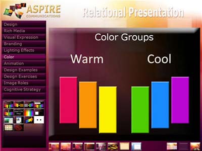
Figure 1 – Color Groups
Note, however, that above effects are not absolutely fixed. They can flip. The quantity and contrast of one color compared to another also comes into play. For example, if we place small black shapes on a solid white slide background, the black shapes pop out as more noticeable, versus the sea of white around them (Figure 2). In this case, the brain is more interested in figuring out if shapes communicate some form of meaning or pattern, rather than merely reacting to their color characteristics. Not surprisingly, some optical illusions take advantage of this phenomenon.
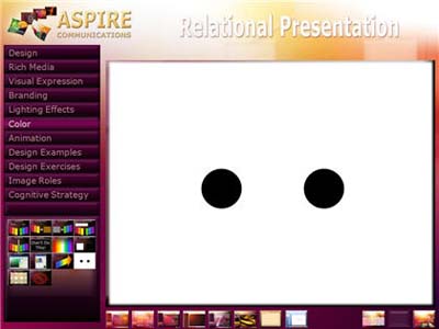
Figure 2 – Color Quantity and Contrast
Consider the color groups, as well as quantity and contrast, when combining colors on slides. It’s pretty safe to combine warm colors with each other and shades of brown (Figure 3) or cool colors with each other and shades of gray (Figure 4). White, black, and beige are neutral colors and go well with all colors in either group.

Figure 3 – Warm Colors Group
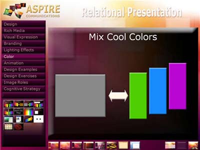
Figure 4 – Cool Colors Group
Where most PowerPoint designers get into trouble is combining colors across the warm/cool boundary. Absolutely NEVER do what is depicted in Figures 5 and 6. If you stare at either of these images for very long, your eyes begin screaming. They have trouble distinguishing interactions between the color wavelengths, resulting in fatigue and discomfort. Mixing bright blues and reds is a terrible practice to inflict upon audiences, and unfortunately it happens all too often. The same goes with mixing reds and greens.

Figure 5 – Red and Blue Color Combinations Cause Eye Strain

Figure 6 – Red and Green Color Combinations also Cause Eye Strain
A red and green combination also brings up the issue of color blindness, which apparently affects approximately 7 percent of men and 1 percent of women. Inability to notice the difference between red and green colors is the most common form of color blindness. For example, let’s say you place green text on a red background, as in Figure 6. If the text color’s shading (amount of darkness) has little contrast with the background color’s shading, some viewers will not be able to read that text at all! Avoid such problems by never mixing these two colors, especially in a text versus background combination.
Julie Terberg, a graphic designer and PowerPoint MVP, also points out that using the themes in PowerPoint can make your color combination choices easier (Figure 7). Theme colors have been chosen to look good together (although, still use caution) and to work well in both light and dark presentation environments.
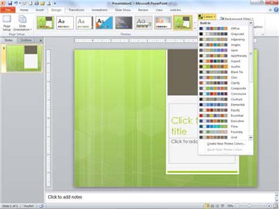
Figure 7 – Using Theme Colors Make Your Choices Easier
The Forgiving Nature of Color Gradients
Interestingly enough, the process of combining colors is much more forgiving when using gradients—colors that fade into each other. Beginning with version 2010, PowerPoint offers a greatly improved, user-friendly interface for making gradients, by the way (Figure 8).

Figure 8 – Adding a Gradient to a Shape
Because nature regularly blends colors this way (think of a sunset), we are used to seeing colors gradually transition from one hue to the next, meaning that you can get away with combining just about any color set and still end up with a reasonably attractive and professional look. Just make sure the transitions are gradual.
Try blending colors to make a custom-designed slide background, a decorative shape—perhaps for a sectional background (Figure 9) or navigation button (Figure 10)—or even jazzy, 3-D text (Figure 11).

Figure 9 – Purple, Gold and Gray Gradient inside a Shape

Figure 10 – Gradient-filled Shape used as a Navigation Button

Figure 11 – Gradient-filled PowerPoint Text
Color and Text Considerations
Going back to the issues of color quantity and contrast (black dots on the white background), those considerations are especially important when slides contain text. Unless such text exists in a navigation button or is purely decorative, generally the goal is for audience members to be able to read it, right? Therefore, opting for a simple background that contrasts sharply with the text color helps the message pop out and attract attention (Figure 12).

Figure 12 – Text Color should Contrast Sharply with a Background
Placing text on top of pictures is popular but can be tricky because controlling the contrast then becomes more difficult. The solution, again, is to make sure the text color contrasts as much as possible with a majority of the picture’s colors and then add a distinct shadow or glow to the text (Figure 13).
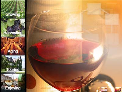
Figure 13 – Shadow on Text Helps it Appear more Distinct on top of a Picture
General Color Issues
Here are a few additional PowerPoint-related color tips we’ve discovered over the years:
Using red text is almost never a good idea. That particular color, of all colors, tends to washout when projected on a screen if any kind of unwanted ambient light also hits the screen—perhaps from sunlight streaking through a window or glare from a poorly aimed stage light.
Unless there is a particularly good reason for using brightly colored text … don’t. Stick with white or light beige on a dark background or black (or otherwise very dark color) on a light background. Your slides will have a more professional appearance as a result.
Stay away from gradients in text unless the words are large and intended to be primarily decorative in nature.
When using gradients, simplicity is your friend. Limit the number of colors, and, whenever possible, try using combinations that are readily found in nature for maximum appeal.
|
|
Robert Lane is a US-based presentation consultant specializing in visually interactive communication theory and is the author of Relational Presentation: A Visually Interactive Approach. His Web site, www.aspirecommunications.com, features resources that further explain the concepts discussed in this article. Contact him at: rlane@aspirecommunications.com. References, visual examples, and additional resources are available on the Aspire web site. |