Note: This article has done its job, and will be retiring soon. To prevent "Page not found" woes, we're removing links we know about. If you've created links to this page, please remove them, and together we'll keep the web connected.
When you are ready to create a chart for your data in Excel for the web, it might help to know a little more about each type of chart. You’ll learn how to arrange your data for the chart type you want, or what chart type works well for your data.
Click a chart type to learn more about it
Column charts
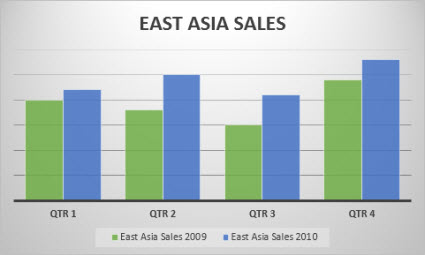
Data that’s arranged in columns or rows on a worksheet can be plotted in a column chart. A column chart typically displays categories along the horizontal axis and values along the vertical axis, like shown in this chart:
Types of column charts
-
Clustered column A clustered column chart shows values in 2-D columns. Use this chart when you have categories that represent:
-
Ranges of values (for example, item counts).
-
Specific scale arrangements (for example, a Likert scale with entries, like strongly agree, agree, neutral, disagree, strongly disagree).
-
Names that are not in any specific order (for example, item names, geographic names, or the names of people).
-
-
Stacked column A stacked column chart shows values in 2-D stacked columns. Use this chart when you have multiple data series and you want to emphasize the total.
-
100% stacked column A 100% stacked column chart shows values in 2-D columns that are stacked to represent 100%. Use this chart when you have two or more data series and you want to emphasize the contributions to the whole, especially if the total is the same for each category.
Line charts
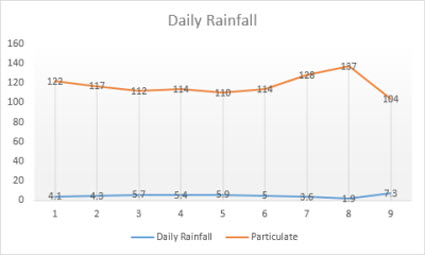
Data that is arranged in columns or rows on a worksheet can be plotted in a line chart. In a line chart, category data is distributed evenly along the horizontal axis, and all value data is distributed evenly along the vertical axis. Line charts can show continuous data over time on an evenly scaled axis, and are therefore ideal for showing trends in data at equal intervals, like months, quarters, or fiscal years.
Types of line charts
-
Line and line with markers Shown with or without markers to indicate individual data values, line charts can show trends over time or evenly spaced categories, especially when you have many data points and the order in which they are presented is important. If there are many categories or the values are approximate, use a line chart without markers.
-
Stacked line and stacked line with markers Shown with or without markers to indicate individual data values, stacked line charts can show the trend of the contribution of each value over time or evenly spaced categories.
-
100% stacked line and 100% stacked line with markers Shown with or without markers to indicate individual data values, 100% stacked line charts can show the trend of the percentage each value contributes over time or evenly spaced categories. If there are many categories or the values are approximate, use a 100% stacked line chart without markers.
Notes:
-
Line charts work best when you have multiple data series in your chart—if you only have one data series, consider using a scatter chart instead.
-
Stacked line charts add the data, which might not be the result you want. It might not be easy to see that the lines are stacked, so consider using a different line chart type or a stacked area chart instead.
-
Pie and doughnut charts
Data that is arranged in one column or row on a worksheet can be plotted in a pie chart. Pie charts show the size of items in one data series, proportional to the sum of the items. The data points in a pie chart are shown as a percentage of the whole pie.
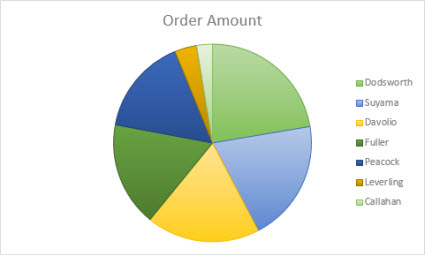
Consider using a pie chart when:
-
You have only one data series.
-
None of the values in your data are negative.
-
Almost none of the values in your data are zero values.
-
You have no more than seven categories, all of which represent parts of the whole pie.
Types of pie charts
-
Pie Pie charts show the contribution of each value to a total in a 2-D format.
Doughnut charts
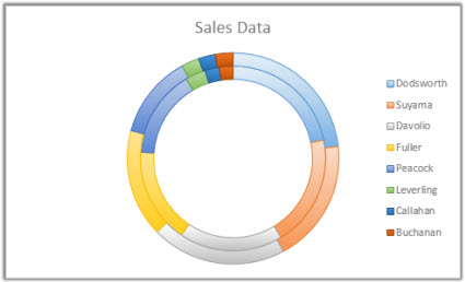
Data that is arranged in columns or rows only on a worksheet can be plotted in a doughnut chart. Like a pie chart, a doughnut chart shows the relationship of parts to a whole, but it can contain more than one data series.
Types of doughnut charts
-
Doughnut Doughnut charts show data in rings, where each ring represents a data series. If percentages are shown in data labels, each ring will total 100%.
Note: Doughnut charts are not easy to read. You may want to use a stacked column or stacked bar chart instead.
Bar charts
Data that is arranged in columns or rows on a worksheet can be plotted in a bar chart. Bar charts illustrate comparisons among individual items. In a bar chart, the categories are typically organized along the vertical axis, and the values along the horizontal axis.
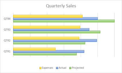
Consider using a bar chart when:
-
The axis labels are long.
-
The values that are shown are durations.
Types of bar charts
-
Clustered A clustered bar chart shows bars in 2-D format.
-
Stacked bar Stacked bar charts show the relationship of individual items to the whole in 2-D bars
-
100% stacked A 100% stacked bar shows 2-D bars that compare the percentage that each value contributes to a total across categories.
Area charts
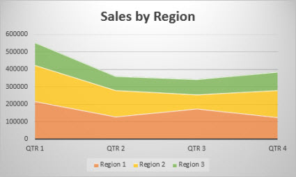
Data that is arranged in columns or rows on a worksheet can be plotted in an area chart. Area charts can be used to plot change over time and draw attention to the total value across a trend. By showing the sum of the plotted values, an area chart also shows the relationship of parts to a whole.
Types of area charts
-
Area Shown in 2-D format, area charts show the trend of values over time or other category data. As a rule, consider using a line chart instead of a non-stacked area chart, because data from one series can be hidden behind data from another series.
-
Stacked area Stacked area charts show the trend of the contribution of each value over time or other category data in 2-D format.
-
100% stacked 100% stacked area charts show the trend of the percentage that each value contributes over time or other category data.
Scatter charts
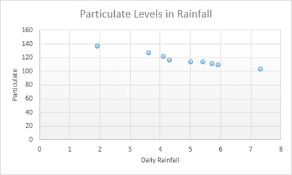
Data that is arranged in columns and rows on a worksheet can be plotted in an scatter chart. Place the x values in one row or column, and then enter the corresponding y values in the adjacent rows or columns.
A scatter chart has two value axes: a horizontal (x) and a vertical (y) value axis. It combines x and y values into single data points and shows them in irregular intervals, or clusters. Scatter charts are typically used for showing and comparing numeric values, like scientific, statistical, and engineering data.
Consider using a scatter chart when:
-
You want to change the scale of the horizontal axis.
-
You want to make that axis a logarithmic scale.
-
Values for horizontal axis are not evenly spaced.
-
There are many data points on the horizontal axis.
-
You want to adjust the independent axis scales of a scatter chart to reveal more information about data that includes pairs or grouped sets of values.
-
You want to show similarities between large sets of data instead of differences between data points.
-
You want to compare many data points without regard to time — the more data that you include in a scatter chart, the better the comparisons you can make.
Types of scatter charts
-
Scatter This chart shows data points without connecting lines to compare pairs of values.
-
Scatter with smooth lines and markers and scatter with smooth lines This chart shows a smooth curve that connects the data points. Smooth lines can be shown with or without markers. Use a smooth line without markers if there are many data points.
-
Scatter with straight lines and markers and scatter with straight lines This chart shows straight connecting lines between data points. Straight lines can be shown with or without markers.
Other charts
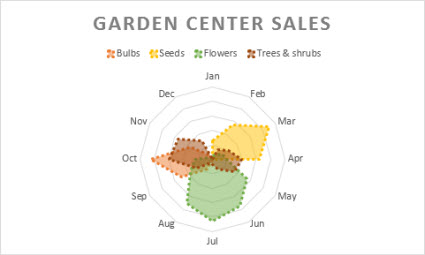
Data that is arranged in columns or rows on a worksheet can be plotted in a radar chart. Radar charts compare the aggregate values of several data series.
Type of radar charts
-
Radar and radar with markers With or without markers for individual data points, radar charts show changes in values relative to a center point.
-
Filled radar In a filled radar chart, the area covered by a data series is filled with a color.


