
Create a chart from start to finish
Charts help you visualize your data in a way that creates maximum impact on your audience. Learn to create a chart and add a trendline. You can start your document from a recommended chart or choose one from our collection of pre-built chart templates.

Create a chart
-
Select data for the chart.
-
Select Insert > Recommended Charts.
-
Select a chart on the Recommended Charts tab, to preview the chart.
Note: You can select the data you want in the chart and press ALT + F1 to create a chart immediately, but it might not be the best chart for the data. If you don’t see a chart you like, select the All Charts tab to see all chart types.
-
Select a chart.
-
Select OK.
Add a trendline
-
Select a chart.
-
Select Chart Design > Add Chart Element.
-
Select Trendline and then select the type of trendline you want, such as Linear, Exponential, Linear Forecast, or Moving Average.
Note: Some of the content in this topic may not be applicable to some languages.
Charts display data in a graphical format that can help you and your audience visualize relationships between data. When you create a chart, you can select from many chart types (for example, a stacked column chart or a 3-D exploded pie chart). After you create a chart, you can customize it by applying chart quick layouts or styles.
Charts contain several elements, such as a title, axis labels, a legend, and gridlines. You can hide or display these elements, and you can also change their location and formatting.


You can create a chart in Excel, Word, and PowerPoint. However, the chart data is entered and saved in an Excel worksheet. If you insert a chart in Word or PowerPoint, a new sheet is opened in Excel. When you save a Word document or PowerPoint presentation that contains a chart, the chart's underlying Excel data is automatically saved within the Word document or PowerPoint presentation.
Note: The Excel Workbook Gallery replaces the former Chart Wizard. By default, the Excel Workbook Gallery opens when you open Excel. From the gallery, you can browse templates and create a new workbook based on one of them. If you don't see the Excel Workbook Gallery, on the File menu, click New from Template.
-
On the View menu, click Print Layout.
-
Click the Insert tab, select the chart type, and then double-click the chart you want to add.

-
When you insert a chart into Word or PowerPoint, an Excel worksheet opens that contains a table of sample data.
-
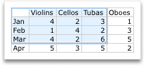
In Excel, replace the sample data with the data that you want to plot in the chart. If you already have your data in another table, you can copy the data from that table and then paste it over the sample data. See the following table for guidelines for how to arrange the data to fit your chart type.
For this chart type
Arrange the data
Area, bar, column, doughnut, line, radar, or surface chart
In columns or rows, as in the following examples:
Series 1
Series 2
Category A
10
12
Category B
11
14
Category C
9
15
or
Category A
Category B
Series 1
10
11
Series 2
12
14
Bubble chart
In columns, putting x values in the first column and corresponding y values and bubble size values in adjacent columns, as in the following examples:
X-Values
Y-Value 1
Size 1
0.7
2.7
4
1.8
3.2
5
2.6
0.08
6
Pie chart
In one column or row of data and one column or row of data labels, as in the following examples:
Sales
1st Qtr
25
2nd Qtr
30
3rd Qtr
45
or
1st Qtr
2nd Qtr
3rd Qtr
Sales
25
30
45
Stock chart
In columns or rows in the following order, using names or dates as labels, as in the following examples:
Open
High
Low
Close
1/5/02
44
55
11
25
1/6/02
25
57
12
38
or
1/5/02
1/6/02
Open
44
25
High
55
57
Low
11
12
Close
25
38
X Y (scatter) chart
In columns, putting x values in the first column and corresponding y values in adjacent columns, as in the following examples:
X-Values
Y-Value 1
0.7
2.7
1.8
3.2
2.6
0.08
or
X-Values
0.7
1.8
2.6
Y-Value 1
2.7
3.2
0.08
-
To change the number of rows and columns included in the chart, rest the pointer on the lower-right corner of the selected data, and then drag to select additional data. In the following example, the table is expanded to include additional categories and data series.
-
To see the results of your changes, switch back to Word or PowerPoint.
Note: When you close the Word document or the PowerPoint presentation that contains the chart, the chart's Excel data table closes automatically.
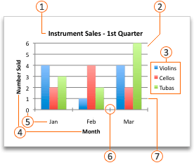
After you create a chart, you might want to change the way that table rows and columns are plotted in the chart. For example, your first version of a chart might plot the rows of data from the table on the chart's vertical (value) axis, and the columns of data on the horizontal (category) axis. In the following example, the chart emphasizes sales by instrument.

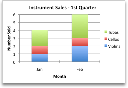
However, if you want the chart to emphasize the sales by month, you can reverse the way the chart is plotted.
-
On the View menu, click Print Layout.
-
Click the chart.
-
Click the Chart Design tab, and then click Switch Row/Column.
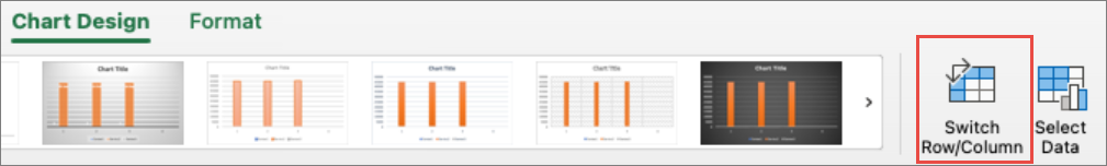
If Switch Row/Column is not available
Switch Row/Column is available only when the chart's Excel data table is open and only for certain chart types. You can also edit the data by clicking the chart, and then editing the worksheet in Excel.
-
On the View menu, click Print Layout.
-
Click the chart.
-
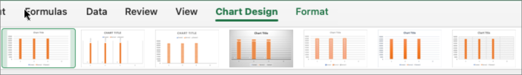
Click the Chart Design tab, and then click Quick Layout.
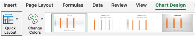
-
Click the layout you want.
To immediately undo a quick layout that you applied, press

Chart styles are a set of complementary colors and effects that you can apply to your chart. When you select a chart style, your changes affect the whole chart.
-
On the View menu, click Print Layout.
-
Click the chart.
-
Click the Chart Design tab, and then click the style you want.
To see more styles, point to a style, and then click

To immediately undo a style that you applied, press
-
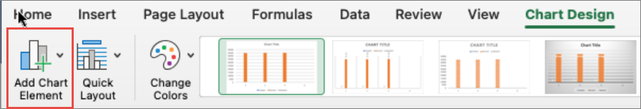
On the View menu, click Print Layout.
-
Click the chart, and then click the Chart Design tab.
-
Click Add Chart Element.
-
Click Chart Title to choose title format options, and then return to the chart to type a title in the Chart Title box.
See also
Create a chart
You can create a chart for your data in Excel for the web. Depending on the data you have, you can create a column, line, pie, bar, area, scatter, or radar chart.
-
Click anywhere in the data for which you want to create a chart.
To plot specific data into a chart, you can also select the data.
-
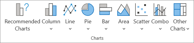
Select Insert > Charts > and the chart type you want.
-
On the menu that opens, select the option you want. Hover over a chart to learn more about it.
Tip: Your choice isn't applied until you pick an option from a Charts command menu. Consider reviewing several chart types: as you point to menu items, summaries appear next to them to help you decide.
-
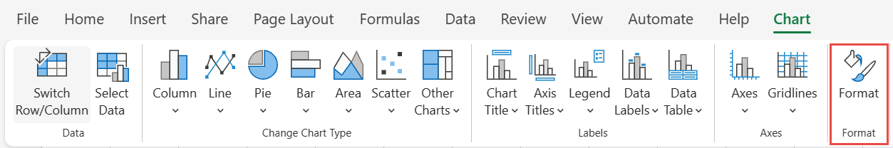
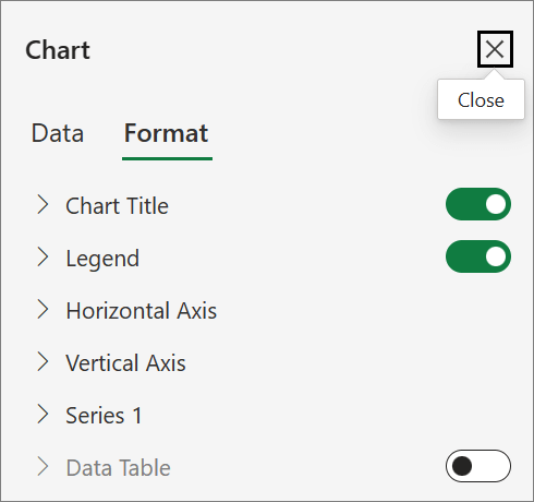
To edit the chart (titles, legends, data labels), select the Chart tab and then select Format.
-
In the Chart pane, adjust the setting as needed. You can customize settings for the chart's title, legend, axis titles, series titles, and more.
Available chart types
It's a good idea to review your data and decide what type of chart would work best. The available types are listed below.
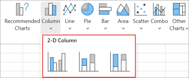
Data that’s arranged in columns or rows on a worksheet can be plotted in a column chart. A column chart typically displays categories along the horizontal axis and values along the vertical axis, like shown in this chart:

Types of column charts
-
Clustered column A clustered column chart shows values in 2-D columns. Use this chart when you have categories that represent:
-
Ranges of values (for example, item counts).
-
Specific scale arrangements (for example, a Likert scale with entries, like strongly agree, agree, neutral, disagree, strongly disagree).
-
Names that are not in any specific order (for example, item names, geographic names, or the names of people).
-
-
Stacked column A stacked column chart shows values in 2-D stacked columns. Use this chart when you have multiple data series and you want to emphasize the total.
-
100% stacked column A 100% stacked column chart shows values in 2-D columns that are stacked to represent 100%. Use this chart when you have two or more data series and you want to emphasize the contributions to the whole, especially if the total is the same for each category.
Data that is arranged in columns or rows on a worksheet can be plotted in a line chart. In a line chart, category data is distributed evenly along the horizontal axis, and all value data is distributed evenly along the vertical axis. Line charts can show continuous data over time on an evenly scaled axis, and are therefore ideal for showing trends in data at equal intervals, like months, quarters, or fiscal years.

Types of line charts
-
Line and line with markers Shown with or without markers to indicate individual data values, line charts can show trends over time or evenly spaced categories, especially when you have many data points and the order in which they are presented is important. If there are many categories or the values are approximate, use a line chart without markers.
-
Stacked line and stacked line with markers Shown with or without markers to indicate individual data values, stacked line charts can show the trend of the contribution of each value over time or evenly spaced categories.
-
100% stacked line and 100% stacked line with markers Shown with or without markers to indicate individual data values, 100% stacked line charts can show the trend of the percentage each value contributes over time or evenly spaced categories. If there are many categories or the values are approximate, use a 100% stacked line chart without markers.
Notes:
-
Line charts work best when you have multiple data series in your chart—if you only have one data series, consider using a scatter chart instead.
-
Stacked line charts add the data, which might not be the result you want. It might not be easy to see that the lines are stacked, so consider using a different line chart type or a stacked area chart instead.
-
Data that is arranged in one column or row on a worksheet can be plotted in a pie chart. Pie charts show the size of items in one data series, proportional to the sum of the items. The data points in a pie chart are shown as a percentage of the whole pie.

Consider using a pie chart when:
-
You have only one data series.
-
None of the values in your data are negative.
-
Almost none of the values in your data are zero values.
-
You have no more than seven categories, all of which represent parts of the whole pie.
Data that is arranged in columns or rows only on a worksheet can be plotted in a doughnut chart. Like a pie chart, a doughnut chart shows the relationship of parts to a whole, but it can contain more than one data series.

Tip: Doughnut charts are not easy to read. You may want to use a stacked column or stacked bar chart instead.
Data that is arranged in columns or rows on a worksheet can be plotted in a bar chart. Bar charts illustrate comparisons among individual items. In a bar chart, the categories are typically organized along the vertical axis, and the values along the horizontal axis.

Consider using a bar chart when:
-
The axis labels are long.
-
The values that are shown are durations.
Types of bar charts
-
Clustered A clustered bar chart shows bars in 2-D format.
-
Stacked bar Stacked bar charts show the relationship of individual items to the whole in 2-D bars
-
100% stacked A 100% stacked bar shows 2-D bars that compare the percentage that each value contributes to a total across categories.
Data that is arranged in columns or rows on a worksheet can be plotted in an area chart. Area charts can be used to plot change over time and draw attention to the total value across a trend. By showing the sum of the plotted values, an area chart also shows the relationship of parts to a whole.

Types of area charts
-
Area Shown in 2-D format, area charts show the trend of values over time or other category data. As a rule, consider using a line chart instead of a non-stacked area chart, because data from one series can be hidden behind data from another series.
-
Stacked area Stacked area charts show the trend of the contribution of each value over time or other category data in 2-D format.
-
100% stacked 100% stacked area charts show the trend of the percentage that each value contributes over time or other category data.
Data that is arranged in columns and rows on a worksheet can be plotted in an scatter chart. Place the x values in one row or column, and then enter the corresponding y values in the adjacent rows or columns.
A scatter chart has two value axes: a horizontal (x) and a vertical (y) value axis. It combines x and y values into single data points and shows them in irregular intervals, or clusters. Scatter charts are typically used for showing and comparing numeric values, like scientific, statistical, and engineering data.

Consider using a scatter chart when:
-
You want to change the scale of the horizontal axis.
-
You want to make that axis a logarithmic scale.
-
Values for horizontal axis are not evenly spaced.
-
There are many data points on the horizontal axis.
-
You want to adjust the independent axis scales of a scatter chart to reveal more information about data that includes pairs or grouped sets of values.
-
You want to show similarities between large sets of data instead of differences between data points.
-
You want to compare many data points without regard to time — the more data that you include in a scatter chart, the better the comparisons you can make.
Types of scatter charts
-
Scatter This chart shows data points without connecting lines to compare pairs of values.
-
Scatter with smooth lines and markers and scatter with smooth lines This chart shows a smooth curve that connects the data points. Smooth lines can be shown with or without markers. Use a smooth line without markers if there are many data points.
-
Scatter with straight lines and markers and scatter with straight lines This chart shows straight connecting lines between data points. Straight lines can be shown with or without markers.
Data that is arranged in columns or rows on a worksheet can be plotted in a radar chart. Radar charts compare the aggregate values of several data series.

Type of radar charts
-
Radar and radar with markers With or without markers for individual data points, radar charts show changes in values relative to a center point.
-
Filled radar In a filled radar chart, the area covered by a data series is filled with a color.
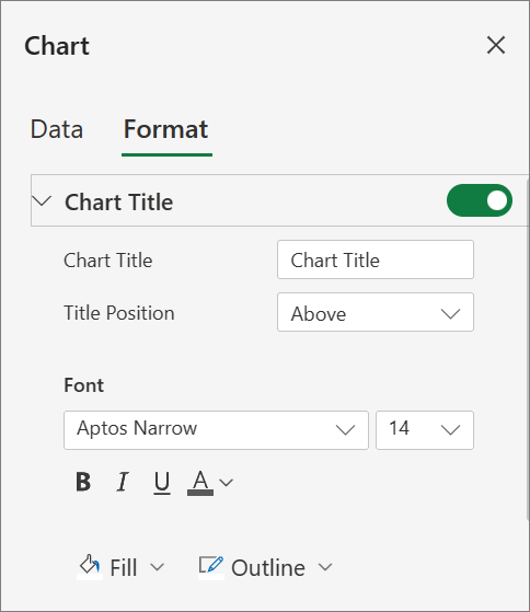
Add or edit a chart title
You can add or edit a chart title, customize its look, and include it on the chart.
-
Click anywhere in the chart to show the Chart tab on the ribbon.
-
Click Format to open the chart formatting options.
-
In the Chart pane, expand the Chart Title section.
-
Add or edit the Chart Title to meet your needs.
-
Use the switch to hide the title if you don't want your chart to show a title.
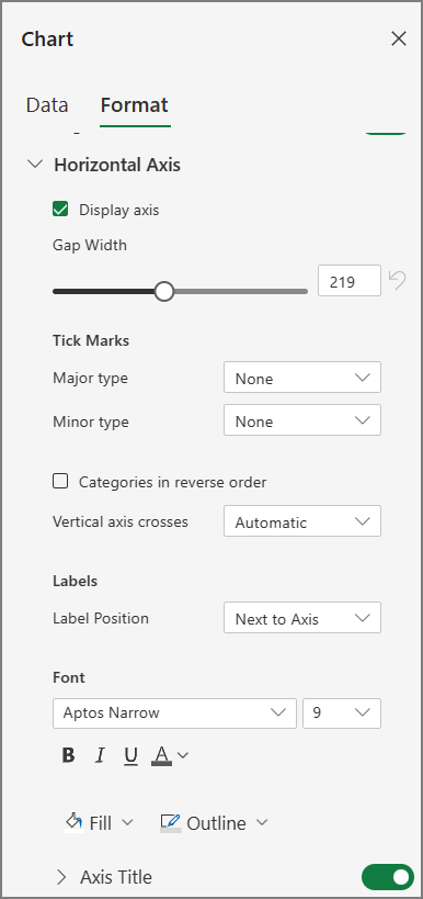
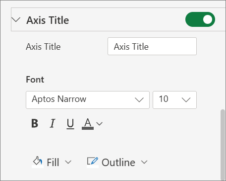
Add axis titles to improve chart readability
Adding titles to the horizontal and vertical axes in charts that have axes can make them easier to read. You can’t add axis titles to charts that don’t have axes, such as pie and doughnut charts.
Much like chart titles, axis titles help the people who view the chart understand what the data is about.

-
Click anywhere in the chart to show the Chart tab on the ribbon.
-
Click Format to open the chart formatting options.
-
In the Chart pane, expand the Horizontal Axis or Vertical Axis section.
-
Add or edit the Horizontal Axis or Vertical Axis options to meet your needs.
-
Expand the Axis Title.
-
Change the Axis Title and modify the formatting.
-
Use the switch to show or hide the title.
Change the axis labels
Axis labels are shown below the horizontal axis and next to the vertical axis. Your chart uses text in the source data for these axis labels.

To change the text of the category labels on the horizontal or vertical axis:
-
Click the cell which has the label text you want to change.
-
Type the text you want and press Enter.
The axis labels in the chart are automatically updated with the new text.
Tip: Axis labels are different from axis titles you can add to describe what is shown on the axes. Axis titles aren’t automatically shown in a chart.
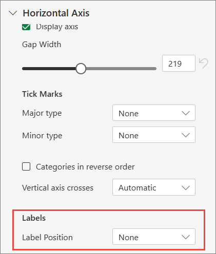
Remove the axis labels
To remove labels on the horizontal or vertical axis:
-
Click anywhere in the chart to show the Chart tab on the ribbon.
-
Click Format to open the chart formatting options.
-
In the Chart pane, expand the Horizontal Axis or Vertical Axis section.
-
From the dropdown box for Label Position, select None to prevent the labels from showing on the chart.
Need more help?
You can always ask an expert in the Excel Tech Community or get support in Communities.


Need more help?
Want more options?
Explore subscription benefits, browse training courses, learn how to secure your device, and more.


Communities help you ask and answer questions, give feedback, and hear from experts with rich knowledge.


